Density Plots with Pandas in Python
Last Updated :
26 Nov, 2020
Density Plot is a type of data visualization tool. It is a variation of the histogram that uses ‘kernel smoothing’ while plotting the values. It is a continuous and smooth version of a histogram inferred from a data.
Density plots uses Kernel Density Estimation (so they are also known as Kernel density estimation plots or KDE) which is a probability density function. The region of plot with a higher peak is the region with maximum data points residing between those values.
Density plots can be made using pandas, seaborn, etc. In this article, we will generate density plots using Pandas. We will be using two datasets of the Seaborn Library namely – ‘car_crashes’ and ‘tips’.
Syntax: pandas.DataFrame.plot.density | pandas.DataFrame.plot.kde
where pandas -> the dataset of the type ‘pandas dataframe’
Dataframe -> the column for which the density plot is to be drawn
plot -> keyword directing to draw a plot/graph for the given column
density -> for plotting a density graph
kde -> to plot a density graph using the Kernel Density Estimation function
Example 1: Given the dataset ‘car_crashes’, let’s find out using the density plot which is the most common speed due to which most of the car crashes happened.
Python3
import pandas as pd
import seaborn as sns
import matplotlib.pyplot as plt
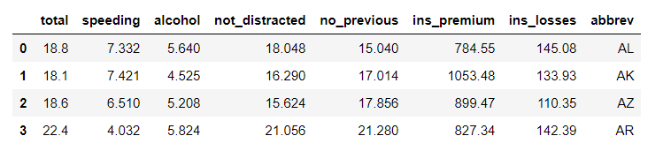
data = sns.load_dataset('car_crashes')
print(data.head(4))
|
Output:
Plotting the graph:
Python3
data.speeding.plot.density(color='green')
plt.title('Density plot for Speeding')
plt.show()
|
Output:
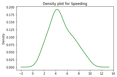
Using a density plot, we can figure out that the speed between 4-5 (kmph) was the most common for crash crashes in the dataset because of it being high density (high peak) region.
Example 2: For another dataset ‘tips’, let’s calculate what was the most common tip given by a customer.
Python3
data = sns.load_dataset('tips')
print(data.head(4))
|
Output:
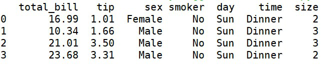
‘tips’ dataset
Plotting the graph:
Python3
data.tip.plot.density(color='green')
plt.title('Density Plot for Tip')
plt.show()
|
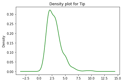
Through the above density plot, we can infer that the most common tip that was given was in the range of 2.5 – 3. The highest peak/density (as represented on the y-axis) was found to be at the tip value of 2.5 – 3.
Plotting the above plot using the plot.kde()
KDE or the Kernel Density Estimation uses Gaussian Kernels to estimate the Probability Density Function of a random variable. Below is the implementation of plotting the density plot using kde() for the dataset ‘tips’.
Python3
data.tip.plot.kde(color='green')
plt.title('KDE-Density plot for Tip')
plt.show()
|
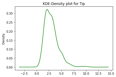
Using this we can infer that there is no major difference between plot.density() and plot.kde() and can be therefore used interchangeably.
Density plots have an advantage over Histograms because they determine the Shape of the distribution more efficiently than histograms. They do not have to depend on the number of bins used unlike in histograms.
Like Article
Suggest improvement
Share your thoughts in the comments
Please Login to comment...