Data visualization with R and ggplot2
Last Updated :
20 Dec, 2023
Data visualization with R and ggplot2 in R Programming Language also termed as Grammar of Graphics is a free, open-source, and easy-to-use visualization package widely used in R Programming Language. It is the most powerful visualization package written by Hadley Wickham.
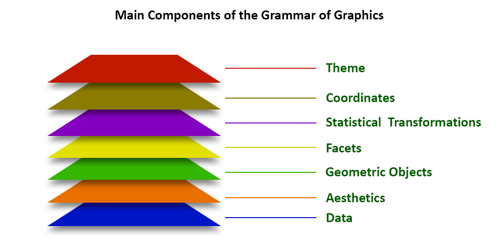
It includes several layers on which it is governed. The layers are as follows:
Building Blocks of layers with the grammar of graphics
- Data: The element is the data set itself
- Aesthetics: The data is to map onto the Aesthetics attributes such as x-axis, y-axis, color, fill, size, labels, alpha, shape, line width, line type
- Geometrics: How our data being displayed using point, line, histogram, bar, boxplot
- Facets: It displays the subset of the data using Columns and rows
- Statistics: Binning, smoothing, descriptive, intermediate
- Coordinates: the space between data and display using Cartesian, fixed, polar, limits
- Themes: Non-data link
Dataset Used
mtcars(motor trend car road test) comprise fuel consumption and 10 aspects of automobile design and performance for 32 automobiles and come pre-installed with dplyr package in R.
Output:
                   mpg cyl disp  hp drat    wt  qsec vs am gear carb
Mazda RX4         21.0   6  160 110 3.90 2.620 16.46  0  1    4    4
Mazda RX4 Wag     21.0   6  160 110 3.90 2.875 17.02  0  1    4    4
Datsun 710        22.8   4  108  93 3.85 2.320 18.61  1  1    4    1
Hornet 4 Drive    21.4   6  258 110 3.08 3.215 19.44  1  0    3    1
Hornet Sportabout 18.7   8  360 175 3.15 3.440 17.02  0  0    3    2
Valiant           18.1   6  225 105 2.76 3.460 20.22  1  0    3    1
Now we load dplyr library and print the summary of mtcars dataset using summary function.
R
install.packages("dplyr")
library(dplyr)
summary(mtcars)
|
Output:
      mpg             cyl             disp             hp
 Min.   :10.40   Min.   :4.000   Min.   : 71.1   Min.   : 52.0
 1st Qu.:15.43   1st Qu.:4.000   1st Qu.:120.8   1st Qu.: 96.5
 Median :19.20   Median :6.000   Median :196.3   Median :123.0
 Mean   :20.09   Mean   :6.188   Mean   :230.7   Mean   :146.7
 3rd Qu.:22.80   3rd Qu.:8.000   3rd Qu.:326.0   3rd Qu.:180.0
 Max.   :33.90   Max.   :8.000   Max.   :472.0   Max.   :335.0
      drat             wt             qsec             vs
 Min.   :2.760   Min.   :1.513   Min.   :14.50   Min.   :0.0000
 1st Qu.:3.080   1st Qu.:2.581   1st Qu.:16.89   1st Qu.:0.0000
 Median :3.695   Median :3.325   Median :17.71   Median :0.0000
 Mean   :3.597   Mean   :3.217   Mean   :17.85   Mean   :0.4375
 3rd Qu.:3.920   3rd Qu.:3.610   3rd Qu.:18.90   3rd Qu.:1.0000
 Max.   :4.930   Max.   :5.424   Max.   :22.90   Max.   :1.0000
       am              gear            carb
 Min.   :0.0000   Min.   :3.000   Min.   :1.000
 1st Qu.:0.0000   1st Qu.:3.000   1st Qu.:2.000
 Median :0.0000   Median :4.000   Median :2.000
 Mean   :0.4062   Mean   :3.688   Mean   :2.812
 3rd Qu.:1.0000   3rd Qu.:4.000   3rd Qu.:4.000
 Max.   :1.0000   Max.   :5.000   Max.   :8.000
ggplot2 in R
We devise visualizations on mtcars dataset which includes 32 car brands and 11 attributes using ggplot2 layers.
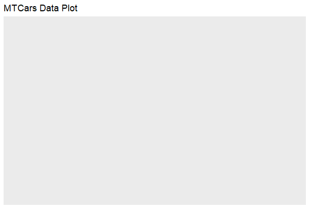
Data Layer:
ggplot2 in R the data Layer we define the source of the information to be visualize, let’s use the mtcars dataset in the ggplot2 package.
R
library(ggplot2)
library(dplyr)
ggplot(data = mtcars) +
labs(title = "MTCars Data Plot")
|
Output:
ggplot2 in R
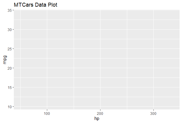
Aesthetic Layer:
ggplot2 in R Here we will display and map dataset into certain aesthetics.
R
ggplot(data = mtcars, aes(x = hp, y = mpg, col = disp))+
labs(title = "MTCars Data Plot")
|
Output:
ggplot2 in R
Geometric layer:
ggplot2 in R geometric layer control the essential elements, see how our data being displayed using point, line, histogram, bar, boxplot.
R
ggplot(data = mtcars, aes(x = hp, y = mpg, col = disp)) +
geom_point() +
labs(title = "Miles per Gallon vs Horsepower",
x = "Horsepower",
y = "Miles per Gallon")
|
Output:
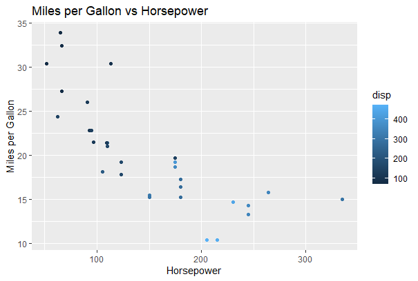
Data visualization with R and ggplot2
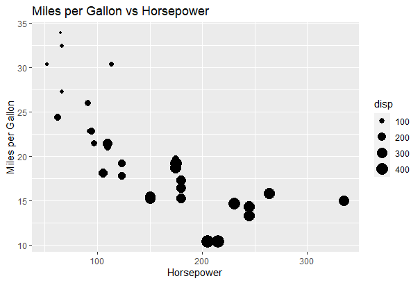
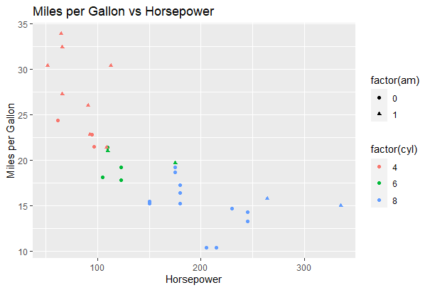
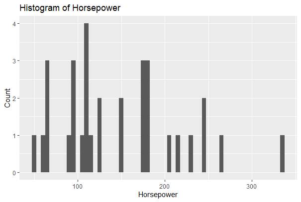
Geometric layer: Adding Size, color, and shape and then plotting the Histogram plot
R
ggplot(data = mtcars, aes(x = hp, y = mpg, size = disp)) +
geom_point() +
labs(title = "Miles per Gallon vs Horsepower",
x = "Horsepower",
y = "Miles per Gallon")
ggplot(data = mtcars, aes(x = hp, y = mpg, col = factor(cyl),
shape = factor(am))) +geom_point() +
labs(title = "Miles per Gallon vs Horsepower",
x = "Horsepower",
y = "Miles per Gallon")
ggplot(data = mtcars, aes(x = hp)) +
geom_histogram(binwidth = 5) +
labs(title = "Histogram of Horsepower",
x = "Horsepower",
y = "Count")
|
Output:
Data visualization with R and ggplot2
Data visualization with R and ggplot2
Data visualization with R and ggplot2
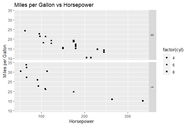
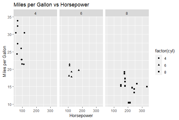
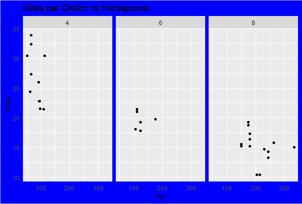
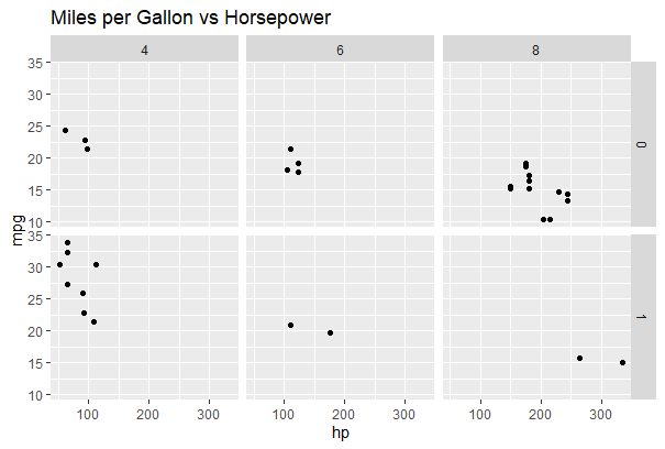
Facet Layer:
ggplot2 in R facet layer is used to split the data up into subsets of the entire dataset and it allows the subsets to be visualized on the same plot. Here we separate rows according to transmission type and Separate columns according to cylinders.
R
p <- ggplot(data = mtcars, aes(x = hp, y = mpg, shape = factor(cyl))) + geom_point()
p + facet_grid(am ~ .) +
labs(title = "Miles per Gallon vs Horsepower",
x = "Horsepower",
y = "Miles per Gallon")
p <- ggplot(data = mtcars, aes(x = hp, y = mpg, shape = factor(cyl))) + geom_point()
p + facet_grid(. ~ cyl) +
labs(title = "Miles per Gallon vs Horsepower",
x = "Horsepower",
y = "Miles per Gallon")
|
Output:
Data visualization with R and ggplot2Data visualization with R and ggplot2
Data visualization with R and ggplot2
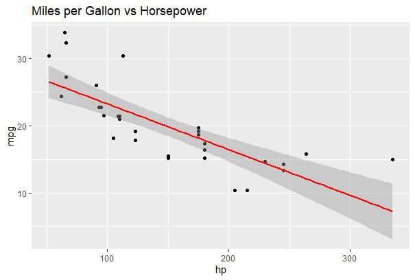
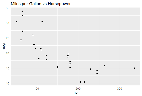
Statistics layer
ggplot2 in R this layer, we transform our data using binning, smoothing, descriptive, intermediate
R
ggplot(data = mtcars, aes(x = hp, y = mpg)) +
geom_point() +
stat_smooth(method = lm, col = "red") +
labs(title = "Miles per Gallon vs Horsepower")
|
Output:
Data visualization with R and ggplot2
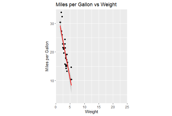
Coordinates layer:
ggplot2 in R these layers, data coordinates are mapped together to the mentioned plane of the graphic and we adjust the axis and changes the spacing of displayed data with Control plot dimensions.
R
ggplot(data = mtcars, aes(x = wt, y = mpg)) +
geom_point() +
stat_smooth(method = lm, col = "red") +
scale_y_continuous("Miles per Gallon", limits = c(2, 35), expand = c(0, 0)) +
scale_x_continuous("Weight", limits = c(0, 25), expand = c(0, 0)) +
coord_equal() +
labs(title = "Miles per Gallon vs Weight",
x = "Weight",
y = "Miles per Gallon")
|
Output:
Data visualization with R and ggplot2
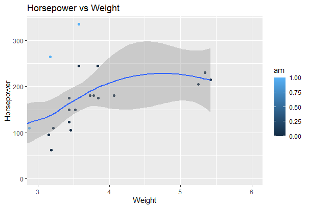
Coord_cartesian() to proper zoom in:
R
ggplot(data = mtcars, aes(x = wt, y = hp, col = am)) +
geom_point() + geom_smooth() +
coord_cartesian(xlim = c(3, 6))
|
Output:
Data visualization with R and ggplot2
Theme Layer:
ggplot2 in R layer controls the finer points of display like the font size and background color properties.
Example 1: Theme layer – element_rect() function
R
ggplot(data = mtcars, aes(x = hp, y = mpg)) +
geom_point() +
facet_grid(. ~ cyl) +
theme(plot.background = element_rect(fill = "blue", colour = "gray")) +
labs(title = "Miles per Gallon vs Horsepower")
|
Output:
Data visualization with R and ggplot2
Example 2:
R
ggplot(data = mtcars, aes(x = hp, y = mpg)) +
geom_point() + facet_grid(am ~ cyl) +
theme_gray()+
labs(title = "Miles per Gallon vs Horsepower")
|
Output:
Data visualization with R and ggplot2
ggplot2 in R provides various types of visualizations. More parameters can be used included in the package as the package gives greater control over the visualizations of data. Many packages can integrate with the ggplot2 package to make the visualizations interactive and animated.
Contour plot for the mtcars dataset
R
install.packages("ggplot2")
library(ggplot2)
ggplot(mtcars, aes(x = wt, y = mpg)) +
stat_density_2d(aes(fill = ..level..), geom = "polygon", color = "white") +
scale_fill_viridis_c() +
labs(title = "2D Density Contour Plot of mtcars Dataset",
x = "Weight (wt)",
y = "Miles per Gallon (mpg)",
fill = "Density") +
theme_minimal()
|
Output:

Data visualization with R and ggplot2
In ggplot2 in R stat_density_2d to generate the 2D density contour plot. The aesthetics x and y specify the variables on the x-axis and y-axis, respectively. The fill aesthetic is set to ..level.. to map fill color to density levels.
Creating a panel of different plots
R
library(ggplot2)
library(gridExtra)
selected_cols <- c("mpg", "disp", "hp", "drat")
selected_data <- mtcars[, selected_cols]
hist_plot_mpg <- ggplot(selected_data, aes(x = mpg)) +
geom_histogram(binwidth = 2, fill = "blue", color = "white") +
labs(title = "Histogram: Miles per Gallon", x = "Miles per Gallon", y = "Frequency")
hist_plot_disp <- ggplot(selected_data, aes(x = disp)) +
geom_histogram(binwidth = 50, fill = "red", color = "white") +
labs(title = "Histogram: Displacement", x = "Displacement", y = "Frequency")
hist_plot_hp <- ggplot(selected_data, aes(x = hp)) +
geom_histogram(binwidth = 20, fill = "green", color = "white") +
labs(title = "Histogram: Horsepower", x = "Horsepower", y = "Frequency")
hist_plot_drat <- ggplot(selected_data, aes(x = drat)) +
geom_histogram(binwidth = 0.5, fill = "orange", color = "white") +
labs(title = "Histogram: Drat", x = "Drat", y = "Frequency")
grid.arrange(hist_plot_mpg, hist_plot_disp, hist_plot_hp, hist_plot_drat,
ncol = 2)
|
Output:

Data visualization with R and ggplot2
The ggplot2 and gridExtra packages to create histograms for four different variables (“Miles per Gallon,” “Displacement,” “Horsepower,” and “Drat”) from the mtcars dataset.
Each histogram is visually represented in a distinctive color (blue, red, green, and orange) with white borders. The resulting grid of histograms provides a quick visual overview of the distribution of these car-related variables.
Save and extract R plots:
To save and extract plots in R, you can use the ggsave function from the ggplot2 package. Here’s an example of how to save and extract plots:
R
plot <- ggplot(data = mtcars, aes(x = hp, y = mpg)) +
geom_point() +
labs(title = "Miles per Gallon vs Horsepower")
ggsave("plot.png", plot)
ggsave("plot.pdf", plot)
extracted_plot <- plot
plot
|
Output:
Data visualization with R and ggplot2
In this demonstration, I used ggplot to construct a plot and the ggsave function to save it as a PDF file (plot.pdf) and a PNG image file (plot.png). By including the correct file extension, you can indicate the intended file format.
You may easily give the ggplot object to a variable, as demonstrated with extracted_plot, to extract the plot as a variable for later usage.
Be sure to substitute your unique plot and desired file names for the plot code and file names (plot.png and plot.pdf).
Share your thoughts in the comments
Please Login to comment...