Data Visualization is the presentation of data in pictorial format. It is extremely important for Data Analysis, primarily because of the fantastic ecosystem of data-centric Python packages. And it helps to understand the data, however, complex it is, the significance of data by summarizing and presenting a huge amount of data in a simple and easy-to-understand format and helps communicate information clearly and effectively.

Pandas and Seaborn is one of those packages and makes importing and analyzing data much easier. In this article, we will use Pandas and Seaborn to analyze data.
Pandas
Pandas offer tools for cleaning and process your data. It is the most popular Python library that is used for data analysis. In pandas, a data table is called a dataframe.
So, let’s start with creating Pandas data frame:
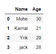
Example 1:
Python3
import pandas as pd
data = {'Name':[ 'Mohe' , 'Karnal' , 'Yrik' , 'jack' ],
'Age':[ 30 , 21 , 29 , 28 ]}
df = pd.DataFrame( data )
df
|
Output:
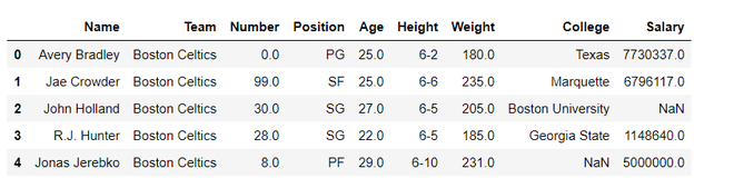
Example 2: load the CSV data from the system and display it through pandas.
Python3
import pandas
data = pandas.read_csv("nba.csv")
data.head()
|
Output:
Seaborn
Seaborn is an amazing visualization library for statistical graphics plotting in Python. It is built on the top of matplotlib library and also closely integrated into the data structures from pandas.
Installation
For python environment :
pip install seaborn
For conda environment :
conda install seaborn
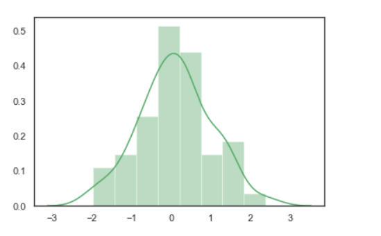
Let’s create Some basic plots using seaborn:
Python3
import numpy as np
import seaborn as sns
sns.set( style = "white" )
rs = np.random.RandomState( 10 )
d = rs.normal( size = 50 )
sns.distplot(d, kde = True, color = "g")
|
Output:
Seaborn: statistical data visualization
Seaborn helps to visualize the statistical relationships, To understand how variables in a dataset are related to one another and how that relationship is dependent on other variables, we perform statistical analysis. This Statistical analysis helps to visualize the trends and identify various patterns in the dataset.
These are the plot will help to visualize:
- Line Plot
- Scatter Plot
- Box plot
- Point plot
- Count plot
- Violin plot
- Swarm plot
- Bar plot
- KDE Plot
Line plot:
Lineplot Is the most popular plot to draw a relationship between x and y with the possibility of several semantic groupings.
Syntax : sns.lineplot(x=None, y=None)
Parameters:
x, y: Input data variables; must be numeric. Can pass data directly or reference columns in data.
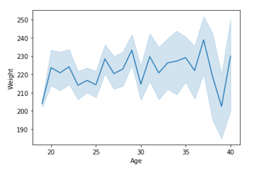
Let’s visualize the data with a line plot and pandas:
Example 1:
Python3
import seaborn as sns
import pandas
data = pandas.read_csv("nba.csv")
sns.lineplot( data['Age'], data['Weight'])
|
Output:
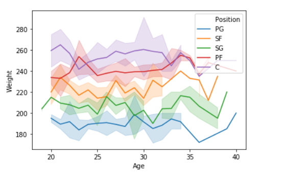
Example 2: Use the hue parameter for plotting the graph.
Python3
import seaborn as sns
import pandas
data = pandas.read_csv("nba.csv")
sns.lineplot(data['Age'],data['Weight'], hue =data["Position"])
|
Output:
Scatter Plot:
Scatterplot Can be used with several semantic groupings which can help to understand well in a graph against continuous/categorical data. It can draw a two-dimensional graph.
Syntax: seaborn.scatterplot(x=None, y=None)
Parameters:
x, y: Input data variables that should be numeric.
Returns: This method returns the Axes object with the plot drawn onto it.
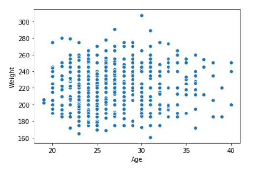
Let’s visualize the data with a scatter plot and pandas:
Example 1:
Python3
import seaborn
import pandas
data = pandas.read_csv("nba.csv")
seaborn.scatterplot(data['Age'],data['Weight'])
|
Output:
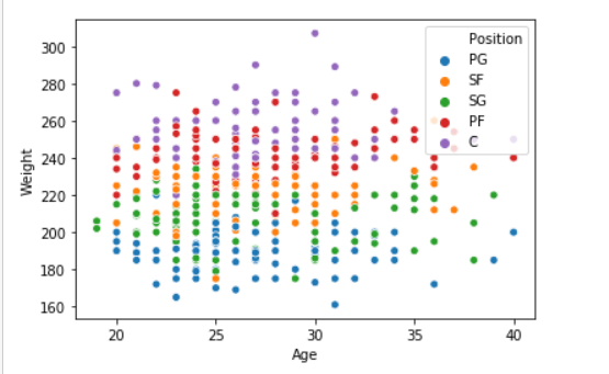
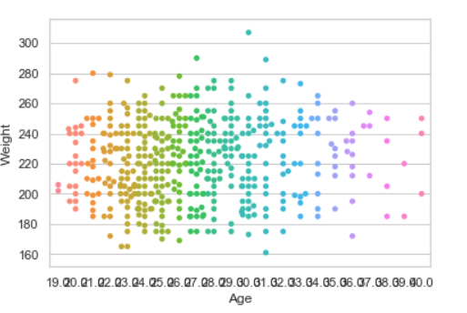
Example 2: Use the hue parameter for plotting the graph.
Python3
import seaborn
import pandas
data = pandas.read_csv("nba.csv")
seaborn.scatterplot( data['Age'], data['Weight'], hue =data["Position"])
|
Output:
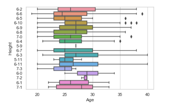
Box plot:
A box plot (or box-and-whisker plot) s is the visual representation of the depicting groups of numerical data through their quartiles against continuous/categorical data.
A box plot consists of 5 things.
- Minimum
- First Quartile or 25%
- Median (Second Quartile) or 50%
- Third Quartile or 75%
- Maximum
Syntax:
seaborn.boxplot(x=None, y=None, hue=None, data=None)
Parameters:
- x, y, hue: Inputs for plotting long-form data.
- data: Dataset for plotting. If x and y are absent, this is interpreted as wide-form.
Returns: It returns the Axes object with the plot drawn onto it.
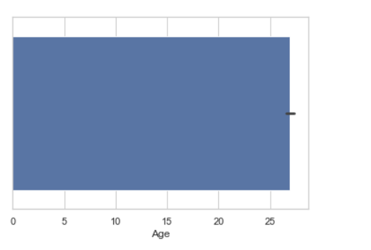
Draw the box plot with Pandas:
Example 1:
Python3
import seaborn as sns
import pandas
data = pandas.read_csv( "nba.csv" )
sns.boxplot( data['Age'] )
|
Output:
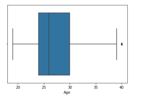
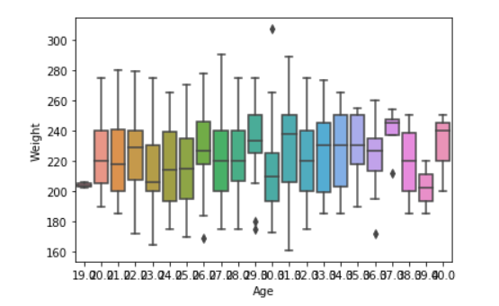
Example 2:
Python3
import seaborn as sns
import pandas
data = pandas.read_csv( "nba.csv" )
sns.boxplot( data['Age'], data['Weight'])
|
Output:
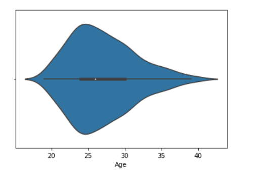
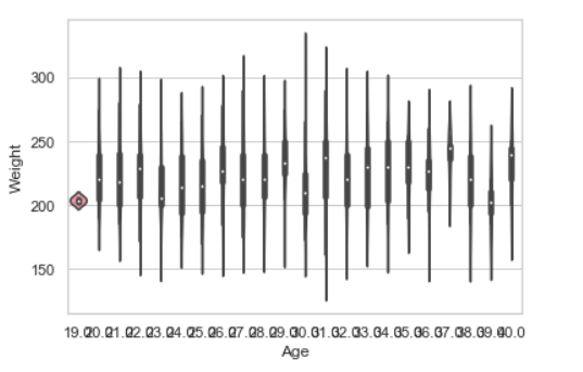
Violin Plot:
A violin plot is similar to a boxplot. It shows several quantitative data across one or more categorical variables such that those distributions can be compared.
Syntax: seaborn.violinplot(x=None, y=None, hue=None, data=None)
Parameters:
- x, y, hue: Inputs for plotting long-form data.
- data: Dataset for plotting.
Draw the violin plot with Pandas:
Example 1:
Python3
import seaborn as sns
import pandas
data = pandas.read_csv("nba.csv")
sns.violinplot(data['Age'])
|
Output:
Example 2:
Python3
import seaborn
seaborn.set(style = 'whitegrid')
data = pandas.read_csv("nba.csv")
seaborn.violinplot(x ="Age", y ="Weight",data = data)
|
Output:
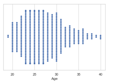
Swarm plot:
A swarm plot is similar to a strip plot, We can draw a swarm plot with non-overlapping points against categorical data.
Syntax: seaborn.swarmplot(x=None, y=None, hue=None, data=None)
Parameters:
- x, y, hue: Inputs for plotting long-form data.
- data: Dataset for plotting.
Draw the swarm plot with Pandas:
Example 1:
Python3
import seaborn
seaborn.set(style = 'whitegrid')
data = pandas.read_csv( "nba.csv" )
seaborn.swarmplot(x = data["Age"])
|
Output:
Example 2:
Python3
import seaborn
seaborn.set(style = 'whitegrid')
data = pandas.read_csv("nba.csv")
seaborn.swarmplot(x ="Age", y ="Weight",data = data)
|
Output:
Bar plot:
Barplot represents an estimate of central tendency for a numeric variable with the height of each rectangle and provides some indication of the uncertainty around that estimate using error bars.
Syntax : seaborn.barplot(x=None, y=None, hue=None, data=None)
Parameters :
- x, y : This parameter take names of variables in data or vector data, Inputs for plotting long-form data.
- hue : (optional) This parameter take column name for colour encoding.
- data : (optional) This parameter take DataFrame, array, or list of arrays, Dataset for plotting. If x and y are absent, this is interpreted as wide-form. Otherwise it is expected to be long-form.
Returns : Returns the Axes object with the plot drawn onto it.
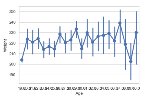
Draw the bar plot with Pandas:
Example 1:
Python3
import seaborn
seaborn.set(style = 'whitegrid')
data = pandas.read_csv("nba.csv")
seaborn.barplot(x =data["Age"])
|
Output:
Example 2:
Python3
import seaborn
seaborn.set(style = 'whitegrid')
data = pandas.read_csv("nba.csv")
seaborn.barplot(x ="Age", y ="Weight", data = data)
|
Output:
Point plot:
Point plot used to show point estimates and confidence intervals using scatter plot glyphs. A point plot represents an estimate of central tendency for a numeric variable by the position of scatter plot points and provides some indication of the uncertainty around that estimate using error bars.
Syntax: seaborn.pointplot(x=None, y=None, hue=None, data=None)
Parameters:
- x, y: Inputs for plotting long-form data.
- hue: (optional) column name for color encoding.
- data: dataframe as a Dataset for plotting.
Return: The Axes object with the plot drawn onto it.
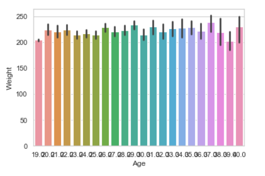
Draw the point plot with Pandas:
Example:
Python3
import seaborn
seaborn.set(style = 'whitegrid')
data = pandas.read_csv("nba.csv")
seaborn.pointplot(x = "Age", y = "Weight", data = data)
|
Output:
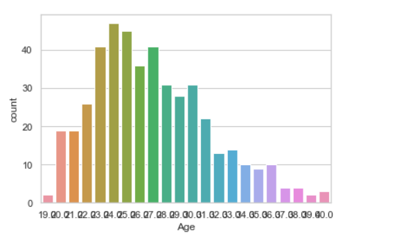
Count plot:
Count plot used to Show the counts of observations in each categorical bin using bars.
Syntax : seaborn.countplot(x=None, y=None, hue=None, data=None)
Parameters :
- x, y: This parameter take names of variables in data or vector data, optional, Inputs for plotting long-form data.
- hue : (optional) This parameter take column name for color encoding.
- data : (optional) This parameter take DataFrame, array, or list of arrays, Dataset for plotting. If x and y are absent, this is interpreted as wide-form. Otherwise, it is expected to be long-form.
Returns: Returns the Axes object with the plot drawn onto it.
Draw the count plot with Pandas:
Example:
Python3
import seaborn
seaborn.set(style = 'whitegrid')
data = pandas.read_csv("nba.csv")
seaborn.countplot(data["Age"])
|
Output:
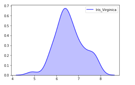
KDE Plot:
KDE Plot described as Kernel Density Estimate is used for visualizing the Probability Density of a continuous variable. It depicts the probability density at different values in a continuous variable. We can also plot a single graph for multiple samples which helps in more efficient data visualization.
Syntax: seaborn.kdeplot(x=None, *, y=None, vertical=False, palette=None, **kwargs)
Parameters:
x, y : vectors or keys in data
vertical : boolean (True or False)
data : pandas.DataFrame, numpy.ndarray, mapping, or sequence
Draw the KDE plot with Pandas:
Example 1:
Python3
from sklearn import datasets
import pandas as pd
import seaborn as sns
iris = datasets.load_iris()
iris_df = pd.DataFrame(iris.data, columns=['Sepal_Length',
'Sepal_Width', 'Patal_Length', 'Petal_Width'])
iris_df['Target'] = iris.target
iris_df['Target'].replace([0], 'Iris_Setosa', inplace=True)
iris_df['Target'].replace([1], 'Iris_Vercicolor', inplace=True)
iris_df['Target'].replace([2], 'Iris_Virginica', inplace=True)
sns.kdeplot(iris_df.loc[(iris_df['Target'] =='Iris_Virginica'),
'Sepal_Length'], color = 'b', shade = True, Label ='Iris_Virginica')
|
Output:
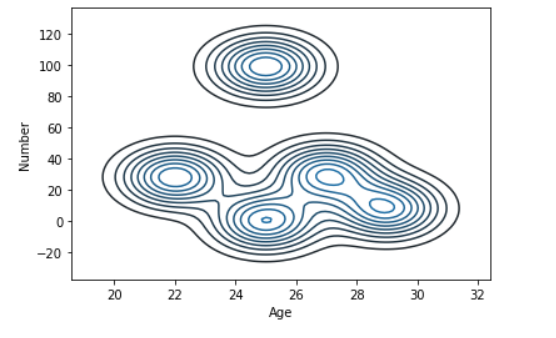
Example 2:
Python3
import seaborn as sns
import pandas
data = pandas.read_csv("nba.csv").head()
sns.kdeplot( data['Age'], data['Number'])
|
Output:
Bivariate and Univariate data using seaborn and pandas:
Before starting let’s have a small intro of bivariate and univariate data:
Bivariate data: This type of data involves two different variables. The analysis of this type of data deals with causes and relationships and the analysis is done to find out the relationship between the two variables.
Univariate data: This type of data consists of only one variable. The analysis of univariate data is thus the simplest form of analysis since the information deals with only one quantity that changes. It does not deal with causes or relationships and the main purpose of the analysis is to describe the data and find patterns that exist within it.
Let’s see an example of Bivariate data :
Example 1: Using the box plot.
Python3
import seaborn as sns
import pandas
data = pandas.read_csv( "nba.csv" )
sns.boxplot( data['Age'], data['Height'])
|
Output:
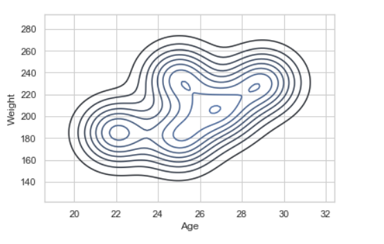
Example 2: using KDE plot.
Python3
import seaborn as sns
import pandas
data = pandas.read_csv("nba.csv").head()
sns.kdeplot( data['Age'], data['Weight'])
|
Output:
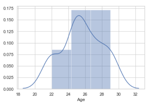
Let’s see an example of univariate data distribution:
Example: Using the dist plot
Python3
import seaborn as sns
import pandas
data = pandas.read_csv("nba.csv").head()
sns.distplot( data['Age'])
|
Output:
Like Article
Suggest improvement
Share your thoughts in the comments
Please Login to comment...