Basic Python Charts
Last Updated :
26 Dec, 2023
Python Chart is part of data visualization to present data in a graphical format. It helps people understand the significance of data by summarizing and presenting huge amounts of data in a simple and easy-to-understand format and helps communicate information clearly and effectively.
In this article, we will be discussing various Python Charts that help to visualize data in various dimensions such as Histograms, Column charts, Box plot charts, Line charts, and so on.
Python Charts for Data Visualization
In Python there are number of various charts charts that are used to visualize data on the basis of different factors. For exploratory data analysis, reporting, or storytelling we can use these charts as a fundamental tool. Consider this different given Datasets for which we will be plotting different charts:
Histogram
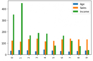
The histogram represents the frequency of occurrence of specific phenomena which lie within a specific range of values and are arranged in consecutive and fixed intervals. In the below code histogram is plotted for Age, Income, Sales, So these plots in the output show frequency of each unique value for each attribute.
Python3
import pandas as pd
import matplotlib.pyplot as plt
data = [['E001', 'M', 34, 123, 'Normal', 350],
['E002', 'F', 40, 114, 'Overweight', 450],
['E003', 'F', 37, 135, 'Obesity', 169],
['E004', 'M', 30, 139, 'Underweight', 189],
['E005', 'F', 44, 117, 'Underweight', 183],
['E006', 'M', 36, 121, 'Normal', 80],
['E007', 'M', 32, 133, 'Obesity', 166],
['E008', 'F', 26, 140, 'Normal', 120],
['E009', 'M', 32, 133, 'Normal', 75],
['E010', 'M', 36, 133, 'Underweight', 40] ]
df = pd.DataFrame(data, columns = ['EMPID', 'Gender',
'Age', 'Sales',
'BMI', 'Income'] )
df.hist()
plt.show()
|
Output:

Histogram Chart
Column Chart
A column chart is used to show a comparison among different attributes, or it can show a comparison of items over time.
Python3
df.plot.bar()
plt.bar(df['Age'], df['Sales'])
plt.xlabel("Age")
plt.ylabel("Sales")
plt.show()
|
Output:
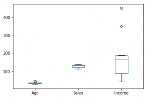
Box plot chart
A box plot is a graphical representation of statistical data based on the minimum, first quartile, median, third quartile, and maximum. The term “box plot” comes from the fact that the graph looks like a rectangle with lines extending from the top and bottom. Because of the extending lines, this type of graph is sometimes called a box-and-whisker plot.
Python3
df.plot.box()
plt.boxplot(df['Income'])
plt.show()
|
Output:
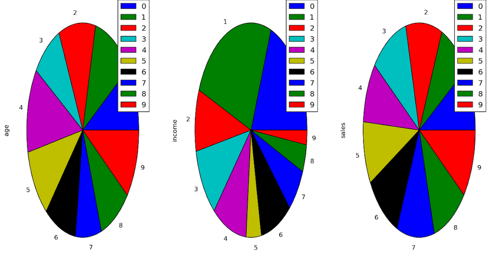
Pie Chart
A pie chart shows a static number and how categories represent part of a whole the composition of something. A pie chart represents numbers in percentages, and the total sum of all segments needs to equal 100%.
Python3
plt.pie(df['Age'], labels = {"A", "B", "C",
"D", "E", "F",
"G", "H", "I", "J"},
autopct ='% 1.1f %%', shadow = True)
plt.show()
plt.pie(df['Income'], labels = {"A", "B", "C",
"D", "E", "F",
"G", "H", "I", "J"},
autopct ='% 1.1f %%', shadow = True)
plt.show()
plt.pie(df['Sales'], labels = {"A", "B", "C",
"D", "E", "F",
"G", "H", "I", "J"},
autopct ='% 1.1f %%', shadow = True)
plt.show()
|
Output:
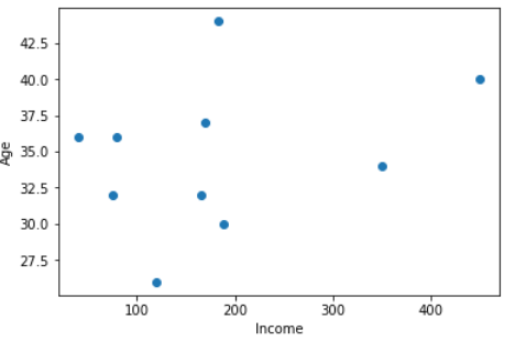
Scatter Chart
A scatter chart shows the relationship between two different variables and it can reveal the distribution trends. It should be used when there are many different data points, and you want to highlight similarities in the data set. This is useful when looking for outliers and for understanding the distribution of your data.
Python3
plt.scatter(df['income'], df['age'])
plt.show()
|
Output:
Line Chart
A Line Charts are effective in showing trends over time. By using line plots you can connect data points with straight lines that make it easy to visualize the overall dataset.
Python3
import matplotlib.pyplot as plt
x = [1, 2, 3, 4, 5]
y = [2, 4, 6, 8, 10]
plt.plot(x, y)
plt.xlabel('X-axis Label')
plt.ylabel('Y-axis Label')
plt.title('Line Chart Example')
plt.show()
|
Output:
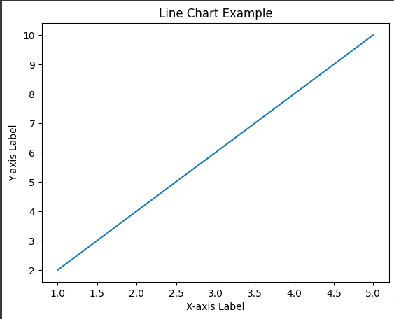
LIne Chart
Area Chart
Area Chart are similar to line charts but there is area difference between the line and the x-axis is generally filled. They are helpful generally in showing magnitude over time.
Python3
import matplotlib.pyplot as plt
x = [1, 2, 3, 4, 5]
y = [2, 4, 6, 8, 10]
plt.fill_between(x, y, color='skyblue', alpha=0.4)
plt.xlabel('X-axis Label')
plt.ylabel('Y-axis Label')
plt.title('Area Chart Example')
plt.show()
|
Output:
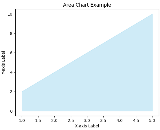
Area Chart
Heatmap
Heatmap use coding of color to represent the values of Matrix. Heatmap helps in finding correlations and patterns in large dataset.
Python3
import seaborn as sns
import numpy as np
data = np.random.rand(10, 12)
sns.heatmap(data, cmap='viridis')
plt.title('Heatmap Example')
plt.show()
|
Output:

HeatMap
Bubble Chart
By using Bubble Chart , you can add third dimension in scatter plot. The bubble chart represents the third variable with the size of the Bubble.
Python3
import matplotlib.pyplot as plt
import numpy as np
x = np.random.rand(50)
y = np.random.rand(50)
sizes = np.random.rand(50) * 100
plt.scatter(x, y, s=sizes, alpha=0.5)
plt.title('Bubble Chart Example')
plt.show()
|
Output:
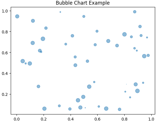
Bubble Chart
Radar Chart
Radar Chart is ideal chart that displays multivariate data in form of two- dimensional chart. Each variable is present on an axis that radiates on an axis radiating from the center.
Python3
import matplotlib.pyplot as plt
import numpy as np
categories = ['A', 'B', 'C', 'D', 'E']
values = [4, 2, 5, 3, 1]
angles = np.linspace(0, 2 * np.pi, len(categories), endpoint=False)
values += values[:1]
angles = np.concatenate((angles, [angles[0]]))
plt.polar(angles, values, marker='o')
plt.title('Radar Chart Example')
plt.show()
|
Output:
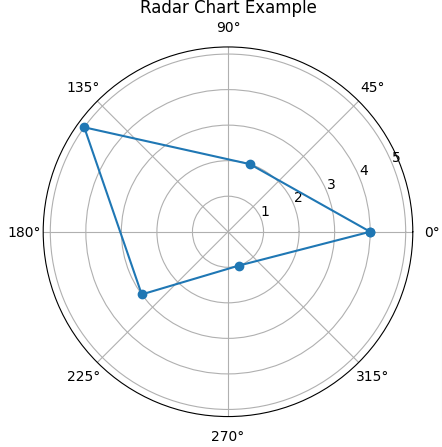
Radar Chart
Conclusion
In conclusion you will delve into the basic realm of Python Charts offers a foundational understanding of visualizing data, these examples provide various Python Charts including histograms, column charts, box plots, pie charts and scatter plots.
Like Article
Suggest improvement
Share your thoughts in the comments
Please Login to comment...