In this article, you learn to customize the legend in Matplotlib. matplotlib is a popular data visualization library. It is a plotting library in Python and has its numerical extension NumPy.
What is Legends in Graph?
Legend is an area of the graph describing each part of the graph. A graph can be as simple as it is. But adding the title, X label, Y label, and legend will be more clear. By seeing the names we can easily guess what the graph is representing and what type of data it is representing.
syntax: legend(*args, **kwargs)
This can be called as follows,
legend() -> automatically detects which element to show. It does this by displaying all plots that have been labeled with the label keyword argument.
legend(labels) -> Name of X and name of Y that is displayed on the legend
legend(handles, labels) -> A list of lines that should be added to the legend. Using handles and labels together can give full control of what should be displayed in the legend. The length of the legend and handles should be the same.
Customizing Plot Legends with Matplotlib
Plots on a graph gain insight from legends. The legend is made more readable and recognizable by the addition of the font, origin, and other details. Let’s explore the several methods that can be used to change the plot legends.
- Basic Legend with Matplotlib
- Change the Legend Position and Title in Matplotlib
- Change Legend Font Size and Style in Matplotlib
- Change Legend Colors and Background in Matplotlib
- Two line styles in Legend in Matplotlib
- Add Legend to Axes in Matplotlib
- Customizing Legend Labels and Marker Styles in Matplotlib
- Customizing Legend Symbols and Line Width in Matplotlib
- Adding Shadow to Legend Box in Matplotlib
- Creating Colored Markers Legend in Matplotlib
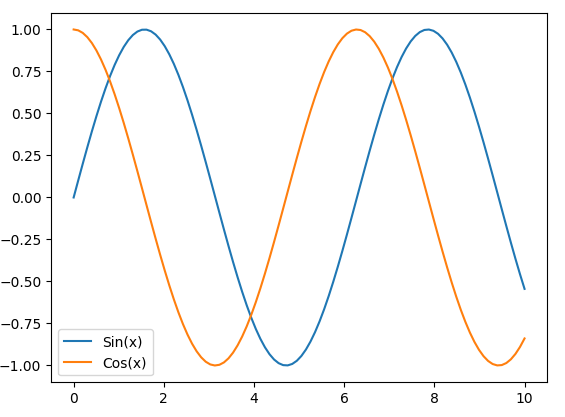
Basic Legend with Matplotlib
Create a simple plot with two curves, these curves, adds labels, displays a legend, and finally shows the legends with Matplotlib.
Python3
import matplotlib.pyplot as plt
import numpy as np
x = np.linspace(0, 10, 100)
y1 = np.sin(x)
y2 = np.cos(x)
plt.plot(x, y1, label='Sin(x)')
plt.plot(x, y2, label='Cos(x)')
plt.legend()
plt.show()
|
Output:
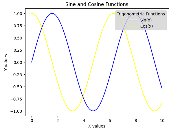
Change the Legend Position and Title in Matplotlib
Matplotlib in Python to create a plot with two curves representing the sine and cosine functions. It customizes the plot by assigning colors to each curve, setting a legend with a title and specific colors, and adding a title to the plot along with labels for the x and y axes.
Location
Sometimes the legend may or may not be in the appropriate place. In matplotlib, we can also add the location where we want to place it. With this flexibility, we can place the legend somewhere where it does not overlay the plots, and hence the plots will look much cleaner and tidier.
Syntax: legend(loc=”)
It can be passed as follows,
‘upper left’, ‘upper right’, ‘lower left’, ‘lower right’ -> It is placed on the corresponding corner of the plot.
‘upper center’, ‘lower center’, ‘center left’, ‘center right’ -> It is placed on the center of corresponding edge.
‘center’ -> It is placed exact center of the plot.
‘best’ -> It is placed without the overlapping of the artists
Title
Adding a title to the legend will be an important aspect to add to the legend box. The title parameter will let us give a title for the legend and the title_size let us assign a specific fontsize for the title.
Syntax:
legend(title=”” , title_fontsize=”)
- title gives title to the legend
- title_fontize gives size to the title.
It can be, ‘xx-small’, ‘x-small’, ‘small’, ‘medium’, ‘large’, ‘x-large’, ‘xx-large’
Python3
import matplotlib.pyplot as plt
import numpy as np
x = np.linspace(0, 10, 100)
y1 = np.sin(x)
y2 = np.cos(x)
plt.plot(x, y1, label='Sin(x)', color='blue')
plt.plot(x, y2, label='Cos(x)', color='yellow')
plt.legend(loc='upper right', title='Trigonometric Functions', facecolor='lightgrey', labelcolor='black')
plt.title('Sine and Cosine Functions')
plt.xlabel('X values')
plt.ylabel('Y values')
plt.show()
|
Output:
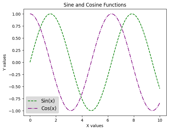
Change Legend Font Size and Style in Matplotlib
To make the legend more appealing we can also change the font size of the legend, by passing the parameter font size to the function we can change the fontsize inside the legend box just like the plot titles.
Syntax: legend(fontsize=”)
It can be passed as, ‘xx-small’, ‘x-small’, ‘small’, ‘medium’, ‘large’, ‘x-large’, ‘xx-large’
Python3
import matplotlib.pyplot as plt
import numpy as np
x = np.linspace(0, 10, 100)
y1 = np.sin(x)
y2 = np.cos(x)
plt.plot(x, y1, label='Sin(x)', color='green', linestyle='--')
plt.plot(x, y2, label='Cos(x)', color='purple', linestyle='-.')
plt.legend(fontsize='large', title_fontsize='x-large', facecolor='lightgrey', labelcolor='black')
plt.title('Sine and Cosine Functions')
plt.xlabel('X values')
plt.ylabel('Y values')
plt.show()
|
Output:
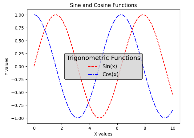
Change Legend Colors and Background in Matplotlib
Sometimes we can feel that it would be great if the legend box was filled with some color to make it more attractive and makes the legends stand out from the plots. Matplotlib also covers this by letting us change the theme of the legend by changing the background, text, and even the edge color of the legend.-+
Syntax:
legend(labelcolor=”)
labelcolor is used to change the color of the text.
legend(facecolor=”)
facecolor is used to change background color of the legend.
legend(edgecolor=”)
edgecolor is used to change the edge color of the legend
Python3
import matplotlib.pyplot as plt
import numpy as np
x = np.linspace(0, 10, 100)
y1 = np.sin(x)
y2 = np.cos(x)
plt.plot(x, y1, label='Sin(x)', color='red', linestyle='--')
plt.plot(x, y2, label='Cos(x)', color='blue', linestyle='-.')
legend = plt.legend(facecolor='lightgrey', edgecolor='black', fancybox=True, title='Trigonometric Functions', fontsize='large', title_fontsize='x-large')
plt.title('Sine and Cosine Functions')
plt.xlabel('X values')
plt.ylabel('Y values')
plt.show()
|
Output:
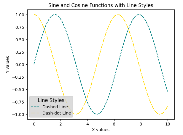
Two line styles in legend in Matplotlib
The legend is customized using the Line2D class to create custom legend handles for the different line styles and colors used in the plot. The resulting legend includes a title, as well as labels for the x and y axes, entries for a dashed line and a dash-dot line, each represented by a custom line with a specified color and linestyle.
Python3
import matplotlib.pyplot as plt
import numpy as np
from matplotlib.lines import Line2D
x = np.linspace(0, 10, 100)
y1 = np.sin(x)
y2 = np.cos(x)
plt.plot(x, y1, label='Sin(x)', linestyle='--', color='teal')
plt.plot(x, y2, label='Cos(x)', linestyle='-.', color='gold')
custom_lines = [Line2D([0], [0], color='teal', linestyle='--'),
Line2D([0], [0], color='gold', linestyle='-.')]
plt.legend(custom_lines, ['Dashed Line', 'Dash-dot Line'], facecolor='lightgrey', title='Line Styles', fontsize='medium', title_fontsize='large')
plt.title('Sine and Cosine Functions with Line Styles')
plt.xlabel('X values')
plt.ylabel('Y values')
plt.show()
|
Output:
Add Legend to Axes in Matplotlib
Custom legend positioned in the upper-right corner with labels for the sine and cosine functions and a title. The overall plot is given a title (‘Sine and Cosine Functions in Specific Axes’) and labeled x and y axes.
Python3
import matplotlib.pyplot as plt
from matplotlib.legend import Legend
x = np.linspace(0, 10, 100)
y1 = np.sin(x)
y2 = np.cos(x)
fig, ax = plt.subplots()
line1, = ax.plot(x, y1, label='Sin(x)', color='magenta')
line2, = ax.plot(x, y2, label='Cos(x)', color='limegreen')
legend_labels = ['Sine Function', 'Cosine Function']
legend = Legend(ax, [line1, line2], legend_labels, loc='upper right', title='Trigonometric Functions', fontsize='large', title_fontsize='x-large')
ax.add_artist(legend)
plt.title('Sine and Cosine Functions in Specific Axes')
plt.xlabel('X values')
plt.ylabel('Y values')
plt.show()
|
Output:

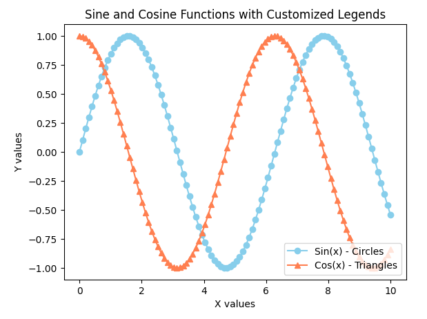
Customizing Legend Labels and Marker Styles in Matplotlib
Syntax: legend(markerfirst = bool, default: True)
By default, the marker is placed first and the label is placed second. marker first parameter is used to change the position of the marker. By making it False, the marker and labels places will be swapped.
Python3
import matplotlib.pyplot as plt
import numpy as np
x = np.linspace(0, 10, 100)
y1 = np.sin(x)
y2 = np.cos(x)
plt.plot(x, y1, label='Sine Function', color='skyblue', marker='o')
plt.plot(x, y2, label='Cosine Function', color='coral', marker='^')
plt.legend(labels=['Sin(x) - Circles', 'Cos(x) - Triangles'], loc='lower right', fontsize='medium')
plt.title('Sine and Cosine Functions with Customized Legends')
plt.xlabel('X values')
plt.ylabel('Y values')
plt.show()
|
Output:
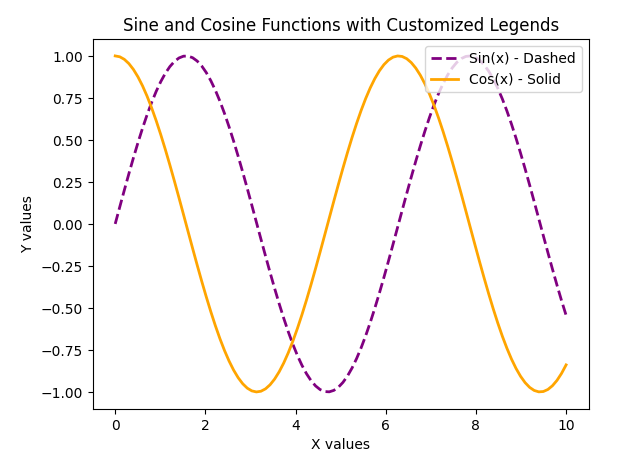
Customizing Legend Symbols and Line Width in Matplotlib
The legend is customized to use specific symbols for each line and adjusted line widths. The resulting plot has a title, labels for the x and y axes, and a legend in the upper-right corner with entries for the sine and cosine functions, each indicating its line style and width.
Python3
import matplotlib.pyplot as plt
import numpy as np
x = np.linspace(0, 10, 100)
y1 = np.sin(x)
y2 = np.cos(x)
plt.plot(x, y1, label='Sine Function', color='purple', linestyle='--', linewidth=2)
plt.plot(x, y2, label='Cosine Function', color='orange', linestyle='-', linewidth=2)
plt.legend(handles=plt.gca().lines, labels=['Sin(x) - Dashed', 'Cos(x) - Solid'], loc='upper right', fontsize='medium')
plt.title('Sine and Cosine Functions with Customized Legends')
plt.xlabel('X values')
plt.ylabel('Y values')
plt.show()
|
Output:
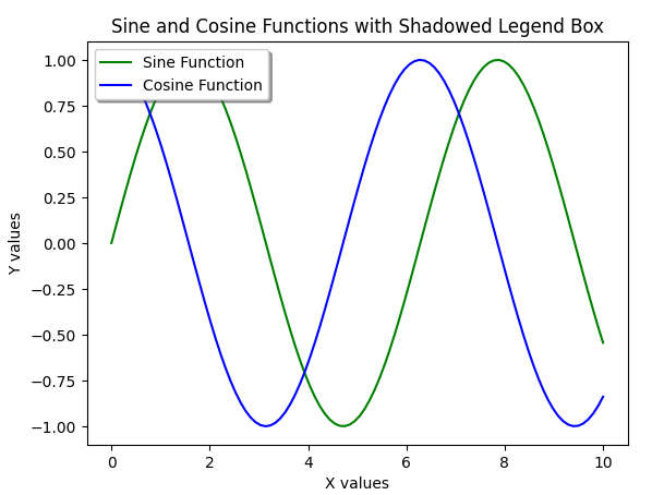
Adding Shadow to Legend Box in Matplotlib
We can make the legend have some of the basic CSS properties like adding a shadow, adding a frame and making the corners round, and also let us add transparency to the legend box if you don’t want to cover those small details in the plot by a frame.
shadow -> This argument gives shadow behind the legend.
frameon -> Gives the frame to legend.
fancybox -> Gives round edges to the legend.
framealpha -> Gives transparency to legend background.
Python3
import matplotlib.pyplot as plt
import numpy as np
x = np.linspace(0, 10, 100)
y1 = np.sin(x)
y2 = np.cos(x)
plt.plot(x, y1, label='Sine Function', color='green')
plt.plot(x, y2, label='Cosine Function', color='blue')
plt.legend(loc='upper left', frameon=True, shadow=True, fontsize='medium')
plt.title('Sine and Cosine Functions with Shadowed Legend Box')
plt.xlabel('X values')
plt.ylabel('Y values')
plt.show()
|
Output:
Creating Colored Markers Legend in Matplotlib
The legend is customized to have colored markers corresponding to each curve. The resulting plot has a title, labels for the x and y axes, and a legend in the upper-right corner with entries for the sine and cosine functions, each represented by a marker with a specified color.
Python3
import matplotlib.pyplot as plt
import numpy as np
x = np.linspace(0, 10, 100)
y1 = np.sin(x)
y2 = np.cos(x)
plt.plot(x, y1, label='Sine Function', color='red', marker='o')
plt.plot(x, y2, label='Cosine Function', color='blue', marker='s')
legend = plt.legend(loc='upper right', fontsize='medium')
for handle in legend.legendHandles:
handle.set_color('black')
plt.title('Sine and Cosine Functions with Colored Markers in Legend')
plt.xlabel('X values')
plt.ylabel('Y values')
plt.show()
|
Output:

Like Article
Suggest improvement
Share your thoughts in the comments
Please Login to comment...