CSS shape-rendering Property
Last Updated :
13 Jun, 2023
The shape-rendering property is used to hint the renderer about the tradeoffs that have to be made while rendering shapes like circles, rectangles or paths. The renderer can be told to make the shape geometrically precise or optimize the shape to speed up rendering in certain situations.
Syntax:
shape-rendering: auto | optimizeSpeed | crispEdges | geometricPrecision | initial | inherit
Property Values:
- auto: It is used to indicate that the user agent would automatically make the decision to balance the speed, have crisp edges or have good geometric precision. Generally, good precision is given more importance than speed and crisp edges. This is the default value.
- optimizeSpeed: It is used to indicate that the shape will be rendered in a manner to emphasize speed over geometric precision or crisp edges. This may cause the user agent to turn off anti-aliasing for all shapes.
- crispEdges: It is used to indicate that the shape will be rendered with an emphasis given to the contrast of clean edges over geometric precision or speed. The user agent may turn off anti-aliasing for shapes and adjust the line positions and widths to align with the pixels of the device.
- initial: It is used to set the property to its default value.
- inherit: It is used to set the property to inherit from its parent element.
- geometricPrecision: It is used to indicate that the shape will be rendered with geometric precision rather than focusing on the speed or crisp edges.
Example: In this example, we are using the above-explained property.
html
<!DOCTYPE html>
<html>
<head>
<title>
CSS | shape-rendering property
</title>
<style>
.shape-crisp {
/* Assume the crispEdges
value for demonstration */
shape-rendering: crispEdges;
fill: green;
}
.shape-auto {
shape-rendering: auto;
fill: green;
}
</style>
</head>
<body>
<h1 style="color: green">
GeeksforGeeks
</h1>
<b>
CSS | shape-rendering
</b>
<div class="container">
<svg height="250px"
width="500px"
version="1.1">
<circle class="shape-crisp"
cx="100"
cy="125"
r="100" />
<circle class="shape-auto"
cx="350"
cy="125"
r="100" />
</svg>
</div>
</body>
</html>
|
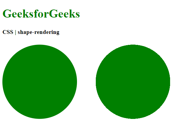
Output: Comparing the crispEdges value with the auto value

Example: In this example, we are using the above-explained property.
html
<!DOCTYPE html>
<html>
<head>
<title>
CSS | shape-rendering property
</title>
<style>
.shape-auto {
/* Assume the auto
value for demonstration */
shape-rendering: auto;
fill: green;
}
.shape-optimizespeed {
shape-rendering: optimizeSpeed;
fill: green;
}
</style>
</head>
<body>
<h1 style="color: green">
GeeksforGeeks
</h1>
<b>
CSS | shape-rendering
</b>
<div class="container">
<svg height="250px"
width="500px"
version="1.1">
<circle class="shape-auto"
cx="100" c
y="125"
r="100" />
<circle class="shape-optimizespeed"
cx="350"
cy="125"
r="100" />
</svg>
</div>
</body>
</html>
|
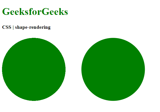
Output: Comparing the auto value with the optimizeSpeed value
 .
.
Example: In this example, we are using the above-explained property.
html
<!DOCTYPE html>
<html>
<head>
<title>
CSS | shape-rendering property
</title>
<style>
.shape-auto {
/* Assume the auto
value for demonstration */
shape-rendering: auto;
fill: green;
}
.shape-crisp {
shape-rendering: crispEdges;
fill: green;
}
</style>
</head>
<body>
<h1 style="color: green">
GeeksforGeeks
</h1>
<b>
CSS | shape-rendering
</b>
<div class="container">
<svg height="250px"
width="500px"
version="1.1">
<circle class="shape-auto"
cx="100"
cy="125"
r="100" />
<circle class="shape-crisp"
cx="350"
cy="125"
r="100" />
</svg>
</div>
</body>
</html>
|
Output: Comparing the auto value with the crispEdges value

Example: In this example, we are using the above-explained property.
html
<!DOCTYPE html>
<html>
<head>
<title>
CSS | shape-rendering property
</title>
<style>
.shape-auto {
/* Assume the auto
value for demonstration */
shape-rendering: auto;
fill: green;
}
.shape-crisp {
shape-rendering: geometricPrecision;
fill: green;
}
</style>
</head>
<body>
<h1 style="color: green">
GeeksforGeeks
</h1>
<b>
CSS | shape-rendering
</b>
<div class="container">
<svg height="250px"
width="500px"
version="1.1">
<circle class="shape-auto"
cx="100"
cy="125"
r="100" />
<circle class="shape-crisp"
cx="350"
cy="125"
r="100" />
</svg>
</div>
</body>
</html>
|
Output: Comparing the crispEdges value with the geometricPrecision value

Example: In this example, we are using the above-explained property.
html
<!DOCTYPE html>
<html>
<head>
<title>
CSS | shape-rendering
</title>
<style>
.shape-crisp {
/* Assume the crispEdges
value for demonstration */
shape-rendering: crispEdges;
fill: green;
}
.shape-initial {
shape-rendering: initial;
fill: green;
}
</style>
</head>
<body>
<h1 style="color: green">
GeeksforGeeks
</h1>
<b>
CSS | shape-rendering
</b>
<div class="container">
<svg height="250px"
width="500px"
version="1.1">
<circle class="shape-crisp"
cx="100"
cy="125"
r="100" />
<circle class="shape-initial"
cx="350"
cy="125"
r="100" />
</svg>
</div>
</body>
</html>
|
Output: Comparing the round value with the initial value
Supported Browsers: The browsers supported by the shape-rendering property are listed below:
- Chrome
- Firefox
- Safari
- Opera
- Internet Explorer 9
Like Article
Suggest improvement
Share your thoughts in the comments
Please Login to comment...