CSS repeating-linear-gradient() Function
Last Updated :
04 Aug, 2023
The repeating-linear-gradient() function is an inbuilt function in CSS that is used to repeat linear gradients.
Syntax:
background-image: repeating-linear-gradient( angle | to side-or-corner, color-stop1,
color-stop2, ...);
Parameters: This function accepts many parameters which are listed below:
- angle: This parameter is used to hold the angle of direction for the gradient. Its value lies between 0 to 360 degrees. By default, its value is 180 degrees.
- side-or-corner: This parameter is used to define the position of the starting point of the gradient line. It consists of two keywords: the first one indicates the horizontal side, left or right, and the second one the vertical side, top or bottom. The order is not relevant and each of the keywords is optional.
- color-stop1, color-stop2, …: This parameter is used to hold the color value followed by its optional stop position.
Below example illustrates the repeating-linear-gradient() function in CSS:
Example 1:
html
<!DOCTYPE html>
<html>
<head>
<title>repeating-linear-gradient() Function</title>
<style>
#main {
height: 200px;
background-color: white;
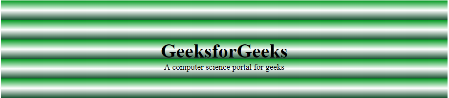
background-image: repeating-linear-gradient(#090,
#fff 10%, #2a4f32 20%);
}
.gfg {
text-align: center;
font-size: 40px;
font-weight: bold;
padding-top: 80px;
}
.geeks {
font-size: 17px;
text-align: center;
}
</style>
</head>
<body>
<div id="main">
<div class="gfg">
GeeksforGeeks
</div>
<div class="geeks">
A computer science portal for geeks
</div>
</div>
</body>
</html>
|
Output:
 Example 2:
html
<!DOCTYPE html>
<html>
<head>
<title>repeating-linear-gradient() Function</title>
<style>
#main {
height: 200px;
background-color: white;
background-image: repeating-linear-gradient(45deg,
blue, green 7%, white 10%);
}
.gfg {
text-align: center;
font-size: 40px;
font-weight: bold;
padding-top: 80px;
}
.geeks {
font-size: 17px;
text-align: center;
}
</style>
</head>
<body>
<div id="main">
<div class="gfg">
GeeksforGeeks
</div>
<div class="geeks">
A computer science portal for geeks
</div>
</div>
</body>
</html>
|
Output:

Supported Browsers:
- Google Chrome 26
- Edge 12
- Firefox 16
- Microsoft Edge 12
- Opera 12.1
- Safari 7
Like Article
Suggest improvement
Share your thoughts in the comments
Please Login to comment...