CSS Pulse animation
Last Updated :
07 Mar, 2024
A CSS pulse animation is a visual effect that repeatedly scales an element up and down, creating a pulsating effect. It is achieved using keyframe animations in CSS, typically by modifying the element’s scale property over time.
Let’s first create an HTML structure containing a div with class name pulse and then we will use the CSS to create the pulse effect.
HTML
<!DOCTYPE html>
<html lang="en">
<head>
<meta charset="UTF-8" />
<title>Pulse Animation</title>
<style>
.pulse {
width: 100px;
height: 100px;
background-color: #3498db;
border-radius: 50%;
animation: pulse 2s infinite;
}
</style>
</head>
<body>
<h3>Pulse Animation</h3>
<div class="pulse"></div>
</body>
</html>
|
CSS Pulse Animation Examples
Pulse animation using Keyframes Animation
Keyframe animation scales an element up and down in a loop. Keyframes define scale transformations at different intervals. The animation property is used to apply the animation to the element, specifying its duration and repetition.
Example: Here is the basic implementation of keyframe animation.
HTML
<!DOCTYPE html>
<html lang="en">
<head>
<meta charset="UTF-8" />
<meta
name="viewport"
content="width=device-width, initial-scale=1.0"
/>
<title>Pulse Animation</title>
<style>
@keyframes pulse {
0% {
transform: scale(1);
}
50% {
transform: scale(1.1);
}
100% {
transform: scale(1);
}
}
body {
display: flex;
flex-direction: column;
justify-content: center;
align-items: center;
}
.pulse {
width: 100px;
height: 100px;
background-color: #3498db;
border-radius: 50%;
animation: pulse 2s infinite;
}
</style>
</head>
<body>
<h3>Pulse Animation Using Keyframes</h3>
<div class="pulse"></div>
</body>
</html>
|
Output:
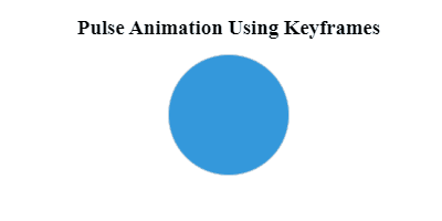
Puslse animation using css key frame
Explanation:
- In the above example Keyframes define animation phases: start, midpoint, and end.
- Start: element appears normal-sized. Midpoint: slightly larger. End: returns to normal.
- CSS sets circle dimensions, blue color, and border-radius for pulse.
- Animation property applied to pulse div to execute keyframes infinitely.
CSS Pulse animation Use Cases
Here Heart-shaped element pulsates, scaling up and down. Achieved with CSS keyframes animation. HTML provides structure.
Define animation with @keyframes for complex movements, while transition alters properties smoothly between states, enhancing user experience in CSS.
Like Article
Suggest improvement
Share your thoughts in the comments
Please Login to comment...