CSS Links
Last Updated :
12 Apr, 2024
A link is a connection from one web page to another web page. CSS property can be used to style the links in various different ways.
States of Link: Before discussing CSS properties, it is important to know the states of a link. Links can exist in different states and they can be styled using pseudo-classes.
There are four states of links given below:
- a:link => This is a normal, unvisited link.
- a:visited => This is a link visited by user at least once
- a:hover => This is a link when mouse hovers over it
- a:active => This is a link that is just clicked.
Syntax:
a:link {
    color:color_name;
}
color_name can be given in any format like color name (green), HEX value (#5570f0) or RGB value rgb(25, 255, 2). There is another state ‘a:focus’ which is used to focused when a user uses the tab key to navigate through the links.
The default value of links:
- By default the links created are underlined.
- When the mouse is hovered above a link, it changes to a hand icon.
- Normal/unvisited links are blue.
- Visited links are colored purple.
- Active links are colored red.
- When a link is focused, it has an outline around it.
Example: This example shows the basic use of links in CSS.
html
<!DOCTYPE html>
<html>

<head>
    <title>CSS links</title>
    <style>
        p {
            font-size: 25px;
            text-align: center;
        }
    </style>
</head>

<body>
    <p>
        <a href="https://www.geeksforgeeks.org/">
            GeeksforGeeks Simple Link
        </a>
    </p>
</body>

</html>
Output:

GIF Output showing the appearance of links in different states using CSS
CSS Properties of Links: Some basic CSS properties of links are given below:
- color
- font-family
- text-decoration
- background-color
color: This CSS property is used to change the color of the link text.
Syntax:
a {
    color: color_name;
}
Example: This example shows the use of the color property in links.
html
<!DOCTYPE html>
<html>
<head>
<title>Link color property</title>
<style>
p {
font-size: 20px;
text-align: center;
}
/*unvisited link will appear green*/
a:link {
color: red;
}
/*visited link will appear blue*/
a:visited {
color: blue;
}
/*when mouse hovers over link it will appear orange*/
a:hover {
color: orange;
}
/*when the link is clicked, it will appear black*/
a:active {
color: black;
}
</style>
</head>
<body>
<p>
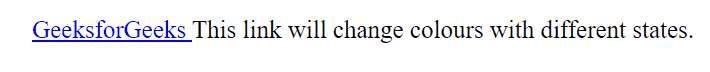
<a href="https://www.geeksforgeeks.org/">
GeeksforGeeks
</a>
This link will change colours with different states.
</p>
</body>
</html>
Output:
GIF Output
font-family: This property is used to change the font type of a link using font-family property.
Syntax:
a {
    font-family: "family name";
}
Example: This example shows the use of the font-family property in links.
html
<!DOCTYPE html>
<html>

<head>
    <style>
        /*Initial link font family arial*/
        a {
            font-family: Arial;
        }

        p {
            font-size: 30px;
            text-align: center;
        }

        /*unvisited link font family*/
        a:link {
            color: Arial;
        }

        /*visited link font family*/
        a:visited {
            font-family: Arial;
        }

        /*when mouse hovers over it will change to times new roman*/
        a:hover {
            font-family: Times new roman;
        }

        /*when the link is clicked, it will changed to Comic sans ms*/
        a:active {
            font-family: Comic Sans MS;
        }
    </style>
</head>

<body>
    <p>
        <a href="https://www.geeksforgeeks.org/" id="link">
            GeeksforGeeks
        </a>
        a Computer Science Portal for Geeks.
    </p>
</body>

</html>
Output:

GIF Output
Text-Decoration: This property is basically used to remove/add underlines from/to a link.
Syntax:
a {
    text-decoration: none;
}
Example: This example shows the use of the text-decoration property in links.
html
<!DOCTYPE html>
<html>

<head>
    <title>Text decoration in link</title>
    <style>
        /*Set the font size for better visibility*/
        p {
            font-size: 2rem;
        }

        /*Removing underline using text-decoration*/
        a {
            text-decoration: none;
        }

        /*underline can be added using
        text-decoration:underline;
        */
    </style>
</head>

<body>
    <p>
        <a href="https://www.geeksforgeeks.org/" id="link">
            GeeksforGeeks
        </a>
        a Computer Science Portal for Geeks.
    </p>
</body>

</html>
Output:

GIF Output
background-color: This property is used to set the background color of the link.
Syntax:
a {
    background-color: color_name;
}
Example: This example shows the use of the background-color property in links.
html
<!DOCTYPE html>
<html>

<head>
    <title>background color</title>
    <style>
        /*Setting font size for better visibility*/
        p {
            font-size: 2rem;
        }

        /*Designing unvisited link button*/
        a:link {
            background-color: powderblue;
            color: green;
            padding: 5px 5px;
            text-decoration: none;
            display: inline-block;
        }

        /*Designing link button when mouse cursor hovers over it*/
        a:hover {
            background-color: green;
            color: white;
            padding: 5px 5px;
            text-align: center;
            text-decoration: none;
            display: inline-block;
        }
    </style>
</head>

<body>
    <p>
        <a href="https://www.geeksforgeeks.org/" id="link">
            GeeksforGeeks
        </a>
        a Computer Science Portal for Geeks.
    </p>
</body>

</html>
Output:

GIF Output
CSS Link Button: CSS links can also be styled using buttons/boxes. The following example shows how CSS links can be designed as buttons.
Example: This example shows the use of links as a button.
html
<!DOCTYPE html>
<html>

<head>
    <title>Link button</title>
    <style>
        /*Setting font size for better visibility*/
        p {
            font-size: 2rem;
        }

        a {
            background-color: green;
            color: white;
            padding: 5px 5px;
            border-radius: 5px;
            text-align: center;
            text-decoration: none;
            display: inline-block;
        }
    </style>
</head>

<body>
    <p>
        <a href="https://www.geeksforgeeks.org/" id="link">
            GeeksforGeeks
        </a>
        a Computer Science Portal for Geeks.
    </p>
</body>

</html>
Output:

GIF Output
Like Article
Suggest improvement
Share your thoughts in the comments
Please Login to comment...