CSS, or Cascading Style Sheets is a language used to make websites look good by controlling how things like colours, fonts, and layout are displayed on a webpage. It was first proposed by Håkon Wium Lie in 1994. Then, Håkon and another person named Bert Bos worked together to develop it further.
In this article, we will provide 60+ CSS interview questions and answers tailored for both freshers and experienced professionals with 3, 5, and 8 years of experience. Here, we cover everything, including fundamentals of CSS, CSS Box Model, CSS Selectors, CSS Flexbox and Grid, CSS Specificity, CSS Architecture, CSS Transitions and Animations and more, that will surely help you to crack your next CSS interview.

CSS Interview Questions and Answers (2024)
In this article, you will learn CSS interview questions and answers that are most frequently asked in interviews. Before proceeding to learn CSS interview questions and answers, first, we learn the complete CSS Tutorial.
CSS Interview Questions For Freshers
Cascading Style Sheets fondly referred to as CSS, is a simply designed language intended to simplify the process of making web pages presentable. CSS allows you to apply styles to web pages.
More importantly, CSS enables you to do this independent of the HTML that makes up each web page. CSS is easy to learn and understood, but it provides powerful control over the presentation of an HTML document.
We use CSS because of the following reasons:
- CSS saves time: You can write CSS once and reuse the same sheet on multiple HTML pages.
- Easy Maintenance: To make a global change simply change the style, and all elements in all the webpages will be updated automatically.
- Search Engines: CSS is considered a clean coding technique, which means search engines won’t have to struggle to “read” its content.
- Superior styles to HTML: CSS has a much wider array of attributes than HTML, so you can give a far better look to your HTML page in comparison to HTML attributes.
- Offline Browsing: CSS can store web applications locally with the help of an offline cache. Using of this we can view offline websites.
- CSS plays an important role, by using CSS you simply got to specify a repeated style for an element once & use it multiple times because CSS will automatically apply the required styles.
- The main advantage of CSS is that style is applied consistently across a variety of sites. One instruction can control several areas which are advantageous.
- Web designers need to use a few lines of programming for every page improving site speed.
- Cascading sheet not only simplifies website development but also simplifies maintenance as a change of one line of code affects the whole website and maintenance time.
- It is less complex therefore the effort is significantly reduced.
- It helps to form spontaneous and consistent changes.
- CSS changes are device friendly. With people employing a batch of various range of smart devices to access websites over the web, there’s a requirement for responsive web design.
- It has the power for re-positioning. It helps us to determine the changes within the position of web elements that are there on the page.
- These bandwidth savings are substantial figures of insignificant tags that are indistinct from a mess of pages.
- Easy for the user to customize the online page
- It reduces the file transfer size.
- CSS, CSS 1 up to CSS3, result in creating confusion among web browsers.
- With CSS, what works with one browser might not always work with another. The web developers need to test for compatibility, running the program across multiple browsers.
- There exists a scarcity of security.
- After making the changes we need to confirm the compatibility if they appear. A similar change affects all the browsers.
- The programing language world is complicated for non-developers and beginners. Different levels of CSS i.e. CSS, CSS 2, CSS 3 are often quite confusing.
- Browser compatibility (some style sheets are supported and some are not).
- CSS works differently on different browsers. IE and Opera support CSS as different logic.
- There might be cross-browser issues while using CSS.
- There are multiple levels that create confusion for non-developers and beginners.
5. What is the current version of CSS?
CSS3 is the latest version of CSS.
|
S.No.
|
CSS
|
CSS3
|
| 1 |
CSS is capable of positioning texts and objects. CSS is somehow backward compatible with CSS3. |
On the other hand, CSS3 is capable of making the web page more attractive and takes less time to create. If you write CSS3 code in CSS, it will be invalid. |
| 2 |
Responsive designing is not supported in CSS |
CSS3 is the latest version, hence it supports responsive design. |
| 3 |
CSS cannot be split into modules. |
Whereas, whereas CSS3 can be breakdown into modules. |
| 4 |
Using CSS, we cannot build 3D animation and transformation. |
But in CSS3 we can perform all kinds of animation and transformations as it supports animation and 3D transformations. |
| 5 |
CSS is very slow as compared to CSS3 |
Whereas, CSS3 is faster than CSS. |
The best CSS frameworks are:
- Bootstrap
- Foundation
- Bulma
- UIKit
- Semantic UI
- Materialize
- Pure
- Tailwind CSS
A CSS style rule consists of a selector, property, and its value. The selector points to the HTML element where CSS style is to be applied. The CSS property is separated by semicolons.
Syntax:
selector {
    Property: value;
}
Cascading Style Sheet(CSS) is used to set the style in web pages that contain HTML elements. It sets the background color, font size, font family, color, … etc properties of elements on a web page.
There are three types of CSS which are given below:
- Inline CSS: Inline CSS contains the CSS property in the body section attached with the element known as inline CSS. This kind of style is specified within an HTML tag using the style attribute.
- Internal or Embedded CSS: This can be used when a single HTML document must be styled uniquely. The CSS ruleset should be within the HTML file in the head section i.e the CSS is embedded within the HTML file.
- External CSS: External CSS contains a separate CSS file which contains only style property with the help of tag attributes (For example class, id, heading, … etc). CSS property is written in a separate file with .css extension and should be linked to the HTML document using the link tag. This means that for each element, style can be set only once and that will be applied across web pages.
Inline CSS has the highest priority, then comes Internal/Embedded followed by External CSS which has the least priority. Multiple style sheets can be defined on one page. If for an HTML tag, styles are defined in multiple style sheets then the below order will be followed.
- As Inline has the highest priority, any styles that are defined in the internal and external style sheets are overridden by Inline styles.
- Internal or Embedded stands second in the priority list and overrides the styles in the external style sheet.
- External style sheets have the least priority. If there are no styles defined either in the inline or internal style sheet then external style sheet rules are applied for the HTML tags.
CSS Selectors: CSS Selectors are used to selecting HTML elements based on their element name, id, attributes, etc. It can select one or more elements simultaneously.
element selector: The element selector in CSS is used to select HTML elements which are required to be styled. In a selector declaration, there is the name of the HTML element, and the CSS properties which are to be applied to that element is written inside the brackets {}.
Syntax:
element_name {
    // CSS Property
}
id selector: The #id selector is used to set the style of the given id. The id attribute is the unique identifier in an HTML document. The id selector is used with a # character.
Syntax:
#id_name {
    // CSS Property
}
class selector: The .class selector is used to select all elements which belong to a particular class attribute. To select the elements with a particular class, use the (.) character with specifying the class name. The class name is mostly used to set the CSS property to the given class.
Syntax:
.class_name {
    // CSS Property
}
Comments are the statements in your code that are ignored by the compiler and are not executed. Comments are used to explain the code. They make the program more readable and understandable.
Syntax:
/* content */
Comments can be single-line or multi-line.
13. What does the ‘a’ in rgba mean?
RGBA contains A (Alpha) which specifies the transparency of elements. The value of alpha lies between 0.0 to 1.0 where 0.0. represents fully transparent and 1.0 represents not transparent.
Syntax:
h1 {
    color:rgba(R, G, B, A);
}
14. What are CSS HSL Colors?
HSL: HSL stands for Hue, Saturation, and Lightness respectively. This format uses the cylindrical coordinate system.
- Hue: Hue is the degree of the color wheel. Its value lies between 0 to 360 where 0 represents red, 120 represents green and 240 represents a blue color.
- Saturation: It takes a percentage value, where 100% represents completely saturated, while 0% represents completely unsaturated (gray).
- Lightness: It takes a percentage value, where 100% represents white, while 0% represents black.
Syntax:
h1 {
    color:hsl(H, S, L);
}
Example:
HTML
<html>
<head>
<title>CSS hsl color property</title>
<style>
h1{
color:hsl(120, 100%, 30%);
text-align:center;
}
</style>
</head>
<body>
<h1>
GeeksforGeeks
</h1>
</body>
</html>
|
Output:

The CSS background properties are used to define the background effects for elements.
CSS background properties are as follows:
- background-color: This property specifies the background color of an element.
- background-image: This property specifies an image to use as the background of an element. By default, the image is repeated so it covers the entire element.
- background-repeat: By default, the background image property repeats the image both horizontally and vertically.
- background-attachment: This property is used to fix the background ground image. The image will not scroll with the page.
- background-position: This property is used to set the image to a particular position.
CSS border properties allow us to set the style, color, and width of the border.
- Border Style: The border-style property specifies the type of border. None of the other border properties will work without setting the border style.
- Border Width: Border width sets the width of the border. The width of the border can be in px, pt, cm or thin, medium and thick.
- Border Color: This property is used to set the color of the border. Color can be set using the color name, hex value, or RGB value. If the color is not specified border inherits the color of the element itself.
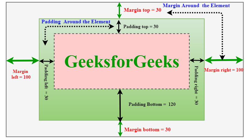
17. What does margin: 40px 100px 120px 80px signify?
CSS margins are used to create space around the element. We can set the different sizes of margins for individual sides (top, right, bottom, left).
Margin properties can have the following values:
- Length in cm, px, pt, etc.
- Width % of the element.
- Margin calculated by the browser: auto.
Therefore, margin: 40px 100px 120px 80px signifies:
- top = 40px
- right = 100px
- bottom = 120px
- left = 80px
- Margin is used to create space around elements and padding is used to create space around elements inside the border.
- We can set the margin property to auto but we cannot set the padding property to auto.
- In Margin property we can allow negative or float number but in padding we cannot allow negative values.
- Margin and padding target all the 4 sides of the element. Margin and padding will work without the border property also. The difference will be more clear with the following example.
Example:
HTML
<!DOCTYPE html>
<html>
<head>
<style>
h2 {
margin:50px;
border:70px solid green;
padding:80px;
}
</style>
</head>
<body>
<h1>GEEKSFORGEEKS</h1>
<h2>
Padding properties
</h2>
</body>
</html>
|
Output:

The CSS box model is a container that contains multiple properties including borders, margin, padding, and the content itself. It is used to create the design and layout of web pages. It can be used as a toolkit for customizing the layout of different elements. The web browser renders every element as a rectangular box according to the CSS box model.
Box-Model has multiple properties in CSS. Some of them are given below:
- borders
- margins
- padding
- Content
The following figure illustrates the box model.
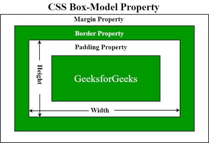
- Border Area: It is the area between the box’s padding and margin. Its dimensions are given by the width and height of the border.
- Margin Area: This area consists of space between border and margin. The dimensions of the Margin area are the margin-box width and the margin-box height. It is useful to separate the element from its neighbors.
- Padding Area: It includes the element’s padding. This area is actually the space around the content area and within the border box. Its dimensions are given by the width of the padding-box and the height of the padding-box.
- Content Area: This area consists of content like text, images, or other media content. It is bounded by the content edge and its dimensions are given by content box width and height.
20. What is the difference between CSS border and outline?
- CSS border properties allow us to set the style, color, and width of the border.
- CSS outline property allows us to draw a line around the element, outside the border.
Example:
HTML
<!DOCTYPE html>
<html lang="en">
<head>
<style>
p {
outline: 5px solid #ddd;
border: 1px solid #000;
}
</style>
</head>
<body>
<p>This is a paragraph.</p>
</body>
</html>
|
Output:

Differences:
- Unlike borders, outlines don’t allow us to set each edge to a different width, or set different colors and styles for each edge. An outline is the same on all sides.
- Outlines cannot be circular.
- Outlines do not take up space, because they are always placed on top of the box of the element.
CSS text formatting properties are used to format text and style text.
CSS text formatting includes the following properties:
- Text-color
- Text-alignment
- Text-decoration
- Text-transformation
- Text-indentation
- Letter spacing
- Line height
- Text-direction
- Text-shadow
- Word spacing
A link is a connection from one web page to another web page. CSS property can be used to style the links in various different ways.
States of Link: Before discussing CSS properties, it is important to know the states of a link. Links can exist in different states and they can be styled using pseudo-classes.
There are four states of links given below:
- a:link: This is a normal, unvisited link.
- a:visited: This is a link visited by a user at least once
- a:hover: This is a link when the mouse hovers over it
- a:active: This is a link that is just clicked.
To add an image as the list-item marker in a list, we use the list-style-image property in CSS.
Syntax:
list-style-image: none | url | initial | inherit;
The style display property is used to hide and show the content of HTML DOM by accessing the DOM element using JavaScript/jQuery.
To hide an element, set the style display property to “none”.
display: "none";
To show an element, set the style display property to “block”.
display:"block";
Example:
HTML
<!DOCTYPE html>
<html>
<head>
<style>
.visible {
display: block;
}
.hidden {
display: none;
}
</style>
</head>
<body>
<h1 class="visible">visible heading</h1>
<h1 class="hidden">hidden heading</h1>
<p>
Note: The h1 element with display: none;
does not take up any space.
</p>
</body>
</html>
|
Output:

The visibility property is used to hide or show the content of HTML elements. The visibility property specifies that the element is currently visible on the page. The ‘hidden’ value can be used to hide the element. This hides the element but does not remove the space taken by the element, unlike the display property.
Syntax:
visibility : 'hidden';
visibility :'visible';
Example:
HTML
<!DOCTYPE html>
<html>
<head>
<style>
.visible {
visibility: visible;
}
.hidden {
visibility: hidden;
}
</style>
</head>
<body>
<h2 class="visible">This heading is visible</h2>
<h2 class="hidden">This heading is hidden</h2>
<p>Note: The hidden element still takes up space.</p>
</body>
</html>
|
Output:

Both of the property is quite useful in CSS. The visibility: “hidden”; property is used to specify whether an element is visible or not in a web document but the hidden elements take up space in the web document. The visibility is a property in CSS that specifies the visibility behavior of an element and display: “none” property is used to specify whether an element is exist or not on the website.
Syntax:
visibility: visible| hidden | collapse | initial | inherit;
display: none | inline | block | inline-block;
So, the difference between display: “none”; and visibility: “hidden”;, right from the name itself we can tell the difference as display: “none”, completely gets rids of the tag, as it had never existed in the HTML page whereas visibility: “hidden”;, just makes the tag invisible it will still be on the HTML page occupying space it’s just invisible.
CSS Interview Questions for Experienced
Creating an overlay effect simply means putting two div together at the same place but both the div appear when needed i.e while hovering or while clicking on one of the div to make the second one appear. Overlays are very clean and give the webpage a tidy look. It looks sophisticated and is simple to design. Overlays can create using two simple CSS properties:
The z-index property is used to displace elements on the z-axis i.e in or out of the screen. It is used to define the order of elements if they overlap with each other.
Syntax:
z-index: auto|number|initial|inherit;
The position property in CSS tells about the method of positioning for an element or an HTML entity.
The position property in CSS tells about the method of positioning for an element or an HTML entity. There are five different types of position properties available in CSS:
- Fixed
- Static
- Relative
- Absolute
- Sticky
The positioning of an element can be done using the top, right, bottom, and left properties. These specify the distance of an HTML element from the edge of the viewport. To set the position by these four properties, we have to declare the positioning method.
Let’s talk about each of these position methods in detail:
1. Fixed: Any HTML element with position: fixed property will be positioned relative to the viewport. An element with fixed positioning allows it to remain at the same position even as we scroll the page. We can set the position of the element using the top, right, bottom, and left.
2. Static: This method of positioning is set by default. If we don’t mention the method of positioning for any element, the element has the position: static method by default. By defining Static, the top, right, bottom and left will not have any control over the element. The element will be positioned with the normal flow of the page.
3. Relative: An element with position: relative is positioned relatively with the other elements which are sitting at top of it. If we set its top, right, bottom, or left, other elements will not fill up the gap left by this element.
4. Absolute: An element with position: absolute will be positioned with respect to its parent. The positioning of this element does not depend upon its siblings or the elements which are at the same level.
5. Sticky: Element with position: sticky and top: 0 played a role between fixed & relative based on the position where it is placed. If the element is placed in the middle of the document then when the user scrolls the document, the sticky element starts scrolling until it touches the top. When it touches the top, it will be fixed at that place in spite of further scrolling. We can stick the element at the bottom, with the bottom property.
The CSS overflow controls the big content. It tells whether to clip content or to add scroll bars. The overflow contains the following property:
- visible
- hidden
- scroll
- auto
1. Visible: The content is not clipped and is visible outside the element box.
2. Hidden: The overflow is clipped and the rest of the content is invisible.
3. Scroll: The overflow is clipped but a scrollbar is added to see the rest of the content. The scrollbar can be horizontal or vertical.
4. Auto: It automatically adds a scrollbar whenever it is required.
Overflow-x and Overflow-y: This property specifies how to change the overflow of elements. x deals with horizontal edges and y deals with vertical edges.
Float is a CSS property written in a CSS file or directly in the style of an element. The float property defines the flow of content. Below are the types of floating properties:
| Float type |
Usage |
| float: left |
Element floats on the left side of the container |
| float: right |
Element floats on the right side of the container |
| float: inherit |
The element inherits the floating property of its parent (div, table, etc…) |
| float: none |
Element is displayed as it is (Default). |
30. What does display:inline-block do?
Inline-block: This feature uses both properties: block and inline. So, this property aligns the div inline but the difference is it can edit the height and the width of the block. Basically, this will align the div both in the block and inline fashion.
Example:
HTML
<!DOCTYPE html>
<html>
<head>
<title>CSS | Display property</title>
<style>
#main{
height: 100px;
width: 200px;
background: teal;
display: inline-block;
}
#main1{
height: 100px;
width: 200px;
background: cyan;
display: inline-block;
}
#main2{
height: 100px;
width: 200px;
background: green;
display: inline-block;
}
.gfg {
margin-left:200px;
font-size:42px;
font-weight:bold;
color:#009900;
}
.geeks {
font-size:25px;
margin-left:210px;
}
.main {
margin:50px;
}
</style>
</head>
<body>
<div class = "gfg">GeeksforGeeks</div>
<div class = "geeks">display: Inline-block; property</div>
<div class = "main">
<div id="main"> BLOCK 1 </div>
<div id="main1"> BLOCK 2</div>
<div id="main2">BLOCK 3 </div>
</div>
</body>
</html>
|
Output:

31. How can we vertically center a text in CSS?
This solution will work for a single line and multiple lines of text, but it still requires a fixed height container:
div {
    height: 200px;
    line-height: 200px;
    text-align: center;
    border: 2px dashed #f69c55;
}
span {
    display: inline-block;
    vertical-align: middle;
    line-height: normal;
}
div{
    GeeksforGeeks
}

Given an image and the task is to set the image to align to center (vertically and horizontally) inside a bigger div. It can be done by using the position property of the element.
Example: This example uses the position property to make the image align to the center.
HTML
<!DOCTYPE html>
<html>
<head>
<title>
Horizontal and Vertical alignment
</title>
<style>
#Outer {
border: 2px solid black;
height: 300px;
position: relative;
}
img {
position: absolute;
margin: auto;
top: 0;
left: 0;
right: 0;
bottom: 0;
}
</style>
</head>
<body>
<div id = "Outer">
<img src=
</div>
</body>
</html>
|
Output:

CSS combinators are explaining the relationship between two selectors. CSS selectors are the patterns used to select the elements for style purposes. A CSS selector can be a simple selector or a complex selector consisting of more than one selector connected using combinators.
There are four types of combinators available in CSS which are discussed below:
- General Sibling selector (~)
- Adjacent Sibling selector (+)
- Child selector (>)
- Descendant selector (space)
General Sibling selector: The general sibling selector is used to select the element that follows the first selector element and also shares the same parent as the first selector element. This can be used to select a group of elements that share the same parent element.
Adjacent Sibling selector: The Adjacent sibling selector is used to select the element that is adjacent or the element that is next to the specified selector tag. This combinator selects only one tag that is just next to the specified tag.
Child Selector: This selector is used to select the element that is the immediate child of the specified tag. This combinator is stricter than the descendant selector because it selects only the second selector if it has the first selector element as its parent.
Descendant selector: This selector is used to select all the child elements of the specified tag. The tags can be the direct child of the specified tag or can be very deep in the specified tag. This combinator combines the two selectors such that selected elements have an ancestor same as the first selector element.
A Pseudo class in CSS is used to define the special state of an element. It can be combined with a CSS selector to add an effect to existing elements based on their states. For Example, changing the style of an element when the user hovers over it, or when a link is visited. All of these can be done using Pseudo Classes in CSS.
Note that pseudo-class names are not case-sensitive.
Syntax:
selector: pseudo-class{
     property: value;
}
There are many Pseudo-classes in CSS but the ones which are most commonly used are as follows:
- :hover Pseudo-class: This pseudo-class is used to add a special effect to an element when our mouse pointer is over it. The below example demonstrates that when your mouse enters the box area, its background color changes from yellow to orange.
- :active Pseudo-class: This pseudo-class is used to select an element that is activated when the user clicks on it. The following example demonstrates that when you click on the box, its background color changes for a moment.
- :focus Pseudo-class: This pseudo-class is used to select an element that is currently focussed by the user. It works on user input elements used in forms and is triggered as soon as the user clicks on it. In the following example, the background color of the input field which is currently focused changes.
- :visited Pseudo-class: This pseudo-class is used to select the links which have been already visited by the user. In the following example, the color of the link changes once it is visited.
Pseudo Elements: Pseudo-element in CSS is used to add style to specified parts of an element. Example: Using style before or after an element.
Syntax:
selector::pseudo-element {
    property:value;
}
Use of Pseudo-Element: Below is some examples to describe the use of pseudo-element.
- ::before Pseudo-element: It is used to add some CSS property before an element when that element is called.
- ::after Pseudo-element: It is used to add some CSS property after an element when that element is called.
- ::first-letter Pseudo-element: It is used to make changes to the first letter of an element.
- ::first-line Pseudo-element: It is used to make changes to the first line of an element.
There are two types of Gradients:
1. Linear Gradients: It includes the smooth color transitions to going up, down, left, right, and diagonally. A minimum of two colors are required to create a linear gradient. More than two color elements can be possible in linear gradients. The starting point and the direction are needed for the gradient effect.
Syntax:
background-image: linear-gradient(direction, color-stop1, color-stop2, ...);
2. CSS Radial Gradients: A radial gradient differs from a linear gradient. It starts at a single point and emanates outward. By default, the first color starts at the center position of the element and then fades to the end color towards the edge of the element. Fade happens at an equal rate until specified.
Syntax:
background-image: radial-gradient(shape size at position, start-color, ..., l
Yes, we can, a transformation modifies an element by its shape, size, and position. It transforms the elements along the X-axis and Y-axis.
There are six main types of 2D transformations which are listed below:
- translate()
- rotate()
- scale()
- skewX()
- skewY()
- matrix()
Yes, it allows changing elements using 3D transformations. In 3D transformation, the elements are rotated along the X-axis, Y-axis, and Z-axis.
There are three main types of transformation which are listed below:
- rotateX()
- rotateY()
- rotateZ()
Transitions in CSS allow us to control the way in which transition takes place between the two states of the element.
The transition allows us to determine how the change in color takes place. We can use the transitions to animate the changes and make the changes visually appealing to the user and hence, giving a better user experience and interactivity. In this article, we will show you how to animate the transition between the CSS properties.
There are four CSS properties that you should use, all or in part (at least two, transition-property and transition-duration, is a must), to animate the transition. All these properties must be placed along with other CSS properties of the initial state of the element:
- transition-property: This property allows you to select the CSS properties which you want to animate during the transition(change).
Syntax:
transition-property: none | all | property | property1,
property2, ..., propertyN;
- transition-duration: This property allows you to determine how long it will take to complete the transition from one CSS property to the other.
Syntax:
transition-duration: time;
Here, time can be in seconds(s) or milliseconds(ms), you should use ‘s’ or ‘ms’ after the number (without quotes).
- transition-timing-function: This property allows you to determine the speed of change and the manner of change, during the transition. Like, the change should be fast at the beginning and slow at the end, etc.
Syntax:
transition-timing-function: ease|ease-in|ease-out|ease-in-out|linear|
step-start|step-end;
- transition-delay: This property allows you to determine the amount of time to wait before the transition actually starts to take place.
Syntax:
transition-delay: time;
Here, again, time can be in seconds(s) or milliseconds(ms), and you should use ‘s’ or ‘ms’ after the number (without quotes).
- The Shorthand Property You can combine all the four transition properties mentioned above, into one single shorthand property, according to the syntax given below. This saves us from writing long codes and prevents us from getting messy. Note the ordering of property, it has significance.
Syntax:
transition: (property name) | (duration) | (timing function) | (delay);
40. How can we animate using CSS?
CSS Animations is a technique to change the appearance and behavior of various elements in web pages. It is used to control the elements by changing their motions or display. It has two parts, one which contains the CSS properties which describe the animation of the elements and the other contains certain keyframes which indicate the animation properties of the element and the specific time intervals at which those have to occur.
The @keyframes rule: Keyframes are the foundations with the help of which CSS Animations works. They define the display of the animation at the respective stages of its whole duration. For example: In the following code, the paragraph changes its color with time. At 0% completion, it is red, at 50% completion it is of orange color and at full completion i.e. at 100%, it is brown.
Example:
HTML
<!DOCTYPE html>
<html>
<head>
<style>
#gfg {
animation-name: color;
animation-duration: 25s;
padding-top:30px;
padding-bottom:30px;
font-family:Times New Roman;
}
#geeks {
font-size: 40px;
text-align:center;
font-weight:bold;
color:#090;
padding-bottom:5px;
}
#geeks1 {
font-size:17px;
font-weight:bold;
text-align:center;
}
@keyframes color {
0% {
background-color: red;
}
50% {
background-color: orange;
}
100% {
background-color: brown;
}
}
</style>
</head>
<body>
<div id = "gfg">
<div id = "geeks">GeeksforGeeks</div>
<div id = "geeks1">
A computer science portal for geeks
</div>
</div>
</body>
</html>
|
Output:

41. What does the CSS box-sizing property do?
The box-sizing CSS property defines how the user should calculate the total width and height of an element i.e. padding and borders, are to be included or not.
Syntax:
box-sizing: content-box|border-box;
Property Values:
- content-box: This is the default value of the box-sizing property. In this mode, the width and height properties include only the content. Border and padding are not included in it i.e if we set an element’s width to 200 pixels, then the element’s content box will be 200 pixels wide, and the width of any border or padding will be added to the final rendered width.
- border-box: In this mode, the width and height properties include content, padding, and borders i.e if we set an element’s width to 200 pixels, that 200 pixels will include any border or padding we added, and the content box will shrink to absorb that extra width. This typically makes it much easier to size elements.
Media query is used to create a responsive web design. It means that the view of a web page differs from system to system based on screen or media types.
Media queries can be used to check many things:
- width and height of the viewport
- width and height of the device
- Orientation
- Resolution
A media query consist of a media type that can contain one or more expression which can be either true or false. The result of the query is true if the specified media matches the type of device the document is displayed on. If the media query is true then a style sheet is applied.
Syntax:
@media not | only mediatype and (expression) {
    // Code content
}
It is also called a flexible box model. It is basically a layout model that provides an easy and clean way to arrange items within a container. Flexbox is different from the block model which is vertically biased and the inline which is horizontally biased. Flexbox was created for small-scale layouts and there’s another standard called grids which are geared more towards larger-scale layouts, It works similar to the way to Twitter bootstrap grid system works. Flexbox is responsive and mobile-friendly. To start with flexbox firstly create a flex container. To create a flex container set the display property to flex.
Syntax:
.main-container {
    display: flex;
}
Flex Properties:
- flex-direction
- flex-wrap
- flex-flow
- justify-content
- align-items
- align-content
It is a CSS property that offers a grid-based layout system, with rows and columns, making it easier to design web pages without floats and positioning.

Syntax:
grid: none|grid-template-rows / grid-template-columns|grid-template-areas|
grid-template-rows / [grid-auto-flow] grid-auto-columns|[grid-auto-flow]
grid-auto-rows / grid-template-columns|initial|inherit;
1. Dimensionality and Flexibility:
- Flexbox offers greater control over alignment and space distribution between items. Being one-dimensional, Flexbox only deals with either columns or rows.
- The grid has two-dimension layout capabilities which allow flexible widths as a unit of length. This compensates for the limitations in Flex.
2. Alignment:
- Flex Direction allows developers to align elements vertically or horizontally, which is used when developers create and reverse rows or columns.
- CSS Grid deploys fractional measure units for grid fluidity and auto-keyword functionality to automatically adjust columns or rows.
3. Item Management
- Flex Container is the parent element while Flex Item represents the children. The Flex Container can ensure balanced representation by adjusting item dimensions. This allows developers to design for fluctuating screen sizes.
- Grid supports both implicit and explicit content placement. Its inbuilt automation allows it to automatically extend line items and copy values into the new creation from the preceding item.
|
Property
|
Grid
|
Flexbox
|
|
Dimension
|
Two – Dimensional
|
One – Dimensional
|
|
Features
|
Can flex combination of items through space-occupying Features
|
Can push content element to extreme alignment
|
|
Support Type
|
Layout First
|
Content First
|
The External Style Sheet (using HTML <link> Tag) is the best method that is used to link the element. Maintaining and re-using the CSS file across different pages is easy and efficient. The <link> tag is placed in the HTML <head> element. To specify a media type=”text/css” for a Cascading Style Sheet <type> attribute which is used to ignore style sheet types that are not supported in a browser.
@import rule: The @import rule is used to import one style sheet into another style sheet. This rule also supports media queries so that the user can import the media-dependent style sheet. The @import rule must be declared at the top of the document after any @charset declaration.
Characteristics of @import:
- The @import at-rule is used to import a style sheet into an HTML page or another style sheet.
- The @import at-rule is also used to add media queries, therefore import is media-dependent.
- It is always to be declared at the top of the document.
Syntax:
@import url|string list-of-mediaqueries;
47. How case-sensitive is CSS?
All CSS style sheets are case-insensitive, except for portions that are not under the control of CSS. For example, the case sensitivity due to values of the HTML attributes “id” and “class”, font names, and URIs lies outside the scope of this specification.
48. What does CSS Animations allow?
CSS allows the animation of HTML elements without using JavaScript. An animation lets an element systematically and with proper timing, change from one style to another. You can change whatever CSS properties you want, and end a number of times, as you want it. To use CSS animation, you must first specify some @keyframes for the animation. @keyframes will describe which styles that element will have at specific times. We will be using a basic example such as the animation of a battery charging.
The @keyframes property has the option to divide the animation time into parts/percentage and perform an activity that is specified for that part of the whole duration of the animation. The @keyframes property is given to each animation according to the name of that animation. It allows you to run the animation infinitely as well.
Keyframes are the foundations with the help of which CSS Animations works. They define the display of the animation at the respective stages of its whole duration. For example: In the following code, the paragraph changes its color with time. At 0% completion, it is red, at 50% completion it is of orange color and at full completion i.e. at 100%, it is brown.
Example:
HTML
<!DOCTYPE html>
<html>
<head>
<style>
div {
width: 200px;
height: 200px;
margin: 200px;
border-radius: 100px;
background-color: red;
animation: circle 8s infinite;
}
@keyframes circle {
0% {
background-color: red;
}
25% {
background-color: yellow;
}
50% {
background-color: blue;
}
100% {
background-color: green;
}
}
</style>
</head>
<body>
<div></div>
</body>
</html>
|
Output:

Counters in CSS are basically variables that can be used for numbering and values of CSS counters may be incremented by CSS rules. For example, CSS counters can be used to increment the numbering of the headings automatically. In HTML, the <ol> tag is used to give the ordered numbers to list items but CSS contains a counter to give order elements in some other fashion.
CSS counters properties: CSS counters contains the following properties:
- counter-reset: It is used to reset a counter.
- counter-increment: It basically increments a counter value.
- content: It is used to generate content.
- counter() or counters() function: The value of a counter can be displayed using either the counter() or counters() function in a content property. These two functions basically used to add the value of a counter to the element.
Initialization of the CSS Counter: To use the CSS counter property firstly it must be created with the counter-reset property and the first step is resetting the counter. The counter by default initialized to a value 0(zero) with the counter-reset property.
Syntax:
counter-reset: myCounter;
Incrementation and Use of CSS Counter: To increment the counter use the CSS counter-increment property.
Syntax:
counter-increment: myCounter;
The counter() or counters() function in content is used to display the content in a particular order.
Syntax:
content: counter(myCounter);
The * selector in CSS is used to select all the elements in an HTML document. It also selects all elements which are inside under another element. It is also called the universal selector.
Syntax:
* {
    // CSS property
}
Responsive Web Design comprises two words i.e., responsive and web design. Responsive means to respond and web design means to design a website. Therefore, responsive web design generally means the website that responds to or resizes or adjusts itself depending upon the screen size it is being seen through. It automatically adjusts to fit the user’s screen whether it’s desktop, laptop, mobile, tablet, etc. It only uses one layout for a web page and it can be done either using CSS and HTML or CSS3 and HTML5.
Id selector(“#”): The id selector selects the id attribute of an HTML element to select a specific element. An id is always unique within the page so it is chosen to select a single, unique element. It is written with the hash character (#), followed by the id of the element.
#element_id_name{
    // CSS properties
}
Class Selector(“.”): The class selector selects HTML elements with a specific class attribute. It is used with a period character “.” (full stop symbol) followed by the class name.
.element_class_name{
    // CSS properties
}
Difference between class (“.”) and id (“#”) Selectors:
|
Class “.”
|
Id “#”
|
| The class selector “.” is used to represent class=”class_name” in HTML element. |
The id selector “#” is used to represent id=”id_name” in HTML element. |
| Each elements can contain more that one “.” selector means that elements is containing more than one class which is separated by space, they will be selected by multiple dots like .class1 .class2 …. and so on. |
Each element can contain only one “#” selector, not more than one unlike class selectors. |
| The “.” selectors are not unique, same selectors can applicable on multiple elements, if the HTML elements holds the same class property like a list of elements can contains the same class. |
|
Pagination is the process of dividing the document into pages and providing them with numbers.
Types of Pagination: There are many types of pagination in CSS. Some of them are given below:
- Simple Pagination
- Active and Hoverable Pagination
- Rounded Active and Hoverable Buttons
- Hoverable Transition Effect
- Bordered Pagination
- Rounded Border Pagination
- Centered Pagination
- Space between Pagination
- Pagination Size
Simple Pagination: This is the basic form of pagination.
Syntax:
.pagination {
    display:type
}
.pagination body {
    color:colorname
    decoration:type
}
55. What is CSS Image reflection?
The box-reflect property is used to create an image reflection.
Attributes:
- below: to create a reflection below the original image
- above: to create a reflection above the original image
- left: to create a reflection on the left side of the original image
- right: to create a reflection on the right side of the original image
Example:
HTML
<!DOCTYPE html>
<html>
<head>
<style>
img {
-webkit-box-reflect: right;
}
</style>
</head>
<body>
<h1>CSS Image Reflection</h1>
<p>Shows the reflection of the image on right side:</p>
<img src=
</body>
</html>
|
Output:

The multiple columns are used to create column layouts on the web pages. There are many column properties in CSS which are listed below:
- column-count
- column-gap
- column-rule-style
- column-rule-width
- column-rule-color
- column-rule
- column-span
- column-width
Example:
HTML
<!DOCTYPE html>
<html>
<head>
<title>Column-count property</title>
<style>
.geeks_content {
-webkit-column-count: 3;
-moz-column-count: 3;
column-count: 3;
padding-top:35px;
text-align:justify;
}
.gfg {
text-align:center;
font-size:40px;
font-weight:bold;
color:green;
}
.geeks {
text-align:center;
}
</style>
</head>
<body>
<div class="gfg">GeeksforGeeks</div>
<div class = "geeks">A computer science portal for geeks</div>
<div class="geeks_content">
Sudo Placement: Prepare for the Recruitment
drive of product based companies like Microsoft,
Amazon, Adobe etc with a free online placement
preparation course. The course focuses on
various MCQ's & Coding question likely to be
asked in the interviews & make your upcoming
placement season efficient and successful.
Placement preparation solely depends on the
company for which you are preparing. There
are basically three different categories
into which we can divide the companies visiting
campuses for placements based on their recruitment
process. Mass Recruiters, Tech Giants, Others / Start-ups
Companies belonging to the above categories have
their own recruitment process. In this course, we
will try to cover every possible detail required
to know for cracking interview of the companies
falling in each of the above categories.
</div>
</body>
</html>
|
Output:

The approach of this article is to add a shadow using the text-shadow property in CSS. This property accepts a list of a comma-separated list of shadows to be applied to the text. The default value of the text-shadow property is “none”.
Syntax:
text-shadow: h-shadow v-shadow blur-radius color|none|initial|
The !important property in CSS is used to provide more weight (importance) than normal property. In CSS, the !important means that “this is important”, ignore all the subsequent rules, and apply !important rule and the !important keyword must be placed at the end of the line, immediately before the semicolon.
- In other words, it adds importance to all the sub-properties that the shorthand property represents.
- In normal use, a rule defined in an external style sheet which is overruled by a style defined in the head of the document, which in turn, is overruled by an inline style within the element itself (assuming equal specificity of the selectors).
- Defining a rule with the !important attribute that discards the normal concerns as regards the later rule overriding the earlier ones.
- So, it is used for overriding the styles that are previously declared in other style sources, in order to achieve a certain design.
Syntax:
element {
    color: blue  !important;
    font-size: 14px !important;
    ...
}
When more than one set of CSS rules applies to the same element, the browser will have to decide which specific set will be applied to the element. The rules the browser follows are collectively called Specificity
Specificity Rules include:
- CSS style applied by referencing external stylesheet has the lowest precedence and is overridden by Internal and inline CSS.
- Internal CSS is overridden by inline CSS.
- Inline CSS has the highest priority and overrides all other selectors.
Specificity Hierarchy: Every element selector has a position in the Hierarchy.
- Inline style: Inline style has the highest priority.
- Identifiers(ID): ID has the second-highest priority.
- Classes, pseudo-classes, and attributes: Classes, pseudo-classes, and attributes have come next.
- Elements and pseudo-elements: Elements and pseudo-elements have the lowest priority.
The CSS Attribute Selector is used to select an element with some specific attribute or attribute value. It is an excellent way to style the HTML elements by grouping them based on some specific attributes and the attribute selector will select those elements with similar attributes.
There are several types of attribute selectors which are discussed below:
- [attribute] Selector: This type of attribute selector is used to select all the elements that have the specified attribute and applies the CSS property to that attribute. For example, the selector [class] will select all the elements with the style attribute.
- [attribute = “value”] Selector: This selector is used to select all the elements whose attribute has the value exactly the same as the specified value.
- [attribute~=”value”] Selector: This selector is used to select all the elements whose attribute value is a list of space-separated values, one of which is exactly equal to the specified value.
- [attribute|=”value”] Selector: This selector is used to select all the elements whose attribute has a hyphen-separated list of values beginning with the specified value. The value has to be a whole word either alone or followed by a hyphen.
- [attribute^=”value”] Selector: This selector is used to select all the elements whose attribute value begins with the specified value. The value doesn’t need to be a whole word.
- [attribute$=”value”] Selector: This selector is used to select all the elements whose attribute value ends with the specified value. The value doesn’t need to be a whole word.
- [attribute*=”value”] Selector: This selector selects all the elements whose attribute value contains the specified value present anywhere. The value doesn’t need to be a whole word.
Like Article
Suggest improvement
Share your thoughts in the comments
Please Login to comment...