CSS flex-grow Property
Last Updated :
24 Apr, 2024
The flex-grow property in CSS controls the proportional growth of an element within a flex container. It determines how much space an element should occupy relative to its siblings. This property is key to responsive design, allowing elements to adjust their size based on the available space in the container.
Note: If the item in the container is not a flexible item then the flex-grow property will not affect that item.
Syntax:
flex-grow: number| initial| inherit;
Default Value: 0
Property values:
Property Value
| Description
|
|---|
number
| A number that defines how the item will grow compare to other flexible items.
|
initial
| It sets the value to it’s default value.
|
inherit
| It inherit the property from it’s parent elements.
|
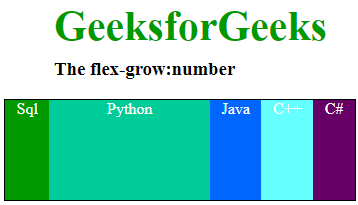
Example: Here we are going to see in a single container there are 5 divs, we will apply the flex-grow: On 2nd div and that div will grow compare to other 4 divs. We can apply flex-grow on any document in the same container that div will grow compared to other div’s width, the flex-grow property will help that div to grow in comparison to other items in that container.
HTML
<!DOCTYPE html>
<html>

<head>
    <title>
        CSS | flex-grow Property
    </title>
    <style>
        #main {
            width: 350px;
            height: 100px;
            border: 1px solid black;
            display: -webkit-flex;
            display: flex;
            color: white;
            text-align: center;
        }

        h1 {
            color: #009900;
            font-size: 42px;
            margin-left: 50px;
        }

        h3 {
            margin-top: -20px;
            margin-left: 50px;
        }

        #main div:nth-of-type(1) {
            flex-grow: 1;
        }

        #main div:nth-of-type(2) {
            flex-grow: 5;
        }

        #main div:nth-of-type(3) {
            flex-grow: 1;
        }

        #main div:nth-of-type(4) {
            flex-grow: 1;
        }

        #main div:nth-of-type(5) {
            flex-grow: 1;
        }
    </style>
</head>

<body>
    <h1>GeeksforGeeks</h1>
    <h3>The flex-grow:number</h3>

    <!-- Making 5 divs in main -->
    <div id="main">
        <div style="background-color:#009900;">
          Sql</div>
        <div style="background-color:#00cc99;">
          Python</div>
        <div style="background-color:#0066ff;">
          Java</div>
        <div style="background-color:#66ffff;;">
          C++</div>
        <div style="background-color:#660066;">
          C#</div>
    </div>
</body>

</html>
Output:
Supported Browser: The browser supported by CSS | flex-grow Property are listed below:
- Google Chrome 29.0
- Edge 12
- Mozilla Firefox 20.0
- Opera 12.1
- Safari 9.0
Like Article
Suggest improvement
Share your thoughts in the comments
Please Login to comment...