CSS | backdrop-filter Property
Last Updated :
23 Aug, 2022
The CSS backdrop-filter property is used to apply effects to the area behind an element. This is unlike the filter property where it applies the effect to the whole element. It can be used to eliminate the use of an extra element to style the background separately.
Syntax:
backdrop-filter: blur() | brightness() | contrast() | drop-shadow() | grayscale() | hue-rotate() | invert() | opacity() | saturate() | sepia() | none | initial | inherit
Property Values:
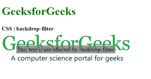
- blur(): It is used to apply a Gaussian blur to the image. The default value of this function is 0 which applies no blur effect.
Example:
html
<!DOCTYPE html>
<html>
<head>
<title>CSS | backdrop-filter</title>
<style>
.container {
background-image: url(
background-size: cover;
display: flex;
align-items: center;
justify-content: center;
height: 100px;
width: 360px;
}
.foreground {
backdrop-filter: blur(5px);
padding: 2px;
}
</style>
</head>
<body>
<h1 style="color: green">
GeeksforGeeks
</h1>
<b>CSS | backdrop-filter</b>
<div class="container">
<div class="foreground">
This text is not affected
by backdrop-filter.
</div>
</div>
</body>
</html>
|

- brightness(): It is used to make the image lighter or darker. A value over 100% will brighten the image and a value below it will darken the image. If the brightness becomes 0%, it will completely black the image.
Example:
html
<!DOCTYPE html>
<html>
<head>
<title>CSS | backdrop-filter</title>
<style>
.container {
background-image: url(
background-size: cover;
display: flex;
align-items: center;
justify-content: center;
height: 100px;
width: 360px;
}
.foreground {
backdrop-filter: brightness(25%);
padding: 2px;
}
</style>
</head>
<body>
<h1 style="color: green">
GeeksforGeeks
</h1>
<b>CSS | backdrop-filter</b>
<div class="container">
<div class="foreground">
This text is not affected
by backdrop-filter.
</div>
</div>
</body>
</html>
|

- contrast(): It is used to set the contrast of the image. The original image is at 100% contrast. If the contrast is below 0%, it will completely black the image.
Example:
html
<!DOCTYPE html>
<html>
<head>
<title>CSS | backdrop-filter</title>
<style>
.container {
background-image: url(
background-size: cover;
display: flex;
align-items: center;
justify-content: center;
height: 100px;
width: 360px;
}
.foreground {
backdrop-filter: contrast(20%);
padding: 2px;
}
</style>
</head>
<body>
<h1 style="color: green">
GeeksforGeeks
</h1>
<b>CSS | backdrop-filter</b>
<div class="container">
<div class="foreground">
This text is not affected by
backdrop-filter.
</div>
</div>
</body>
</html>
|
- drop-shadow(): It is used to apply a drop shadow effect to the element. It accepts the horizontal and vertical shadow amounts along with the spread and color values.
Example:
html
<!DOCTYPE html>
<html>
<head>
<title>CSS | backdrop-filter</title>
<style>
.container {
background-image: url(
background-size: cover;
display: flex;
align-items: center;
justify-content: center;
height: 100px;
width: 360px;
}
.foreground {
backdrop-filter: drop-shadow(20px 10px red);
padding: 2px;
}
</style>
</head>
<body>
<h1 style="color: green">
GeeksforGeeks
</h1>
<b>CSS | backdrop-filter</b>
<div class="container">
<div class="foreground">
This text is not affected by
backdrop-filter.
</div>
</div>
</body>
</html>
|

- grayscale(): It is used to convert the colors of the image into black and white. A value of 0% indicates the original image and 100% will indicate a completely black and white image.
Example:
html
<!DOCTYPE html>
<html>
<head>
<title>CSS | backdrop-filter</title>
<style>
.container {
background-image: url(
background-size: cover;
display: flex;
align-items: center;
justify-content: center;
height: 100px;
width: 360px;
}
.foreground {
backdrop-filter: grayscale(75%);
padding: 2px;
}
</style>
</head>
<body>
<h1 style="color: green">
GeeksforGeeks
</h1>
<b>CSS | backdrop-filter</b>
<div class="container">
<div class="foreground">
This text is not affected by
backdrop-filter.
</div>
</div>
</body>
</html>
|

- hue-rotate(): It is used to apply a hue rotation to the image. The function value denotes the number of degrees around the color circle that the image circle would be adjusted. The default value is 0 which represents the original image.
Example:
html
<!DOCTYPE html>
<html>
<head>
<title>CSS | backdrop-filter</title>
<style>
.container {
background-image: url(
background-size: cover;
display: flex;
align-items: center;
justify-content: center;
height: 100px;
width: 360px;
}
.foreground {
backdrop-filter: hue-rotate(180deg);
padding: 2px;
}
</style>
</head>
<body>
<h1 style="color: green">
GeeksforGeeks
</h1>
<b>CSS | backdrop-filter</b>
<div class="container">
<div class="foreground">
This text is not affected by
backdrop-filter.
</div>
</div>
</body>
</html>
|

- invert(): It is used to invert the image. The default value is 0% which represents the original image and 100% will make the image completely inverted.
Example:
html
<!DOCTYPE html>
<html>
<head>
<title>CSS | backdrop-filter</title>
<style>
.container {
background-image: url(
background-size: cover;
display: flex;
align-items: center;
justify-content: center;
height: 100px;
width: 360px;
}
.foreground {
backdrop-filter: invert(100%);
padding: 2px;
}
</style>
</head>
<body>
<h1 style="color: green">
GeeksforGeeks
</h1>
<b>CSS | backdrop-filter</b>
<div class="container">
<div class="foreground">
This text is not affected by
backdrop-filter.
</div>
</div>
</body>
</html>
|

- opacity(): It is used to set the opacity of the image. The default value is 0% which indicates that the image is completely transparent and a value of 100% indicates the original image which is completely opaque.
Example:
html
<!DOCTYPE html>
<html>
<head>
<title>CSS | backdrop-filter</title>
<style>
.container {
background-image: url(
background-size: cover;
display: flex;
align-items: center;
justify-content: center;
height: 100px;
width: 360px;
}
.foreground {
backdrop-filter: opacity(50%);
padding: 2px;
}
</style>
</head>
<body>
<h1 style="color: green">
GeeksforGeeks
</h1>
<b>CSS | backdrop-filter</b>
<div class="container">
<div class="foreground">
This text is not affected by
backdrop-filter.
</div>
</div>
</body>
</html>
|

- saturate(): It is used to set the saturation of the element. The default value is 100% which indicates the original image. A 0% value would indicate a completely unsaturated image and more than 100% would indicate a super-saturated image.
Example:
html
<!DOCTYPE html>
<html>
<head>
<title>CSS | backdrop-filter</title>
<style>
.container {
background-image: url(
background-size: cover;
display: flex;
align-items: center;
justify-content: center;
height: 100px;
width: 360px;
}
.foreground {
backdrop-filter: saturate(50%);
padding: 2px;
}
</style>
</head>
<body>
<h1 style="color: green">
GeeksforGeeks
</h1>
<b>CSS | backdrop-filter</b>
<div class="container">
<div class="foreground">
This text is not affected by
backdrop-filter.
</div>
</div>
</body>
</html>
|

- sepia(): It is used to convert the image to sepia giving it a warmer appearance. A 0% value represents the original image and 100% represents a completely sepia image.
Example:
html
<!DOCTYPE html>
<html>
<head>
<title>CSS | backdrop-filter</title>
<style>
.container {
background-image: url(
background-size: cover;
display: flex;
align-items: center;
justify-content: center;
height: 100px;
width: 360px;
}
.foreground {
backdrop-filter: sepia(100%);
padding: 2px;
}
</style>
</head>
<body>
<h1 style="color: green">
GeeksforGeeks
</h1>
<b>CSS | backdrop-filter</b>
<div class="container">
<div class="foreground">
This text is not affected by
backdrop-filter.
</div>
</div>
</body>
</html>
|

- none: It is the default value and does not apply any effect to the image.
Example:
html
<!DOCTYPE html>
<html>
<head>
<title>CSS | backdrop-filter</title>
<style>
.container {
background-image: url(
background-size: cover;
display: flex;
align-items: center;
justify-content: center;
height: 100px;
width: 360px;
}
.foreground {
backdrop-filter: none;
padding: 2px;
}
</style>
</head>
<body>
<h1 style="color: green">
GeeksforGeeks
</h1>
<b>CSS | backdrop-filter</b>
<div class="container">
<div class="foreground">
This text is not affected by
backdrop-filter.
</div>
</div>
</body>
</html>
|

- initial: It is used to set this property to its default value.
Example:
html
<!DOCTYPE html>
<html>
<head>
<title>CSS | backdrop-filter</title>
<style>
.container {
background-image: url(
background-size: cover;
display: flex;
align-items: center;
justify-content: center;
height: 100px;
width: 360px;
}
.foreground {
backdrop-filter: initial;
padding: 2px;
}
</style>
</head>
<body>
<h1 style="color: green">
GeeksforGeeks
</h1>
<b>CSS | backdrop-filter</b>
<div class="container">
<div class="foreground">
This text is not affected by
backdrop-filter.
</div>
</div>
</body>
</html>
|

- inherit: It inherits the property from its parent element.
Supported Browsers: The browsers supported by backdrop-filter property are listed below:
- Google Chrome 76.0 and above
- Edge 17.0 and above
- Firefox 103.0 and above
- Safari 9.0 and above
- Opera 63.0 and above
Like Article
Suggest improvement
Share your thoughts in the comments
Please Login to comment...