In this tutorial, we will make a recommendation system that will take in the different environmental attributes such as the nitrogen, phosphorous, potassium content in the soil, temperature, etc., and predict what is the best crop that the user can plant so that it survives in the given climatic conditions. .
Features Available in Crop Dataset
The dataset consists of a single CSV file. This dataset is mainly made concerning Indian climatic conditions. There are, in total, seven input features and one output feature. The seven input features are as follows:
- N – Ratio of Nitrogen content in the soil.
- P – Ratio of Phosphorous content in the soil.
- K – Ratio of Potassium content in the soil.
- Temperature – The temperature in degrees Celsius.
- Humidity – Relative humidity in %
- ph – ph value of the soil.
- Rainfall – Rainfall in mm.
Let us perform some exploratory data analysis on our dataset and get to know the data. First, import all the required libraries.
Importing Libraries
Python libraries make it very easy for us to handle the data and perform typical and complex tasks with a single line of code.
- Pandas – This library helps to load the data frame in a 2D array format and has multiple functions to perform analysis tasks in one go.
- Numpy – Numpy arrays are very fast and can perform large computations in a very short time.
- Matplotlib – This library is used to draw visualizations.
- Sklearn – This module contains multiple libraries having pre-implemented functions to perform tasks from data preprocessing to model development and evaluation.
- TensorFlow – This is an open-source library that is used for Machine Learning and Artificial intelligence and provides a range of functions to achieve complex functionalities with single lines of code.
Python3
import pandas as pd
import matplotlib.pyplot as plt
import pickle
import numpy as np
from sklearn.model_selection import train_test_split
import sklearn.metrics as metrics
from sklearn.linear_model import LogisticRegression
import seaborn as sns
|
Now let’s load this dataset into the panda’s data frame so, that we can leverage the inbuilt analysis functions in the panda’s library.
Python3
PATH = 'Crop_recommendation.csv'
data = pd.read_csv(PATH)
|
Now, let’s print the first five rows of the dataset to get to know what types of values are given for each independent as well as dependent feature.
Output:
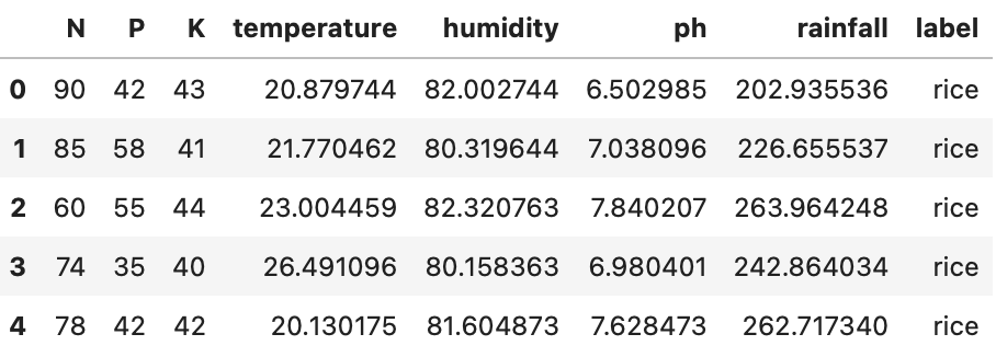
First five rows of the dataset using head() function
As you can see, there are seven input variables, and the output variable we want to predict is the ‘label’ column, which is the name of the crop. Now let us see how many NULL values there are in the dataset and the datatype for each column.
Output:
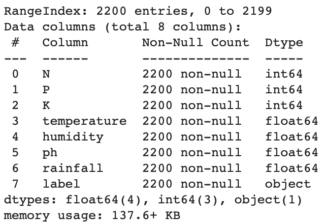
Basic info about the dataset and the type of data it contains in each column
The following inference can be taken from the above information:
- There are, in total, 2200 entries
- For each column, there are 2200 non-NULL count entries. This means that we have no NULL value present in the dataset.
- All the input variables are of numerical data type, either integer or float.
- The output label is a string data type.
Now let us find the number of distinct labels when we want to predict along with their counts.
Descriptive Analysis
Descriptive statistics is a means of describing features of a data set by generating summaries about data samples.
Output:
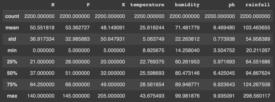
Descriptive Statistical measures of the dataset
Exploratory Data Analysis (EDA)
EDA is an approach to analyzing the data using visual techniques. It is used to discover trends, and patterns, or to check assumptions with the help of statistical summaries and graphical representations.
Count the number of unique output labels
Output:
array(['rice', 'maize', 'chickpea', 'kidneybeans',
       'pigeonpeas', 'mothbeans', 'mungbean', 'blackgram',
         'lentil', 'pomegranate', 'banana', 'mango', 'grapes',
          'watermelon', 'muskmelon', 'apple', 'orange',
       'papaya', 'coconut', 'cotton', 'jute', 'coffee'],
dtype=object)
Now let’s check whether the classes provided in the dataset are balanced or not. This step is very important because this helps to improve the performance of the model by using different sampling methods.
Python3
data['label'].value_counts()
|
Output:
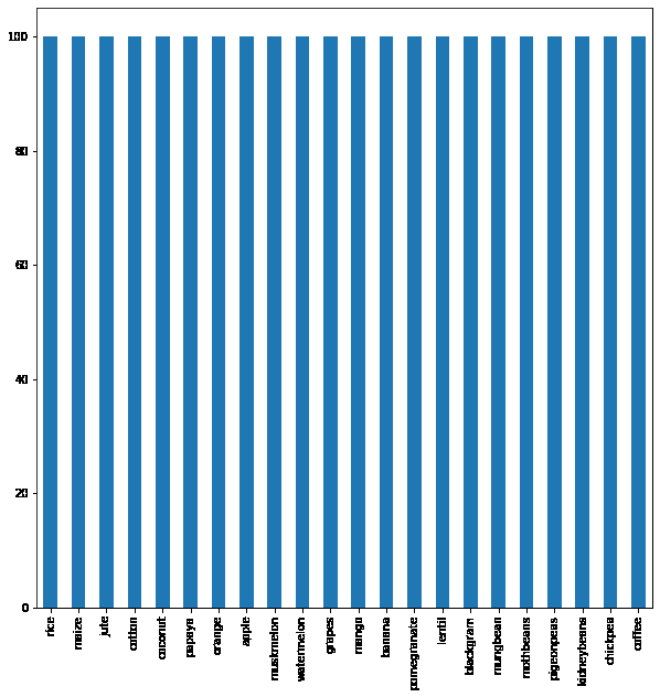
Barplot to identify the data imbalance in the dataset
From the above output image, we can see that there are an equal number of row entries for each of the labels. From this, we learn that there is no class imbalance present in our dataset, and we can go ahead and train our model on it without any preprocessing. We will find the various distributions of data input features.
Python3
plt.rcParams['figure.figsize'] = (10, 10)
plt.rcParams['figure.dpi'] = 60
features = ['N', 'P', 'K', 'temperature',
'humidity', 'ph', 'rainfall']
for i, feat in enumerate(features):
plt.subplot(4, 2, i + 1)
sns.distplot(data[feat], color='greenyellow')
if i < 3:
plt.title(f'Ratio of {feat}', fontsize=12)
else:
plt.title(f'Distribution of {feat}', fontsize=12)
plt.tight_layout()
plt.grid()
|
Output:
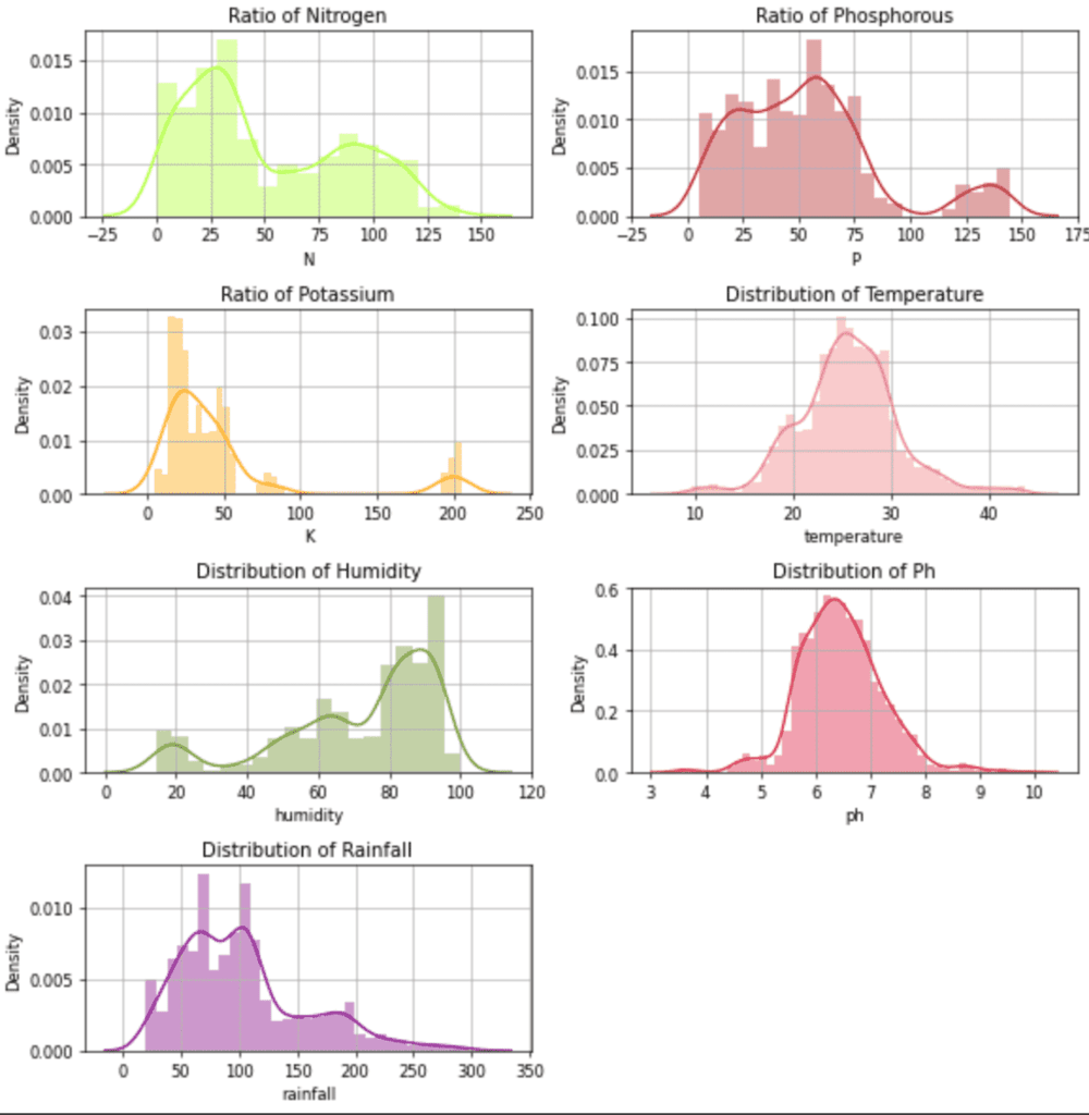
Distribution plot for the independent features.
Feature vs. Feature distributions for different crops
Python3
sns.pairplot(data, hue='label')
|
Output:
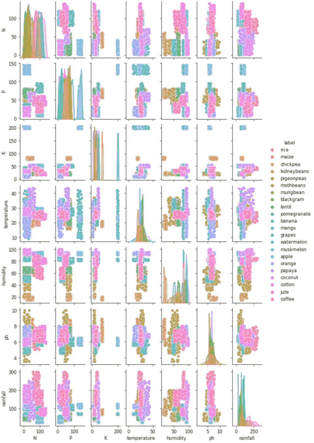
Pair plot to identify any significant relationship between two features
From the above plots, we can infer the following:
- There are clusters in the data concerning features and crops.
- Classifier or clustering algorithms can be used.
Correlation Between Features
We will now plot the heatmap for features. It will give an idea of which and how two features relate to each other. We want to reduce the correlation between two variables as low as possible
Python3
fig, ax = plt.subplots(1, 1, figsize=(15, 9))
sns.heatmap(data.corr(),
annot=True,
cmap='viridis')
ax.set(xlabel='features')
ax.set(ylabel='features')
plt.title('Correlation between different features',
fontsize=15,
c='black')
plt.show()
|
Output:
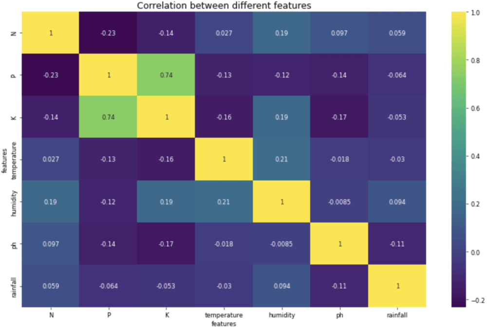
Heatmap to analyze the correlation between features.
Inference from the above heatmap is that apart from K vs. P, there are no two highly correlated features.
Separating input and output variables
Now we will split the input variables from the output variable. This is required so that while training our model, we will have all the output data in a single array and all the input data in a different array.
Python3
features = data[['N', 'P', 'K', 'temperature',
'humidity', 'ph', 'rainfall']]
labels = data['label']
|
Now we are done with the data analysis. We will now move toward model training and metrics calculation.
Model Training
The first step in model training is splitting the data into training and testing sets. The training set is where the model sees the input and output and learns them based on the outputs.
Splitting data into training and test set
To perform the split, we will use the built-in function train_test_split from the sklearn library. In this project, we will use 80% of the data for training and the remaining 20% for testing.
Python3
X_train, X_test,\
Y_train, Y_test = train_test_split(features,
labels,
test_size=0.2,
random_state=42)
|
We will use the Logistic Regression model to classify the labels. A logistic regression model uses the sigmoid function to predict the probability of the labels. As this is a multiclass classification task, logistic regression uses one vs. many phenomena to determine the correct label for the input.

Here, P is the probability and X are the input features and a and b are the parameters to be trained
Python3
%%capture
LogReg = LogisticRegression(random_state=42)\
.fit(X_train, Y_train)
predicted_values = LogReg.predict(X_test)
accuracy = metrics.accuracy_score(Y_test,
predicted_values)
|
Once the model is trained and tested on the test set, we will note the metrics of the model. This way, we will know how well the model has performed.
Python3
print("Logistic Regression accuracy: ", accuracy)
|
Output:
Logistic Regression accuracy: 0.9454545454545454
To know the detailed description of the classification model for each class label, we can use the function classification_report from the metrics class in sklearn. This way, we will know the accuracy, precision, reclass, and f1 score for each class label and the average of all.
Python3
print(metrics.classification_report(Y_test,
predicted_values))
|
Output:
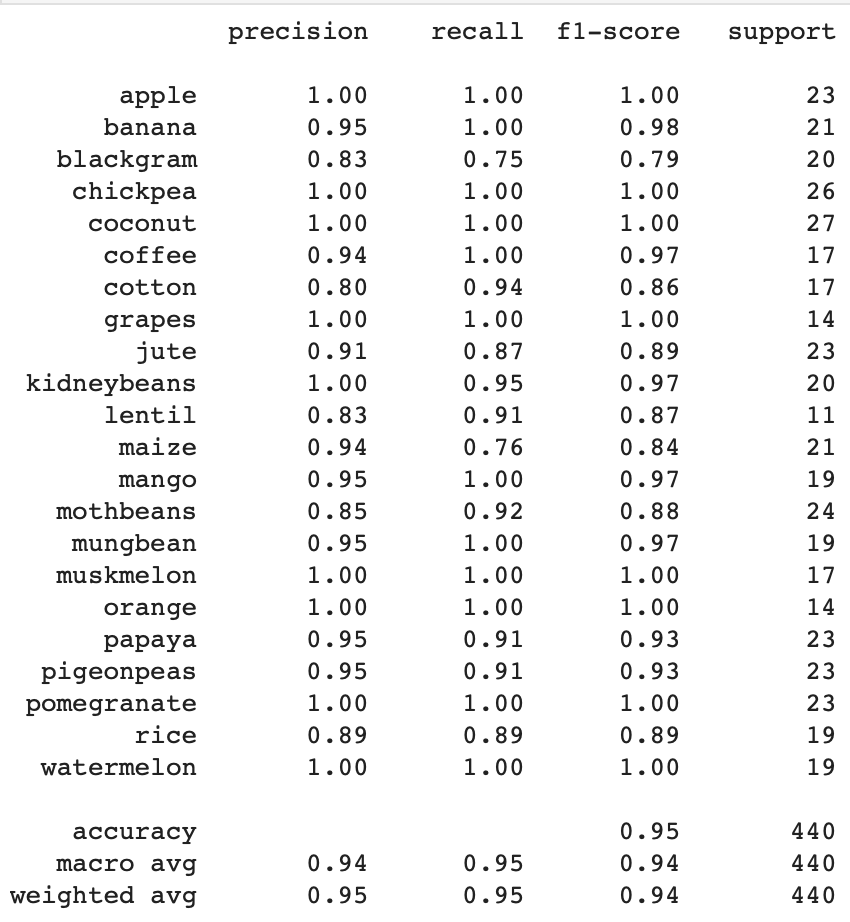
Classification report for the Logistic Regression model
Saving the model
After training and testing the model, we will save the model. Saving the model is necessary as we don’t want to train our model from scratch each time to predict the output. Also, we can now export our model at the production level, ready to be deployed into the Django or Flask application.
Python3
filename = 'LogisticRegresion.pkl'
MODELS = './recommender-models/'
pickle.dump(LogReg, open(MODELS + filename, 'wb'))
|
We have successfully trained an ML model for recommending crops based on the input features mentioned.
Like Article
Suggest improvement
Share your thoughts in the comments
Please Login to comment...