Creating Horizontal Bar Charts using Pandas
Last Updated :
02 Dec, 2020
Prerequisites: Pandas
A bar chart represents categorical data with corresponding data values as rectangular bars. Usually, the x-axis represents categorical values and the y-axis represents the data values or frequencies. This is called a vertical bar chart and the inverse is called a horizontal bar chart. In some cases, a horizontal bar chart provides better readability.
Python has various visualization libraries such as Matplotlib and Seaborn. The Pandas library, having a close integration with Matplotlib, allows creation of plots directly though DataFrame and Series object. This article explores the methods to create horizontal bar charts using Pandas.
Using the plot instance of the Pandas DataFrame, various kinds of graphs can be created including Bar charts. There are two types of bar charts that represent complex categories:
- Grouped or Compounded Bar Charts – When you have sub-categories of a main category, this graph assigns each variable or sub-category with a separate bar in the corresponding category.
- Stacked Bar Charts – When you have sub-categories of a main category, this graph stacks the sub-categories on top of each other to produce a single bar.
The bar() and barh() methods of Pandas draw vertical and horizontal bar charts respectively. Essentially, DataFrame.plot(kind=”bar”) is equivalent to DataFrame.plot.bar(). Below are some examples to create different types of bar charts using the above mentioned functions.
Simple horizontal bar chart
Syntax:
DataFrame.plot.barh()
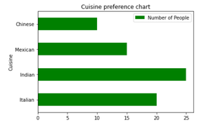
The barh() methods accept x and y parameters where x takes the categorical values (by default, it takes the index of the DataFrame) and y takes all the numeric columns. The keyword arguments (like title or figure size) supported by DataFrame.plot() can be passed to the barh() method in order to customize the bar chart. Given is the implementation depicting a horizontal bar chart representing the number of people that preferred particular categories of cuisine.
Example:
Python3
import pandas as pd
df = pd.DataFrame({'Cuisine': ['Italian', 'Indian', 'Mexican', 'Chinese'],
'Number of People': [20, 25, 15, 10]})
df.plot.barh(x='Cuisine', y='Number of People',
title='Cuisine Preference', color='green')
|
Output:
Compounded horizontal bar chart
From the above example, if people are divided into sub-groups of males and females then we can represent this data with a compounded horizontal bar chart. This example shows a horizontal bar chart representing the number of males and females that preferred particular categories of cuisine using two methods.
Example 2:
Bar chart using barh() method
Python3
import pandas as pd
df = pd.DataFrame({'Number of Males': [10, 15, 25, 14],
'Number of Females': [20, 25, 15, 10]},
index=['Italian', 'Indian', 'Mexican', 'Chinese'])
df.plot.barh(title="Gender wise Cuisine preference chart",
color={"green", "pink"})
|
Output:
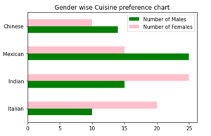
Example 3:
Bar chart using plot() method
Python3
import pandas as pd
df = pd.DataFrame({'Number of Males': [10, 15, 25, 14],
'Number of Females': [20, 25, 15, 10]},
index=['Italian', 'Indian', 'Mexican', 'Chinese'])
df.plot(kind="barh", title="Gender wise Cuisine preference chart",
color={"green", "pink"})
|
Output:
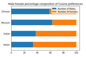
Stacked horizontal bar chart
Stacked bar charts are useful in representing the composition or contribution of different sub-groups. The example below shows a horizontal bar chart representing the percentage of males and females that preferred particular categories of cuisine. A stacked horizontal bar chart places the values at each observation in the dataframe side by side in a single bar. However, it stacks the numeric values rather than the percentage of a whole. So, we first convert the data values into the percentage of a whole then use the barh() function with the stacked parameter set to True to create a filled stacked horizontal bar chart.
Example 4:
Python3
import pandas as pd
df = pd.DataFrame({'Number of Males': [10, 15, 25, 14],
'Number of Females': [20, 25, 15, 10]},
index=['Italian', 'Indian', 'Mexican', 'Chinese'])
percent_df = df.apply(lambda x: (x * 100) / sum(x), axis=1)
percent_df.plot.barh(stacked=True,
title="Male-Female percentage composition of Cuisine preferences")
|
Output:
Like Article
Suggest improvement
Share your thoughts in the comments
Please Login to comment...