Create Heatmap in R Using ggplot2
Last Updated :
08 Jun, 2023
A heatmap depicts the relationship between two attributes of a data frame as a color-coded tile. A heatmap produces a grid with multiple attributes of the data frame, representing the relationship between the two attributes taken at a time. In both data analysis and visualization, heatmaps are a common visualization tool. They are especially beneficial for displaying and examining relationships and patterns in tabular data. The ggplot2 package in R, a robust and adaptable data visualization library, can be used to make heatmaps.
Dataset used: bestsellers
Let us first create a correlation matrix to understand the relation between different attributes, for this cor() function is used.
Syntax: cor(dataframe)
Note: This function fails when the data frame consists of values apart from numeric values, so we will also use the sapply() method.
Example:
R
df <- read.csv("bestsellers.csv")
cor(df[sapply(df, is.numeric)])
|
Output:
            User.Rating      Reviews        Price       Year
User.Rating   1.0000000 -0.251392152 -0.102723788  0.2124160
Reviews      -0.2513922  1.000000000  0.007326475  0.1517643
Price        -0.1027238  0.007326475  1.000000000 -0.1674304
Year          0.2124160  0.151764281 -0.167430419  1.0000000
Now that we have a correlation matrix, we have to melt it in a form that a heatmap can be created. For this melt() function of reshape2 library is used.
Melting in R programming is done to organize the data. It is performed using melt() function which takes dataset and column values that have to be kept constant. Using melt(), dataframe is converted into a long format and stretches the data frame.
Syntax: melt(data, na.rm = FALSE, value.name = “value”)
Parameters:
- data: represents dataset that has to be reshaped
- na.rm: if TRUE, removes NA values from dataset
- value.name: represents name of variable used to store values
Example:
R
library(ggplot2)
library(reshape2)
df <- read.csv("bestsellers.csv")
data <- cor(df[sapply(df,is.numeric)])
data1 <- melt(data)
head(data1)
|
Output:
         Var1        Var2      value
1 User.Rating User.Rating  1.0000000
2     Reviews User.Rating -0.2513922
3       Price User.Rating -0.1027238
4        Year User.Rating  0.2124160
5 User.Rating     Reviews -0.2513922
6     Reviews     Reviews  1.0000000
To create a heatmap with the melted data so produced, we use geom_tile() function of the ggplot2 library. It is essentially used to create heatmaps.
Syntax: geom_tile(x,y,fill)
Parameter:
- x: position on x-axis
- y: position on y-axis
- fill: numeric values that will be translated to colors
To this function, Var1 and Var2 of the melted dataframe are passed to x and y respectively. These represent the relation between attributes taken two at a time. To fill parameters provide, since that will be used to color-code the tiles based on some numeric value.
Example:
R
library(ggplot2)
library(reshape2)
df <- read.csv("bestsellers.csv")
data <- cor(df[sapply(df,is.numeric)])
data1 <- melt(data)
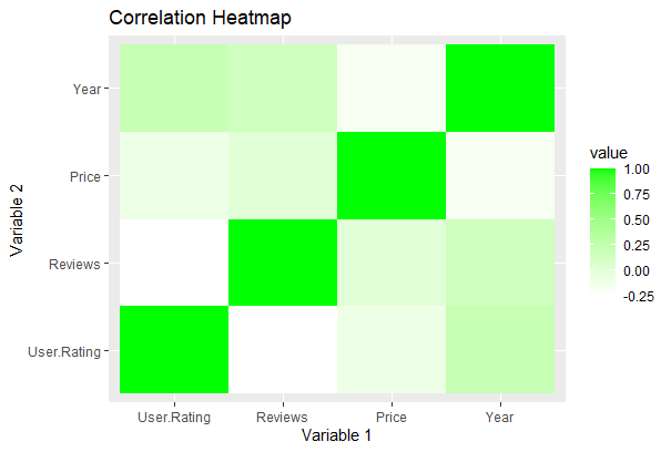
ggplot(data1, aes(x = Var1, y = Var2, fill = value)) +
geom_tile() +
labs(title = "Correlation Heatmap",
x = "Variable 1",
y = "Variable 2")
|
Output:

Create Heatmap in R Using ggplot2
Changing color:
The color of the plot can be changed using three functions:
- scale_fill_gradient(): adds extreme colors to the plot.
Syntax:
scale_fill_gradient(high, low)
Parameter:
- low: color to highlight smaller values
- high: color to highlight bigger values
R
library(ggplot2)
library(reshape2)
df<-read.csv("bestsellers.csv")
data<-cor(df[sapply(df,is.numeric)])
data1<-melt(data)
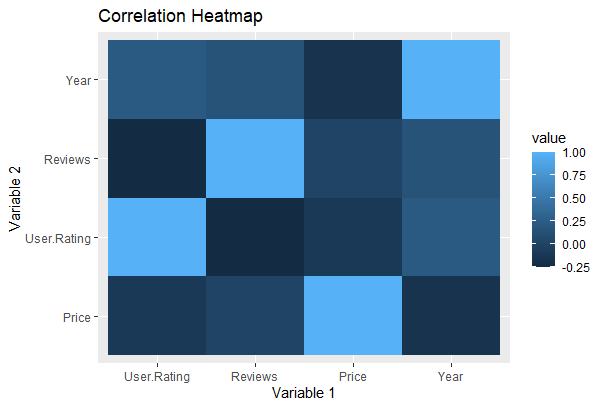
ggplot(data1,aes(x = Var1, y = Var2, fill = value))+
geom_tile()+scale_fill_gradient(high = "green", low = "white")+
geom_tile() +
labs(title = "Correlation Heatmap",
x = "Variable 1",
y = "Variable 2")
|
Output:
Create Heatmap in R Using ggplot2
- scale_fill_distiller(): It used to customize according to ColorBrewer palette.
Syntax: scale_fill_distiller(palette)
R
library(ggplot2)
library(reshape2)
df<-read.csv("bestsellers.csv")
data<-cor(df[sapply(df, is.numeric)])
data1<-melt(data)
ggplot(data1,aes(x = Var1, y = Var2,fill = value))+
geom_tile() + scale_fill_distiller(palette = "Spectral")+
geom_tile() +
labs(title = "Correlation Heatmap",
x = "Variable 1",
y = "Variable 2")
|
Output:

Create Heatmap in R Using ggplot2
- scale_fill_viridis(): to use viridis. In this function, discrete is set to FALSE.
Syntax: scale_fill_viridis(discrete)
R
library(ggplot2)
library(reshape2)
library(viridis)
df<-read.csv("bestsellers.csv")
data<-cor(df[sapply(df,is.numeric)])
data1<-melt(data)
ggplot(data1, aes(x = Var1, y = Var2, fill = value))+
geom_tile() + scale_fill_viridis(discrete = FALSE)+
geom_tile() +
labs(title = "Correlation Heatmap",
x = "Variable 1",
y = "Variable 2")
|
Output:

Create Heatmap in R Using ggplot2
Order the row:
A heatmap can be reordered by reordering its y-elements. This can be done by reorder().
Syntax: reorder(y_value,value)
Where, Value is the element to reorder by.
R
library(ggplot2)
library(reshape2)
df<-read.csv("bestsellers.csv")
data<-cor(df[sapply(df,is.numeric)])
data1<-melt(data)
ggplot(data1,aes(x = Var1, y = reorder(Var2, value),
fill = value)) + geom_tile()+
geom_tile() +
labs(title = "Correlation Heatmap",
x = "Variable 1",
y = "Variable 2")
|
Output:
Create Heatmap in R Using ggplot2
Changing Title:
The title can be added to a heatmap to make it descriptive. It can be done by using ggtitle().
Syntax: ggtitle(“title”)
R
library(ggplot2)
library(reshape2)
df<-read.csv("bestsellers.csv")
data<-cor(df[sapply(df,is.numeric)])
data1<-melt(data)
ggplot(data1, aes(x = Var1, y = Var2, fill = value))+
geom_tile()+ggtitle("Bestsellers")
|
Output:
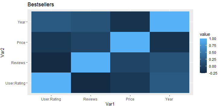
Create Heatmap in R Using ggplot2
Removing Labels:
Labels of the heatmap can also be removed to show only the corresponding values it is representing. If we remove labels, keeping ticks doesn’t make sense. We can use attributes of theme() function axis.ticks and axis.text and set them to element_blank().
Syntax: theme(axis.ticks = element_blank(), axis.text = element_blank())
R
library(ggplot2)
library(reshape2)
df<-read.csv("bestsellers.csv")
data<-cor(df[sapply(df,is.numeric)])
data1<-melt(data)
ggplot(data1,aes(x=Var1,y=Var2,fill=value))+geom_tile()+
theme(axis.ticks = element_blank(),
axis.text = element_blank())
|
Output:
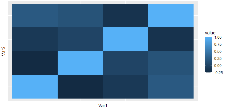
Create Heatmap in R Using ggplot2
Save and extract plots:
R
library(ggplot2)
library(reshape2)
df<-read.csv("bestsellers.csv")
data<-cor(df[sapply(df,is.numeric)])
data1<-melt(data)
plot<-ggplot(data1,aes(x = Var1, y = reorder(Var2, value),
fill = value)) + geom_tile()+
geom_tile() +
labs(title = "Correlation Heatmap",
x = "Variable 1",
y = "Variable 2")
ggsave("plot.png", plot)
ggsave("plot.pdf", plot)
extracted_plot <- plot
|
In this demonstration, I used ggplot to construct a plot and the ggsave function to save it as a PDF file (plot.pdf) and a PNG image file (plot.png). By including the correct file extension, you can indicate the intended file format.
You may easily give the ggplot object to a variable, as demonstrated with extracted_plot, to extract the plot as a variable for later usage.
Be sure to substitute your unique plot and desired file names for the plot code and file names (plot.png and plot.pdf).
Like Article
Suggest improvement
Share your thoughts in the comments
Please Login to comment...