Covid-19 Data Analysis Using Tableau
Last Updated :
24 Jan, 2022
Tableau is a software used for data visualization and analysis. it’s a tool that can make data-analysis easier. Visualizations can be in the form of worksheets or dashboard. Here are some simple steps in creating worksheets and dashboard using covid-19 dataset in Tableau tool.
Data link: https://data.world/covid-19-data-resource-hub/covid-19-case-counts
Data Description: The dataset is mainly divided into 3 CSV files. Each file as a number of attributes 5, number of instances 44,757.
- Confirmed Cases(time_series_covid19_confirmed_global_narrow.csv).
- Recovered Cases(time_series_covid19_recovered_global_narrow.csv).
- Death Cases(time_series_covid19_deaths_global_narrow.csv).
Step 1: Download the Tableau from https://www.tableau.com/products/desktop/download. Tableau provides 14 days of free trial for the customers.
Step 2: Getting started with Tableau
Tableau provides online videos and paid Live classrooms for users. The beginners can explore these videos and implement visualization on different dataset’s. These videos talk about connecting data, data preparation and creating dashboards.
In the “Connect Tab” we can connect to different formats of data. for example, it can be JSON format or PDF file etc.
This is sheet where we can create the visualization.
Step 4: Creating worksheets
Just drag the desired attributes on rows and columns that it!!!! I have created my first worksheet on “counts of Death cases” across the globe. Drag confirmed attribute on column ( present in top bar of Tableau) and change it to SUM. Drag Country attribute on Row(present in top bar of tableau). Drag Attribute Date and drop it in Pages. In Right corner of Tableau we “show me” tab where we can change it to maps. And it’s done.
The video represents the counts of reported death cases from January 21 to July 31st. The graph indicates the growth of death cases around the world. The cases started increasing form end of February initially form china. Presently the US has most of the death cases and then followed by brazil and U.K(please note: The visualization is from January 21 to July 31st ).
2nd Worksheet is on “confirmed cases” across the globe. The above-mentioned tasks are performed the same but on Confirmed.csv file
The video indicates that until February 1st week not more than 100 cases were reported across the world. than cases started reporting firstly in china than slowly across the world. by the midweek of April, almost all the countries across the world were affected. Presently US has the most confirmed cases with more than 35 lakh cases.
3rd worksheet on “Recovered cases” across the globe.
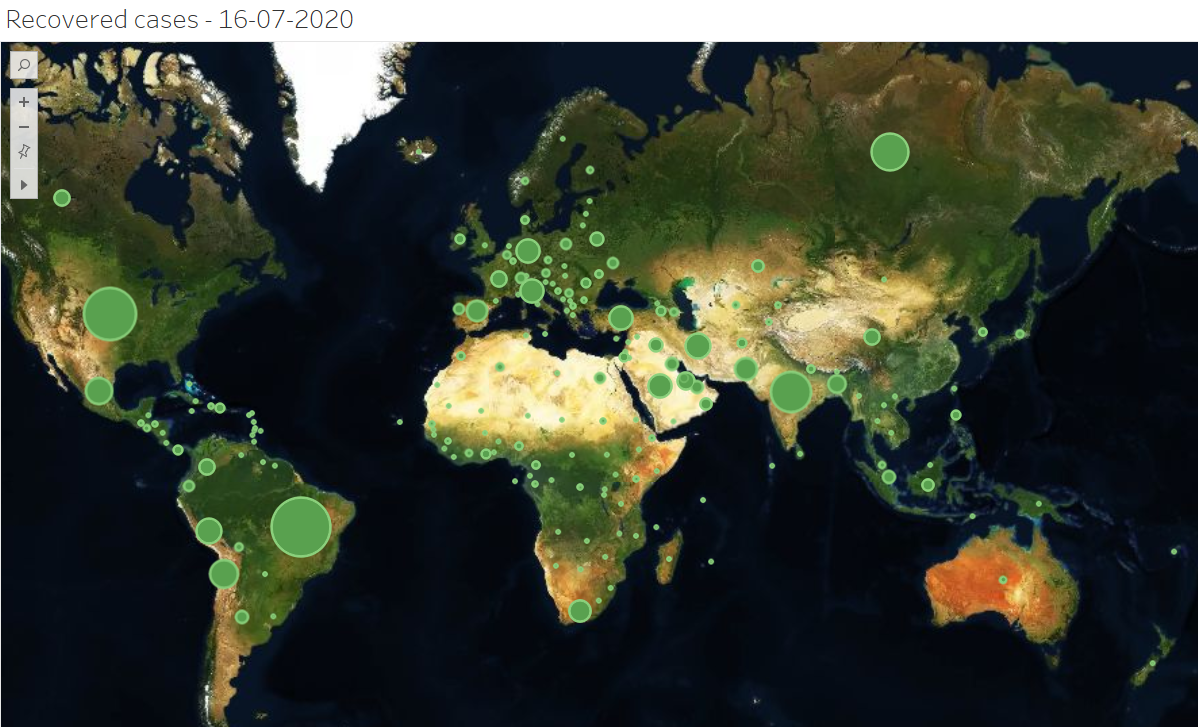
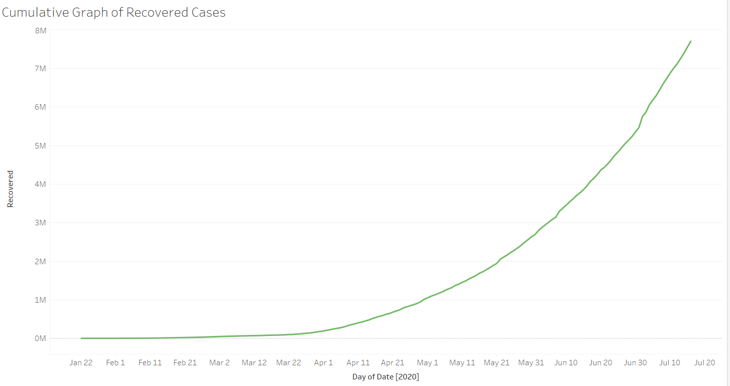
The above graph indicates the worldwide growth of recovered cases. We can make the graph colourful by choosing different types of maps.
Understanding Data:
1. Cumulative graph of confirmed cases across the globe
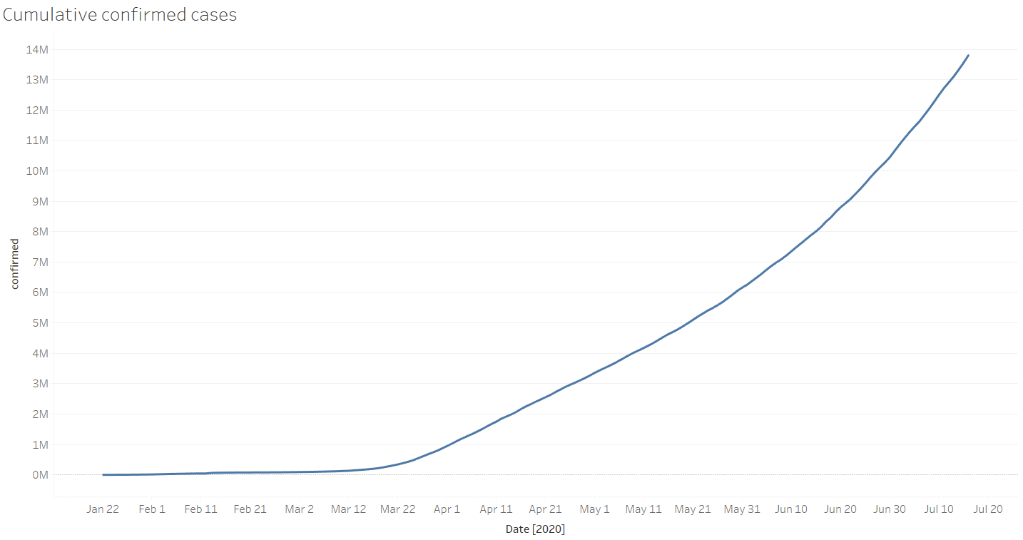
Drag and drop date attribute on the column. Drag and drop confirmed attribute on rows and change to Aggregate type. The graph is ready. we can also represent this graph using video by also dragging and dropping dates on the right corner of Tableau.
2.Cumulative graph of Recovered cases across the globe
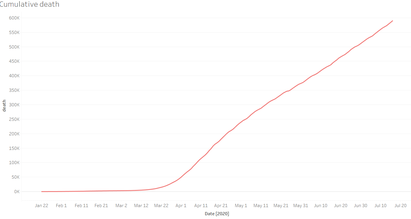
3.Cumulative graph of Death cases across the globe
4.Confirmed Cases with respect to different nations and there curves
Form the video we can conclude that US nations curve is completely different when compared to other nations as it has the highest number of confirmed cases.
5.Analysing Recovered cases with respect to different nations curve
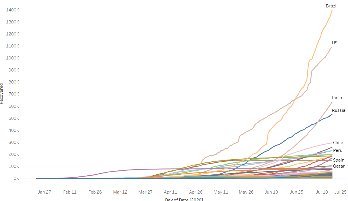
By the above graph, we can infer that Brazil has the highest number of recovered cases than compared to US.
6.Analysing Death cases with respect to different nations curve.
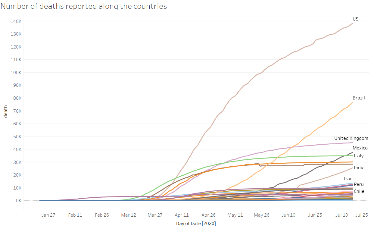
Looking at the death curves and comparing it to previous confirmed cases curve we can infer that even though India has the high number of confirmed cases than compared to the United Kingdom and Mexico but its death rate is low than compared to this nations.
7.Confirmed cases Bar graph.
Bar graph gives the exact number of confirmed cases across the country wise
8.Recovered cases Bar graph
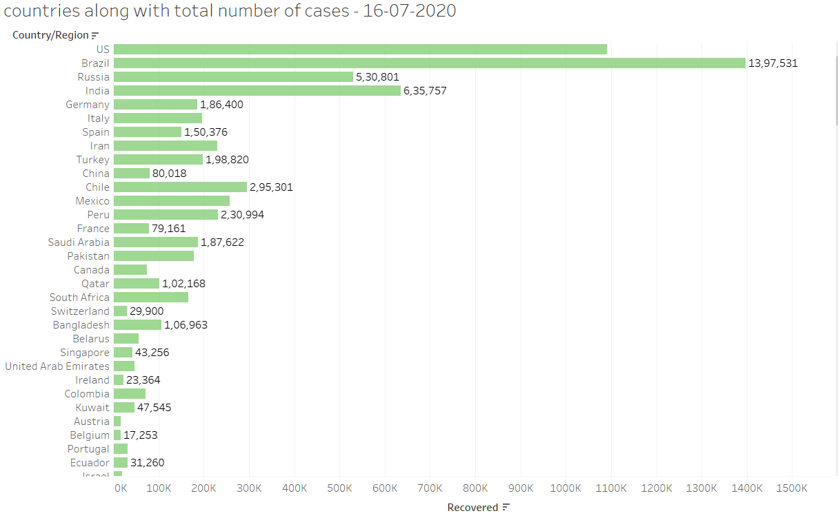
Above bar graph indicates country wise total number of recovered occurred till date 16-07-2020
9.Death cases bar graph
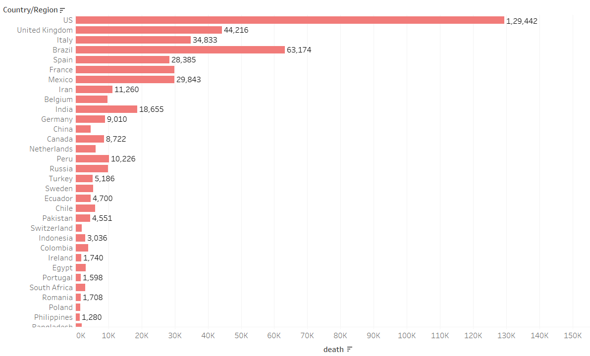
Above bar graph indicates country-wise total number of deaths occurred till date 16-07-2020
10. Top 3 Worst affected countries and their comparison
All the worksheets can be put together to get a dashboard.
Like Article
Suggest improvement
Share your thoughts in the comments
Please Login to comment...