Correlation Chart in Excel
Last Updated :
11 Sep, 2023
Correlation basically means a mutual connection between two or more sets of data. In statistics, bivariate data or two random variables are used to find the correlation between them. Correlation coefficient is generally the measurement of correlation between the bivariate data which basically denotes how much two random variables are correlated with each other.
If the correlation coefficient is 0, the bivariate data are not correlated with each other.
If the correlation coefficient is -1 or +1, the bivariate data are strongly correlated with each other.
r=-1 denotes strong negative relationship and r=1 denotes strong positive relationship.
In general, if the correlation coefficient is close to -1 or +1 then we can say that the bivariate data are strongly correlated to each other.
The correlation coefficient is calculated using Pearson’s Correlation Coefficient which is given by :
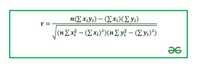
where,
r: Correlation coefficient
 : Values of the variable x.
 : Values of the variable y.
n: Number of samples taken in the data set.
Numerator: Covariance of x and y.
Denominator: Product of Standard Deviation of x and Standard Deviation of y.
In this article, we are going to discuss how to make correlation charts in Excel using suitable examples.
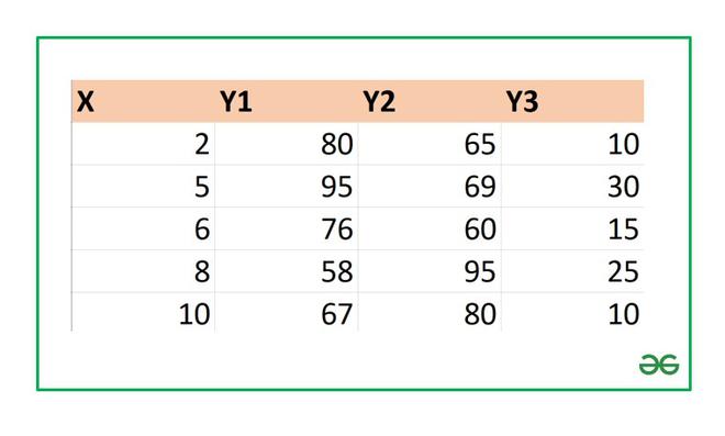
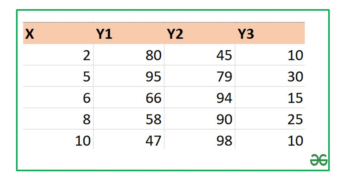
Example 1: Consider the following data set :
Finding Correlation Coefficient in Excel
In Excel to find the correlation coefficient use the formula :
=CORREL(array1,array2)
array1 : array of variable x
array2: array of variable y
To insert array1 and array2 just select the cell range for both.
1. Let’s find the correlation coefficient for the variables X and Y1.
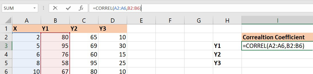
array1 : Set of values of X. The cell range is from A2 to A6.
array2 : Set of values of Y1. The cell range is from B2 to B6.
Similarly, you can find the correlation coefficients for (X, Y2) and (X, Y3) using the Excel formula.
Finally, the correlation coefficients are as follows :
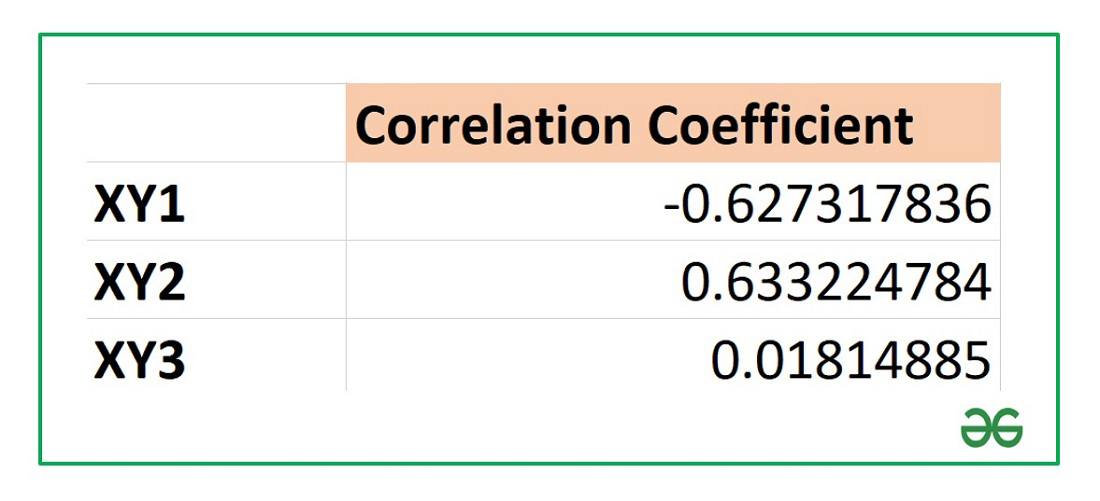
From the above table we can infer that :
X and Y1 has negative correlation coefficient.
X and Y2 has positive correlation coefficient.
X and Y3 are not correlated as the correlation coefficient is almost zero.
Correlation Chart in Excel
A scatter plot is mostly used for data analysis of bivariate data. The chart consists of two variables X and Y where one of them is independent and the second variable is dependent on the previous one. The chart is a pictorial representation of how these two data are correlated with each other.
Three cases are possible on the basis of the value of the correlation coefficient, R as shown below :
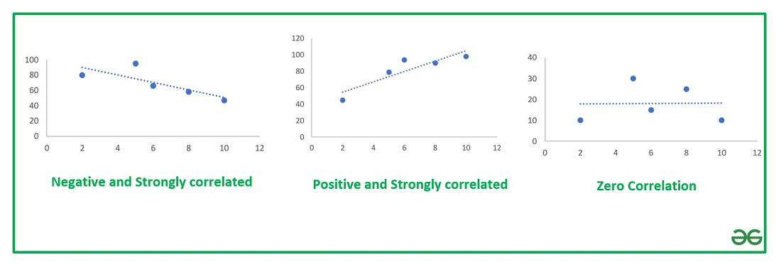
Types of Correlation Chart
Example 2: Consider the following data set :
The correlation coefficients for the above data set are :

The steps to plot a correlation chart are :
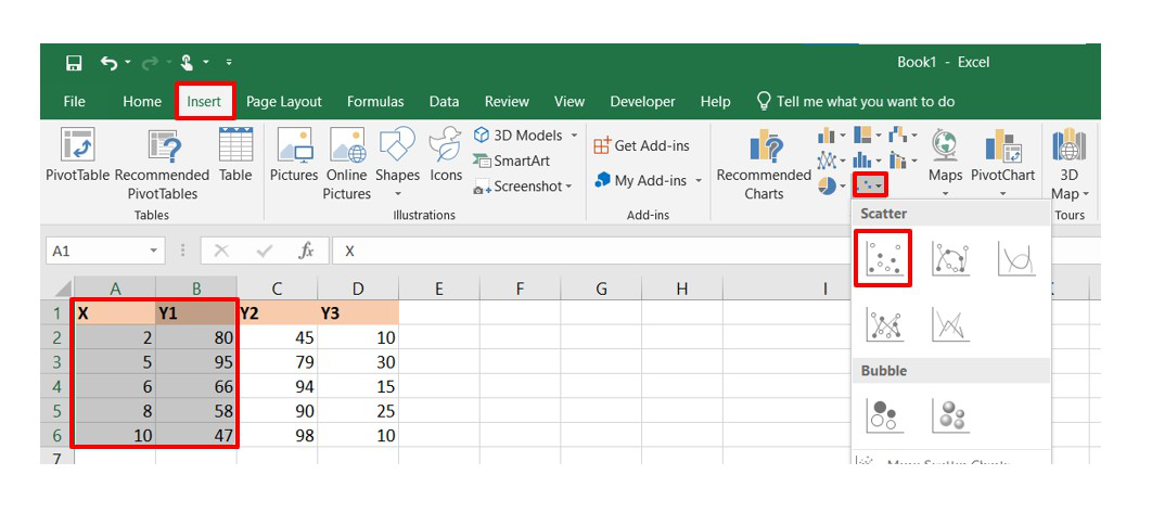
- Select the bivariate data X and Y in the Excel sheet.
- Go to the Insert tab at the top of the Excel window.
- Select Insert Scatter or Bubble chart. A pop-down menu will appear.
- Now select the Scatter chart.
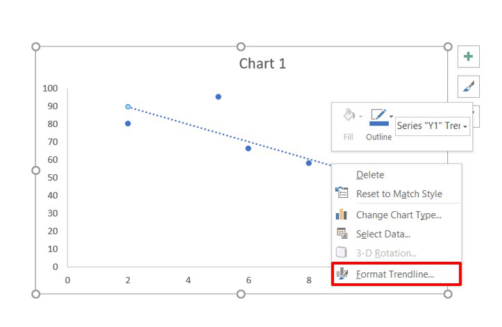
- Now, we need to add a linear trendline in the scatter plot to show the correlation between the bivariate data. In order to do so, select the chart and from the top right corner click on the “+” button and then check the box of Trendline.
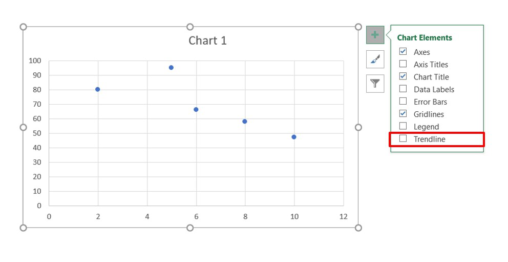
- The trendline is now added and our correlation chart is now ready.
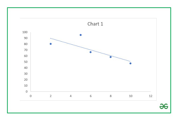
Negative relationship chart
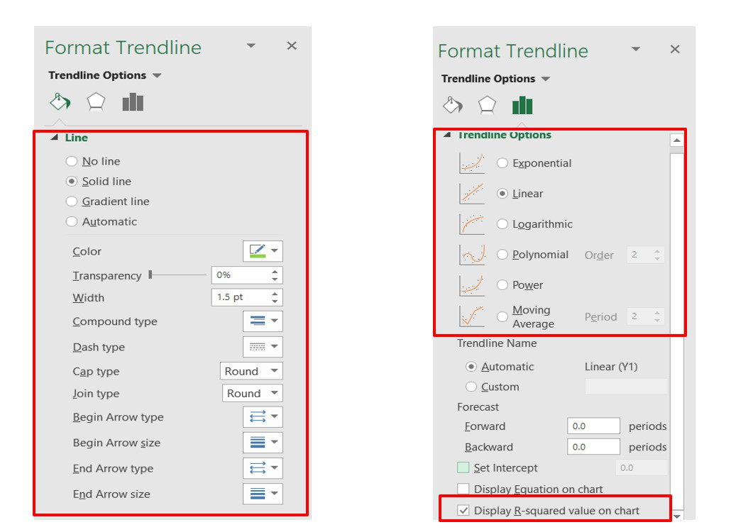
- Now you can format the Trendline by selecting and clicking on the “Format Trendline” option. A dialog box will open where you can change the type and color of the trendline and also show the
 value in the chart.
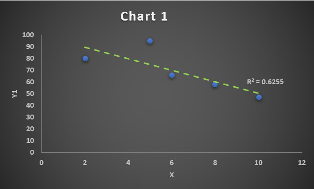
You can further format the above chart by making it more interactive by changing the “Chart Styles”, adding suitable “Axis Titles”, “Chart Title”, “Data Labels”, changing the “Chart Type” etc. It can be done using the “+” button in the top right corner of the Excel chart.
Finally, after all the modifications the charts look like this:
Correlation Chart 1
Since the correlation coefficient is R=-0.79, we have obtained a negatively correlated chart. The linear trendline will grow downwards.
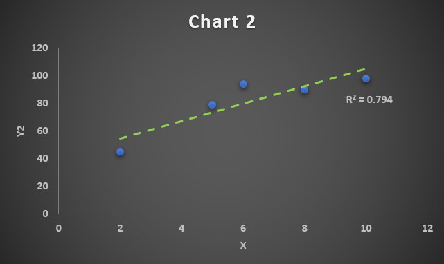
Correlation Chart 2
Since the correlation coefficient is R=0.89, we have obtained a positively correlated chart. The linear trendline will grow upwards.
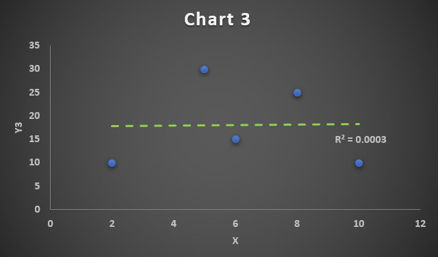
Correlation Chart 3
Since the correlation coefficient is R=0.01, which is approximately 0, so we have obtained a zero-correlated chart. The linear trendline will be a straight line parallel to X-axis and it implies the bivariate data X and Y3 are not correlated to each other.
Frequently Asked Questions
How to calculate the correlation in Excel?
To calculate the correlation coefficient in Excel, you can use the CORREL function. For example, if your data is in columns A and B, you can the formula ‘=CORREL(A1:A10, B1:B10)’ to calculate the correlation coefficient between the two sets of data.
What does a positive correlation look like on a correlation chart?
In a correlation chart, a positive correlation is visually represented by points that tend to form an upward-slopping trendline. As one variable increases, the other variable also tends to increase.
How to create a correlation chart in Excel?
To create a correlation chart in Excel follow the below steps:
Step 1: Select the data for both variables.
Step 2: Go to the “Insert” tab and choose “Scatter” from the Chart group.
Step 3: Select the Scatter plot type that suits your data.
Step 4: If desired, add a trendline to the chart by selecting the chart and going to ” Chart Elements”. Check the “Trendline” Option.
Like Article
Suggest improvement
Share your thoughts in the comments
Please Login to comment...