Combining plots in R
Last Updated :
05 Feb, 2023
In R Programming Language, you can combine plots using ‘par’ function. Combining plots will help you to make decisions easily. Comparing results will be easy by combining plots. par() function is used to set the parameters for multiple plots, and the layout() function determines how the plots should be arranged. To combine different plots first individual plots should be created, you can use the plot() and legend() functions to add every single plot to a single plotting window.
Why do you have to combine plots?
While performing data analysis there may be a situation where we need to compare both plots and make decisions according to them. Data analysts combine plots to look at different plots at the same time.
Parameters in par() function
|
Parameter
|
Description
|
| mfrow() |
used to specify the plots row-wise |
| mfcol() |
used to specify the plots column wise |
| layout() |
It takes a matrix as its argument, where each element of the matrix represents a plotting region in the layout |
Using mfrow to combine plots
We will use the palmerpenguins data set for a while. In this example, we create two single plots and combine them row-wise using the par() function and mfrow parameter.
R
install.packages("palmerpenguins")
library(palmerpenguins)
par(mfrows = c(2,1))
plot(penguins$body_mass_g,
penguins$flipper_length_mm,
main = "ScatterPlot",
xlab = "body_mass",
ylab = "flipper_length")
plot(penguins$bill_depth_mm,
penguins$bill_length_mm,
main = "ScatterPlot",
xlab = "bill_depth",
ylab = "bill_length")
|
Output:
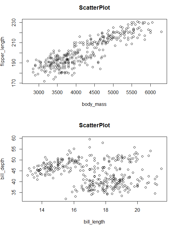
combined plots using mfrows
Using mfcol to combine plots
In this example, we create two single plots and combine them column-wise using par() method and mfcol parameter.
R
math_marks <- c(90, 95, 85, 76, 65)
science_marks <- c(45, 98, 54, 87, 65)
student_names <- c("A", "B", "C", "D", "E")
par(mfcol = c(1,2))
pie(math_marks, student_names,
main = "PieChart", radius = 0.75)
pie(science_marks, student_names,
main = "Piechart", radius = 0.75)
|
Output:
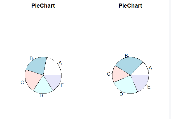
combined pie charts using mfcol
Using layout() to combine plots
We use the layout() parameter to combine plots according to our requirements and we use layout() to customize the combined plot.
Note: layout() function can be used only within an open device, otherwise you will get an error.
To avoid errors while using layout() function use the windows() function which creates a new window to combine plots.layout() takes a matrix as its arguments along with nrow and ncol etc.
R
game <- data.frame(scores <- c(34, 54, 21, 67, 98),
players <- c("A", "B", "C", "D", "E"),
avg_score <- c(56, 43, 65, 23, 16))
windows()
layout(matrix(c(1, 2, 3, 4), nrow = 2,
ncol = 2, byrow = TRUE))
plot(game$scores, game$avg_score,
main = "ScatterPlot",
xlab = "Score_in_game",
ylab = "avg_score")
boxplot(game$avg_score, main = "Boxplot")
hist(game$scores, main = "Histogram",
xlab = "scores")
pie(game$avg_score, game$players,
main = "Piechart", radius = 0.75)
|
Output:

combined plots using layout()
To display the layout of the plot, you can use layout.show() function. More examples of layout() function
R
par(mfrow = c(2, 2), mar=c(5, 5, 5, 5))
layout(matrix(c(2, 0, 1, 3), 2, 2, byrow = TRUE),
widths=c(3, 3), heights=c(1, 3))
set.seed(123)
x <- rnorm(100)
y <- rnorm(100)
barplot(x, main = "Bar Plot", col = "blue")
plot(x, y, main = "Scatter Plot",
col = "red", pch = 16)
d <- density(x)
plot(d, main = "Density Plot",
col = "green", type = "l")
|
Output:
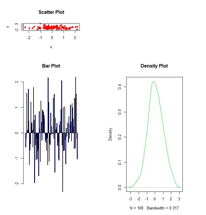
combined plots using layout()
R
layout(matrix(c(1,2,3,3), ncol=2, byrow=TRUE))
x <- rnorm(100)
y <- rnorm(100)
plot(density(x), col = "green")
plot(x, y, 'p', col = "red")
barplot(x, col = "yellow")
|
Output:
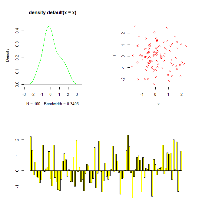
combined plots using layout()
We can create just a simple layout without any graphs in it for demonstration purposes.
R
example <- layout(matrix(c(2, 0, 1, 3),
2, 2, byrow = TRUE))
layout.show(example)
|
Output:
Share your thoughts in the comments
Please Login to comment...