Combine bar and line chart in ggplot2 in R
Last Updated :
24 Jun, 2021
Sometimes while dealing with hierarchical data we need to combine two or more various chart types into a single chart for better visualization and analysis. These are known as “Combination charts”. In this article, we are going to see how to combine a bar chart and a line chart in R Programming Language using ggplot2.
Dataset in use: Courses Sold vs Students Enrolled
| Year |
Courses Sold |
Percentage Of Students Enrolled |
| 2014 |
35 |
30% |
| 2015 |
30 |
25% |
| 2016 |
40 |
30% |
| 2017 |
25 |
50% |
| 2018 |
30 |
40% |
| 2019 |
35 |
20% |
| 2020 |
65 |
60% |
In order to plot a bar plot in R, we use the function geom_bar( ).
Syntax:
geom_bar(stat, fill, color, width)
Parameters :
- stat : Set the stat parameter to identify the mode.
- fill : Represents color inside the bars.
- color : Represents color of outlines of the bars.
- width : Represents width of the bars.
Also, the line plot is plotted using the function geom_line( ).
Syntax:
geom_line(mapping=NULL, data=NULL, stat=”identity”, position=”identity”,…)
Example:
R
year <- c(2014, 2015, 2016, 2017, 2018, 2019,2020)
course <- c(35, 30, 40, 25, 30, 35, 65)
penroll <- c(0.3, 0.25, 0.3, 0.5, 0.4, 0.2, 0.6)
perf <- data.frame(year, course, penroll)
head(perf)
library(ggplot2)
ggplot(perf) +
geom_bar(aes(x=year, y=course),stat="identity", fill="cyan",colour="#006000")+
geom_line(aes(x=year, y=penroll),stat="identity",color="red")+
labs(title= "Courses vs Students Enrolled in GeeksforGeeks",
x="Year",y="Number of Courses Sold")
|
Output:
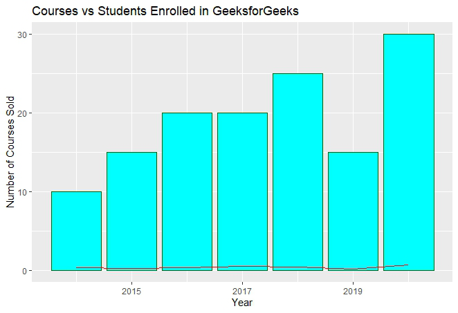
In the above plot, we can observe that the bar plot is in proper shape as expected, but the line plot is merely visible. It happens due to the scaling factor since the line plot is for the percentage of students which is in decimal and the current vertical axis having very large values. So, we need a secondary axis in order to fit the line properly in the same chart area.
As scaling comes into the picture, we have to use the R function scale_y_continuous( ) which comes in the ggplot2 package. Also, another function sec_axis( ) is used to add a secondary axis and assign the specifications to it.
Syntax:
sec_axis(trans,name,breaks,labels,guide)
Parameters :
- trans : A formula or function needed to transform.
- name : The name of the secondary axis.
Since we are dealing with a secondary Y-axis, so we need to write the command inside scale_y_continuous( ).
Syntax:
scale_y_continuous(name,labels,position,sec.axis,limits,breaks)
The scaling factor is the trickiest part to handle while dealing with a secondary axis. Since the secondary axis needs to be in percentage we have to use the scale factor of 0.01 and write the formula of conversion in the trans argument of sec_axis( ). And you are scaling with 0.01 in the formula, you also have to multiply the same axis with 100 in the geom_line( ) in order to make balance in scaling.
Example:
R
year <- c(2014, 2015, 2016, 2017, 2018, 2019,2020)
course <- c(35, 30, 40, 25, 30, 35, 65)
penroll <- c(0.3, 0.25, 0.3, 0.5, 0.4, 0.2, 0.6)
perf <- data.frame(year, course, penroll)
library(ggplot2)
ggp <- ggplot(perf) +
geom_bar(aes(x=year, y=course),stat="identity", fill="cyan",colour="#006000")+
geom_line(aes(x=year, y=100*penroll),stat="identity",color="red",size=2)+
labs(title= "Courses vs Students Enrolled in GeeksforGeeks",
x="Year",y="Number of Courses Sold")+
scale_y_continuous(sec.axis=sec_axis(~.*0.01,name="Percentage"))
ggp
|
Output:
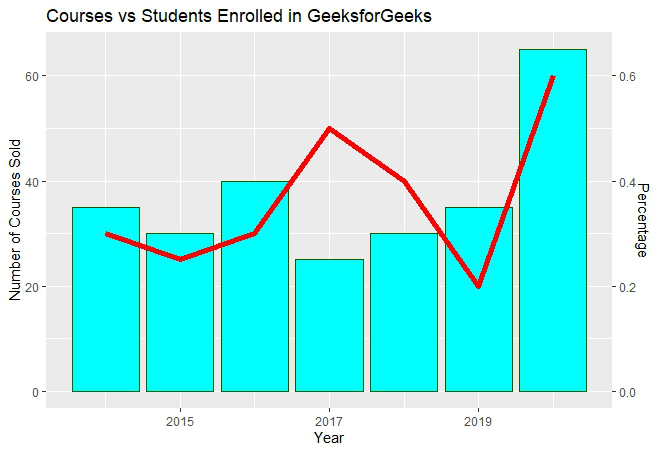
The secondary axis added will be in the form of fractional value as we can see above. But we need the secondary axis in percentage. In order to convert to percentage, we have to use the arguments labels inside the sec_axis( ).
Some important keywords used are :
- scale: It is used for scaling the data. A scaling factor is multiplied by the original data value.
- labels: It is used to assign labels.
The function used is scale_y_continuous( ) which is a default scale in “y-aesthetics” in the library ggplot2. Since we need to add “percentage” in the labels of the Y-axis, the keyword “labels” is used.
Now use below the command to convert the y-axis labels into percentages.
scales : : percent
This will simply scale the y-axis data from decimal to percentage. It multiplies the present value by 100. The scaling factor is 100.
Example:
R
year <- c(2014, 2015, 2016, 2017, 2018, 2019,2020)
course <- c(35, 30, 40, 25, 30, 35, 65)
penroll <- c(0.3, 0.25, 0.3, 0.5, 0.4, 0.2, 0.6)
perf <- data.frame(year, course, penroll)
library(ggplot2)
ggp <- ggplot(perf) +
geom_bar(aes(x=year, y=course),stat="identity", fill="cyan",colour="#006000")+
geom_line(aes(x=year, y=100*penroll),stat="identity",color="red",size=2)+
labs(title= "Courses vs Students Enrolled in GeeksforGeeks",
x="Year",y="Number of Courses Sold")+
scale_y_continuous(sec.axis=sec_axis(
~.*0.01,name="Percentage of Students Enrolled", labels=scales::percent))
ggp
|
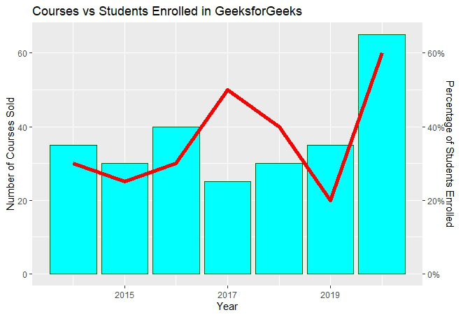
Output:
Like Article
Suggest improvement
Share your thoughts in the comments
Please Login to comment...