Combination Charts in Excel
Last Updated :
12 Sep, 2023
Sometimes while dealing with hierarchical data we need to combine two or more various chart types into a single chart for better visualization and analysis. These are known as “Combination charts” in Excel.
In this article, we are going to see how to make combination charts from a set of two different charts in Excel using the example shown below.
What is a Combo Chart in Excel
Combination charts in Excel is a tool that allows you to display multiple types of data on the same chart. These are also called Combo Charts. Combination charts are combinations of two or more different charts in Excel. To combine two charts, we should have two datasets but one common field combined. By combining different chart types, you can present complex datasets in a visually appealing and easy-to-understand manner.
Example: Consider a famous coaching institute that deals with both free content in their YouTube channel and also has their own paid online courses. There are broadly two categories of students in this institute :
- The students who enrolled but are learning from YouTube free video content.
- The students who enrolled in paid online video lectures.
So, the institute asked its Sales Department to make a statistical chart about how many paid courses from a pool of courses that the institute deals with sold from the year 2014 to the year 2020 and also show the percentage of students who have enrolled in the online paid courses only.
Table
| 2014 |
10 |
30% |
| 2015 |
15 |
25% |
| 2016 |
20 |
30% |
| 2017 |
20 |
50% |
| 2018 |
25 |
45% |
| 2019 |
15 |
20% |
| 2020 |
30 |
70% |
How to Create a Combination (Combo) Chart in Excel
There are various charts in Excel, which can be used to create an Excel Combination chart. For example, we can use Bar charts and Line Charts, Column Charts and Line charts, etc. Follow the below steps to create a Combination chart in Excel:
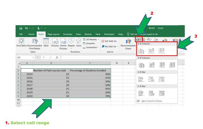
Step 1: Insert the data in the cells. After insertion, select the rows and columns by dragging the cursor.
Step 2: Now click on Insert Tab from the top of the Excel window and then select Insert Column or Bar Chart. From the pop-down menu select the first “2-D Column”.
 >Chart group” width=”660″ height=”inherit” srcset=”https://media.geeksforgeeks.org/wp-content/uploads/20210513094113/InsertPhoto0.jpg 1095w, https://media.geeksforgeeks.org/wp-content/uploads/20210513094113/InsertPhoto0-100×64.jpg 100w, https://media.geeksforgeeks.org/wp-content/uploads/20210513094113/InsertPhoto0-200×127.jpg 200w, https://media.geeksforgeeks.org/wp-content/uploads/20210513094113/InsertPhoto0-300×191.jpg 300w, https://media.geeksforgeeks.org/wp-content/uploads/20210513094113/InsertPhoto0-660×420.jpg 660w, https://media.geeksforgeeks.org/wp-content/uploads/20210513094113/InsertPhoto0-768×489.jpg 768w, https://media.geeksforgeeks.org/wp-content/uploads/20210513094113/InsertPhoto0-1024×652.jpg 1024w”>Inserting Bar Chart
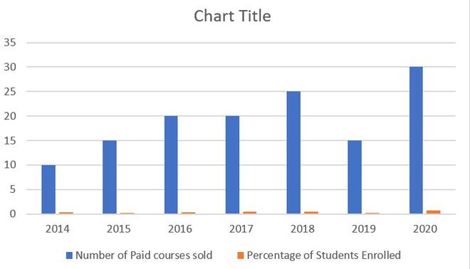
Bar Chart
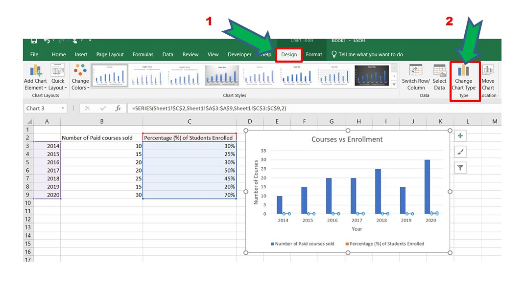
Step 3: To add a combination chart :
Select the Chart> Design > Change chart Type.
 Change Chart Type.” width=”inherit” height=”inherit”>
Another way is to right-click on the chart and select “Chart Type”.
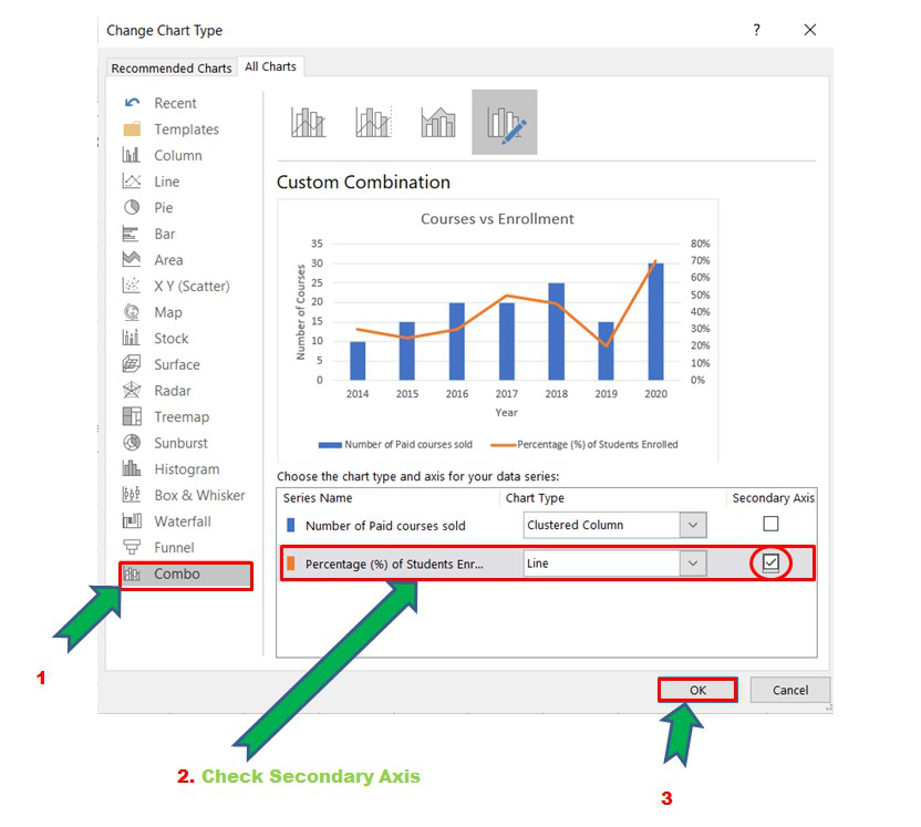
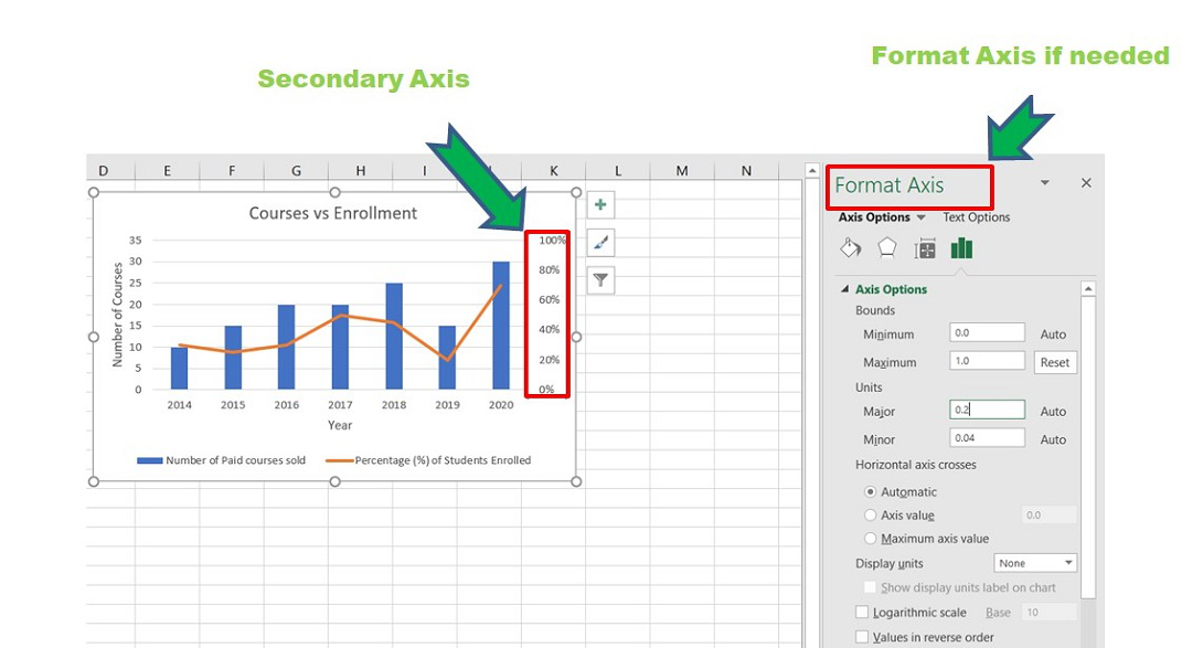
Step 4: The Chart Type window opens. Now go to the “Combo” option and check the “Secondary Axis” box for the “Percentage of Students Enrolled” column. This will add the secondary axis in the original chart and will separate the two charts. This will result in better visualization for analysis purposes.
Adding Combo
Combo chart with secondary axis
The combination charts are ready. The secondary axis is for the “Percentage of Students Enrolled”. The modifications can be performed in this secondary axis using the Format Axis window on the right corner of Excel.
Step 5: You can format the above combo chart by adding various “Chart Styles”, and suitable “Axis Titles” in all three axes. Refer to the image shown below :
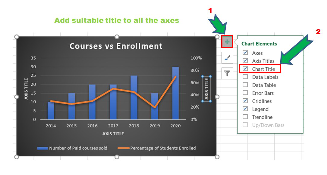
Updating and adding the axes title
Now, we can also change the type of the second chart. For that right-click on the chart and open the “Chart Type” window. In our case, we have selected a Stacked Line with markers for the Percentage of Students Enrolled line chart.
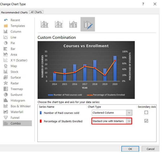
Changing the chart type
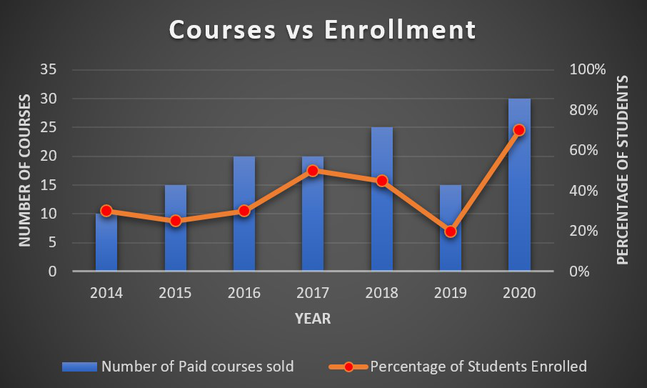
Final combination charts
We can infer from the above chart that in the year 2019, the percentage of students who enrolled in online paid courses is relatively less but in 2020 more students have enrolled in paid courses than free content on YouTube.
Advantages of Combo Chart
- It can be used to display two or more charts in one and can provide more concise information.
- It could represent using different charts to display the primary and secondary Y- axis.
- It can be used for critical comparison purposes, which could be beneficial for the future.
Disadvantages Combo Chart
- These charts sometimes become more complicated and complex as the number of charts increases
- Too many graphs may make it difficult to interrupt the parameters.
FAQs on Combo Charts in Excel
What are combination Charts in Excel?
Combination charts in Excel is a tool that allows you to display multiple types of data on the same chart. These are also called Combo Charts. Combination charts are combinations of two or more different charts in Excel. To combine two charts, we should have two datasets but one common field combined. By combining different chart types, you can present complex datasets in a visually appealing and easy-to-understand manner.
How to create a Combination Chart in Excel?
Follow the below steps to create a combination chart in Excel:
Step 1: Select the range of dataset you want in your dataset.
Step 2: Go to the Insert tab in the Excel Ribbon.
Step 3: Click on the “Recommended charts”, and choose the combination of charts according to your need.
Step 4: Customize the Chart as needed by right-clicking on various elements, such as data series, axis and labels.
When to use Combination Chart in Excel?
You can use a combination chart on the basis of the following points:
- Compare different data types that have different scales.
- Highlight trends between two datasets.
- Visualize targets and actuals for a better understanding of performance.
How to switch the chart types of individual data series in a combination chart?
To switch the chart type follow the below steps:
Step 1: Click on the data series in the Chart to select it.
Step 2: Go to the “Chart Design” or “Chart Tools” tab in the Excel Ribbon.
Step 3: In the “Change chart type” section, choose the desired chart type for the selected data series.
Like Article
Suggest improvement
Share your thoughts in the comments
Please Login to comment...