Class 8 RD Sharma Solutions – Chapter 24 Data Handling II (Graphical Representation of Data as Histograms) – Exercise 24.1 | Set 1
Last Updated :
19 Apr, 2021
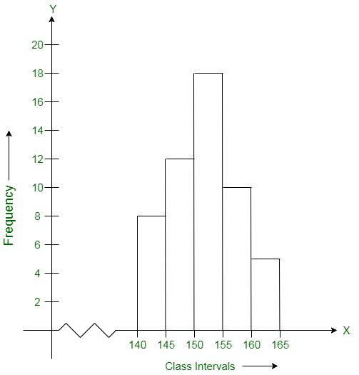
Question 1. Given below is the frequency distribution of the heights of 50 students of a class:
| Class Interval |
140 – 145 |
145 – 150 |
150 – 155 |
155 – 160 |
160 – 165 |
| Frequency |
8 |
12 |
18 |
10 |
5 |
Draw a histogram representing the above data.
Solution:
To draw a histogram first construct x-axis and y-axis, where the x-axis represents class interval and the y-axis represents the frequency. Now, by taking suitable intervals from the given frequency table, we construct the rectangles as shown in the below figure.
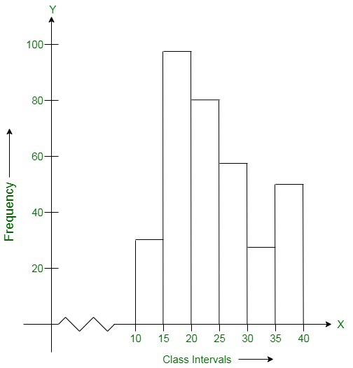
Question 2. Draw a histogram of the following data:
| Class Interval |
10 – 15 |
15 – 20 |
20 – 25 |
25 – 30 |
30 – 35 |
35 – 40 |
| Frequency |
30 |
98 |
80 |
58 |
29 |
50 |
Solution:
To draw a histogram first construct x-axis and y-axis, where the x-axis represents class interval and the y-axis represents the frequency. Now, by taking suitable intervals from the given frequency table, we construct the rectangles as shown in the below figure.
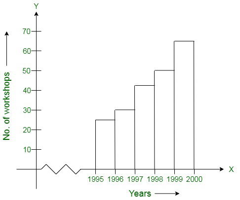
Question 3. Number of workshops organized by a school in different areas during the last five years are as follows:
| Years |
No. of Workshops |
| 1995 – 1996 |
25 |
| 1996 – 1997 |
30 |
| 1997 – 1998 |
42 |
| 1998 – 1999 |
50 |
| 1999 – 2000 |
65 |
Draw a histogram representing the above data.
Solution:
To draw a histogram first construct x-axis and y-axis, where the x-axis represents class interval and the y-axis represents the frequency. Now, by taking suitable intervals from the given frequency table, we construct the rectangles as shown in the below figure.
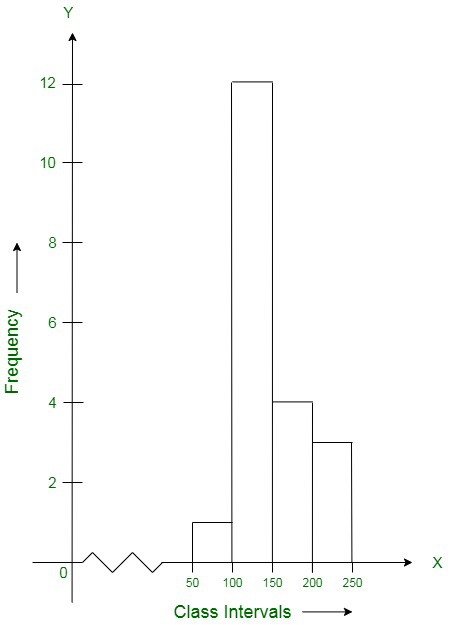
Question 4. In a hypothetical sample of 20 people the amounts of money with them were found to be as follows:
114, 108, 100, 98, 101, 109, 117, 119, 126, 131, 136, 143, 156, 168, 182, 195, 207, 219, 235, 118.
Draw the histogram of the frequency distribution (taking one of the class intervals as 50-100).
Solution:
First we create a frequency table using the given observations:
| Class Interval |
Frequency |
| 50 – 100 |
2 |
| 100 – 150 |
11 |
| 150 – 200 |
4 |
| 200 – 250 |
3 |
Now we draw a histogram using the frequency table:
To draw a histogram first construct x-axis and y-axis, where the x-axis represents class interval and the y-axis represents the frequency. Now, by taking suitable intervals from the given frequency table, we construct the rectangles as shown in the below figure.
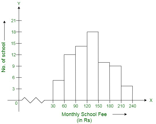
Question 5. Construct a histogram for the following data:
| Monthly School Fee(in Rs) |
30-60 |
60-90 |
90-120 |
120-150 |
150-180 |
180-210 |
210-240 |
| No. of Schools |
5 |
12 |
14 |
18 |
10 |
9 |
4 |
Solution:
To draw a histogram first construct x-axis and y-axis, where the x-axis represents monthly school fee(in Rs) and y-axis represents the no. of schools. Now, by taking suitable intervals from the given frequency table, we construct the rectangles as shown in the below figure.
Question 6. Draw a histogram for the daily earnings of 30 drug stores in the following table:
| Daily Earnings(in Rs) |
450 – 500 |
500 – 550 |
550-600 |
600-650 |
650-700 |
| No. of Stores |
16 |
10 |
7 |
3 |
1 |
Solution:
To draw a histogram first construct x-axis and y-axis, where x-axis represents monthly daily earnings(in Rs) and y-axis represents the no. of stores. Now, by taking suitable intervals from the given frequency table, we construct the rectangles as shown in the below figure.

Like Article
Suggest improvement
Share your thoughts in the comments
Please Login to comment...