Circular Packing to visualise hierarchy data in R
Last Updated :
16 Feb, 2022
In this article, we are talking about handling hierarchical data using circular packing visualizations. To prepare circular packing with R Programming Language, we will use ggraph package and prepare a bubble to show the hierarchies.
Circular Packing to visualize hierarchy data in R
Preparing the Hierarchical Data
Here we are going to prepare hierarchical data for demonstration. For this, we will use flare datasets.
R
library(ggraph)
library(igraph)
library(tidyverse)
library(viridis)
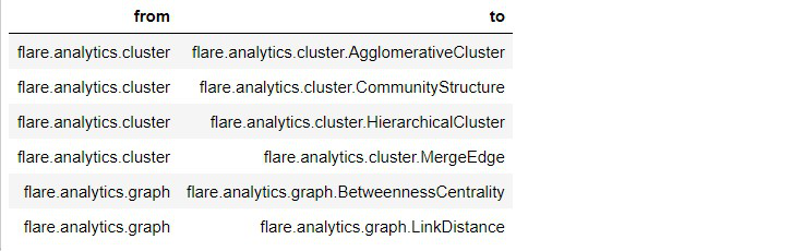
edges = flare$edges
head(edges)
|
Output:
Creating another dataframe for hierarchical structure
R
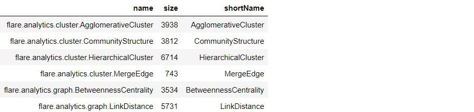
vertices = flare$vertices
head(vertices)
|
Output:
Preparing the graph with dataframe:
R
mygraph <- graph_from_data_frame( edges,
vertices = vertices )
mygraph
|
Output:
IGRAPH 6e05b59 DN-- 252 251 --
+ attr: name (v/c), size (v/n), shortName (v/c)
+ edges from 6e05b59 (vertex names):
[1] flare.analytics.cluster->flare.analytics.cluster.AgglomerativeCluster
[2] flare.analytics.cluster->flare.analytics.cluster.CommunityStructure
[3] flare.analytics.cluster->flare.analytics.cluster.HierarchicalCluster
[4] flare.analytics.cluster->flare.analytics.cluster.MergeEdge
[5] flare.analytics.graph  ->flare.analytics.graph.BetweennessCentrality
[6] flare.analytics.graph  ->flare.analytics.graph.LinkDistance
[7] flare.analytics.graph  ->flare.analytics.graph.MaxFlowMinCut
[8] flare.analytics.graph  ->flare.analytics.graph.ShortestPaths
+ ... omitted several edges
Visualize Circular Hierarchy
Here we will visualize the dataframe with a hierarchical structure.
R
ggraph(mygraph,
layout = 'circlepack',
weight = size) +
geom_node_circle(aes(fill = as.factor(depth),
color = as.factor(depth) )) +
scale_color_manual( values=c("0" = "green", "1" = "red",
"2" = "red",
"3" = "red", "4"="red") ) +
scale_fill_manual(values = c("0" = "green", "1" = viridis(4)[1],
"2" = viridis(4)[2], "3" = viridis(4)[3],
"4" = viridis(4)[4])) +
theme_void()
|
Output:
Like Article
Suggest improvement
Share your thoughts in the comments
Please Login to comment...