Categorical bubble plot in R
Last Updated :
16 Mar, 2021
A Scatter plot is a graphical representation of two numeric variables related to each other based on the premise of Cartesian coordinate system where a point or dot is plotted at the intersection of the imaginary vertical and horizontal lines extending from the values of the X and Y axes respectively. One of the variables is represented along the X-axis which is usually the horizontal axis and the other is represented along the vertical direction, usually the Y-axis. An enhancement of the Scatter plot is the Bubble Plot where the traditional dots or points of the Scatter Plot are replaced by circles or bubbles. This allows the introduction of another numeric variable to be represented simultaneously whose value is mapped corresponding to the size of the bubble. Thus, the bubble plot allows us to map three numeric variables in the same plot.
A further extension or rather enhancement of the bubble plot is the categorical bubble plot where we can represent a categorical variable in addition to the three numeric variables that were already being mapped in the bubble plot. The working mechanism of the categorical bubble plot is that the position of the bubbles is determined by the values of two numeric variables mapped along the X and Y axes. The size of the bubble is determined by the value of the third numeric variable. In addition to all this, the color of the bubble specifies the category to which it belongs which is how the categorical variable is represented in the same plot. In this article, we are going to explore 2 approaches to plot bubble plots in R. These approaches are as mentioned below :
- using the ggplot2 library
- using the plotly library
Method 1: Using GGPLOT2
In this approach, we use the ggplot2 () library which is a very comprehensive library for rendering all types of charts and graphs. Under this approach, we add two additional parameters in the aes() function by the name of “size” the value of which is a numerical variable, and “color” which is used to represent the categorical variable. The syntax and parameters required for the bubble plot using ggplot are mentioned below.
Syntax: ggplot(name of data frame, aes(x = column name of first numeric column, y = column name of second numeric variable, size = column name of the variable to specify the size, color = column name of the categorical variable))
To specify the range of sizes of the bubbles, we use :
scale_size(range = the range of sizes of the bubbles, name = name to be displayed on top of the size legend)
Approach
- Create data set
- Import module
- Plot data frame
- Display plot
Program :
R
height <- abs(rnorm(25, 175, 10))
weight <- abs(rnorm(25, 72, 10))
population <- floor(abs(rnorm(25, 1500, 500)))
cities <- c(rep("Delhi", 7), rep("Mumbai", 6),
rep("Chennai", 6), rep("Bengaluru", 6))
dataframe <- data.frame(height, weight,
population, cities)
library(ggplot2)
ggplot(dataframe, aes(x = weight, y = height,
size = population,
color = cities))+
geom_point(alpha = 0.7)+
scale_size(range = c(0.1, 10), name = "Population")+
ggtitle("Height and Weight Data of 4 Cities")+
theme(plot.title = element_text(hjust = 0.5))
|
Output:
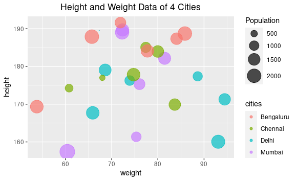
Categorical Bubble Plot using ggplot
Method 2: Using Plotly
Plotly is an R package/library that is used to design and render interactive graphs. It is built on top of the open-source Javascript library and is used to generate publication-ready graphs and charts. In case, plotly is not included in your R environment.
The syntax and parameters required for rendering categorical bubble plot using plotly are mentioned below:
Syntax :
We use plot_ly () function to generate plots using plotly.
Parameter:
- the data set ( data frame here)
- x = ~column name of the variable to be displayed on the X-axis
- y = ~column name of the variable to be displayed on the Y-axis
- text = ~name of column to be displayed when the cursor hovers above the bubble
- color = ~column name based on which the color is assigned (the categorical variable)
- size = ~column name to determine the size of the bubble
- sizes = c() to specify the ranges of the bubble sizes
- marker = list() to specify opacity as well as the unit of measurement as in diameter
- We can also specify the layout which comprises title, the grid structure and so on using the layout() function.
Approach
- Create data frame
- Import module
- Create plot
- Display plot
Program :
R
height <- abs(rnorm(25, 175, 10))
weight <- abs(rnorm(25, 72, 10))
population <- floor(abs(rnorm(25, 1500, 500)))
cities <- c(rep("Delhi", 7), rep("Mumbai", 6),
rep("Chennai", 6), rep("Bengaluru", 6))
dataframe <- data.frame(height, weight,
population, cities)
library(plotly)
bubbleplot <- plot_ly(dataframe, x = ~weight, y = ~height,
text = ~cities, size = ~population,
color = ~cities, sizes = c(10, 50),
marker =
list(opacity = 0.7,
sizemode = "diameter"))
bubbleplot <- bubbleplot%>%layout
(title = "Height and Weight Data of 4 Cities",
xaxis = list(showgrid = TRUE),
yaxis = list(showgrid = TRUE))
bubbleplot
|
Output :
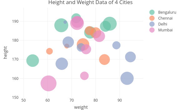
Categorical Bubble Plot generated using Plotly
Like Article
Suggest improvement
Share your thoughts in the comments
Please Login to comment...