Calculation of Correlation with Scattered Diagram
Last Updated :
06 Apr, 2023
What is Correlation?
A statistical tool that helps in the study of the relationship between two variables is known as Correlation. It also helps in understanding the economic behaviour of the variables. However, correlation does not tell anything about the cause-and-effect relationship between the two variables. Correlation can be measured through three different methods; viz., Scatter Diagram, Karl Pearson’s Coefficient of Correlation, and Spearman’s Rank Correlation Coefficient.
According to L.R. Connor, “If two or more quantities vary in sympathy so that movements in one tend to be accompanied by corresponding movements in others, then they are said to be correlated.”
What is a Scatter Diagram?
A simple and attractive method of measuring correlation by diagrammatically representing bivariate distribution for determination of the nature of the correlation between the variables is known as Scatter Diagram Method. This method gives a visual idea to the investigator/analyst regarding the nature of the association between the two variables. It is the simplest method of studying the relationship between two variables as there is no need to calculate any numerical value.
How to draw a Scatter Diagram?
The two steps required to draw a Scatter Diagram or Dot Diagram are as follows:
- Plot the values of the given variables (say X and Y) along the X-axis and Y-axis, respectively.
- Show these plotted values on the graph by dots. Each of these dots represents a pair of values.
Interpretation of Scatter Diagram
After observing the pattern of dots, one can know the presence or absence of correlation and its type. Besides, it also gives an idea of the nature and intensity of the relationship between the two variables.
The scatter diagram can be interpreted in the following ways:
1. Perfect Positive Correlation:
If the points of the scatter diagram fall on a straight line and have a positive(upward) slope, then the correlation is said to be perfectly positive; i.e., r = +1.
2. Perfect Negative Correlation:
If the points of the scatter diagram fall on a straight line and have a negative(downward) slope, then the correlation is said to be perfectly negative; i.e., r = -1.
3. Positive Correlation:
When the points of the scatter diagram cluster around a straight line (upward slope from left to right), then the correlation is said to be positive.
4. Negative Correlation:
When the points of the scatter diagram cluster around a straight line (downward/negative slope), then the correlation is said to be negative.
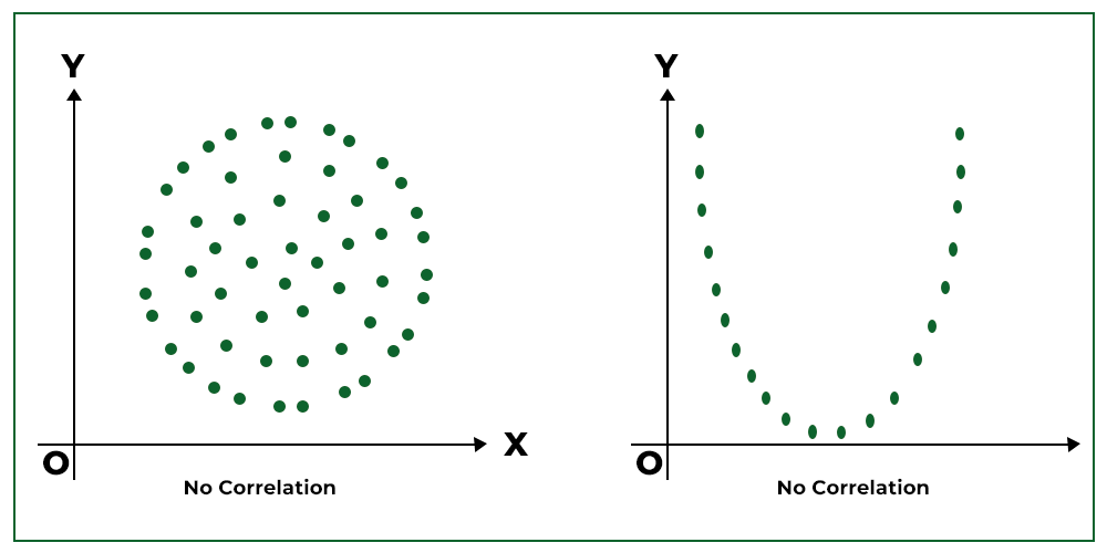
5. No Correlation:
When the points of the scatter diagram are scattered in a haphazard manner, then there is zero or no correlation.
How to interpret a Scatter Diagram?
While interpreting a scatter diagram, the given below points should be taken into consideration:
- Dense or Scattered Points: If the plotted points are close to each other, then the analyst can expect a high degree of correlation between the two variables. However, if the plotted points are widely scattered, then the analyst can expect a poor correlation between the variables.
- Trend or No Trend: If the points plotted on the scatter diagram shows any trend either upward or downward, then it can be said that the variables are correlated. However, if the plotted points do not show any trend, then it can be said that the variables are uncorrelated.
- Upward or Downward Trend: If the plotted points show an upward trend rising from the lower left-hand corner of the graph and goes upward to the upper right-hand corner, then the correlation is positive. It means that the two variables move in the same direction. However, if the plotted points show a downward trend from the upper left-hand corner of the graph to the lower right-hand corner, then the correlation is negative. It means that the two variables move in the opposite direction.
- Perfect Correlation: If the points plotted on the scatter diagram lie on a straight line and have a positive slope, then it can be said that the correlation is perfect and positive. However, if the points plotted lie on a straight line and have a negative slope, then it can be said that the correlation is perfect and negative.
Example:
Draw a Scatter Diagram for the following data and state the type of correlation between the given two variables X and Y.
Solution:
We will draw the scatter diagram by plotting the values of Series X on the X-axis and values of Series y on the Y-axis (10, 80), (20, 160),………(60, 480).
We can see that all the points of the given two variables X and Y are plotted on a positively sloping straight line, which means that there is a Positive Correlation between the values of Series X and Y.
Merits of Scatter Diagram
1. Simplicity: Scatter Diagram is a simple and non-mathematical method to study correlation between two variables.
2. First Step: It is the first step of investigating the relationship between two variables.
3. Easily Understandable: One can easily understand and interpret scatter diagrams. Besides, only at a single glance at the diagram, one can easily tell the presence or absence of correlation.
4. Not Affected by Extreme Items: The size of extreme values does not affect the scatter diagram. It is a quality which is not present in most mathematical methods.
Demerits of Scatter Diagram
1. Rough Measure: Scatter diagram only gives a rough idea of the degree and nature of correlation between the given two variables. Therefore, it is only a qualitative expression rather than a quantitative expression.
2. Non-mathematical Method: Like other methods of correlation, Scatter Diagram Method does not indicate the exact numerical value of correlation.
3. Unsuitable for Large Observations: If there are more than two variables, it becomes difficult to draw a scatter diagram.
Like Article
Suggest improvement
Share your thoughts in the comments
Please Login to comment...