Bulma Responsiveness Vertical by default
Last Updated :
17 Feb, 2022
Bulma is a component-rich, mobile-first CSS framework based on flexbox. Since it is a mobile-first framework, by default the columns are stacked vertically on top of each other, the children of the level component are also shown vertically on mobile devices and the navigation menu is also hidden on mobile devices by default.
So, if we want, we can force layout columns and the level component horizontally by using the is-mobile modifier.
Bulma Responsiveness Vertical by default Classes:
- is-mobile: This class is used to enforce columns and the level component to adopt a horizontal layout on mobile devices.
Syntax:
<div class="columns is-mobile">
    ...
</div>
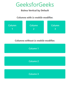
Example 1: The below example shows the use of the is-mobile modifier on the columns to make them adopt a horizontal layout on mobile devices.
HTML
<!DOCTYPE html>
<html>
<head>
<title>Bulma Vertical by Default</title>
<link rel='stylesheet'
href=
<style>
.container>p{
margin-top: 25px;
margin-bottom: 10px;
}
</style>
</head>
<body class="has-text-centered">
<h1 class="is-size-2 has-text-success">
GeeksforGeeks
</h1>
<b>Bulma Vertical by Default</b>
<div class="container is-fluid">
<p>
<b>Columns with <i>is-mobile</i> modifier.</b>
</p>
<div class="columns is-mobile">
<div class="column">
<div class="notification is-primary">
Column 1
</div>
</div>
<div class="column">
<div class="notification is-primary">
Column 2
</div>
</div>
<div class="column">
<div class="notification is-primary">
Column 3
</div>
</div>
</div>
<p>
<b>Columns without <i>is-mobile</i> modifier.</b>
</p>
<div class="columns">
<div class="column">
<div class="notification is-primary">
Column 1
</div>
</div>
<div class="column">
<div class="notification is-primary">
Column 2
</div>
</div>
<div class="column">
<div class="notification is-primary">
Column 3
</div>
</div>
</div>
</div>
</body>
</html>
|
Output: (On mobile devices)
Bulma Responsiveness Vertical by default
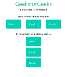
Example 2: The below example shows the use of the is-mobile modifier on the levels component in Bulma.
HTML
<!DOCTYPE html>
<html>
<head>
<title>Bulma Vertical by Default</title>
<link rel='stylesheet'
href=
<style>
.container>p {
margin-top: 25px;
margin-bottom: 10px;
}
</style>
</head>
<body class="has-text-centered">
<h1 class="is-size-2 has-text-success">
GeeksforGeeks
</h1>
<b>Bulma Vertical by Default</b>
<div class="container is-fluid">
<p>
<b>Level with <i>is-mobile</i> modifier.</b>
</p>
<nav class="level is-mobile">
<div class="level-item">
<div class="notification is-primary">
Item 1
</div>
</div>
<div class="level-item has-text-centered">
<div class="notification is-primary">
Item 2
</div>
</div>
<div class="level-item has-text-centered">
<div class="notification is-primary">
Item 3
</div>
</div>
</nav>
<p>
<b>Level without <i>is-mobile</i> modifier.</b>
</p>
<nav class="level">
<div class="level-item">
<div class="notification is-primary">
Item 1
</div>
</div>
<div class="level-item has-text-centered">
<div class="notification is-primary">
Item 2
</div>
</div>
<div class="level-item has-text-centered">
<div class="notification is-primary">
Item 3
</div>
</div>
</nav>
</div>
</body>
</html>
|
Output: (on mobile devices)
Bulma Responsiveness Vertical by default
Reference: https://bulma.io/documentation/overview/responsiveness/#vertical-by-default
Like Article
Suggest improvement
Share your thoughts in the comments
Please Login to comment...