Bulma Multiple select
Last Updated :
20 Jan, 2022
Bulma is a free, open-source CSS framework based on flexbox. It is component-rich, compatible, and well documented. It is highly responsive in nature. It uses classes to implement its design.
Bulma multiple select is used to create a style of multiple select dropdown items. The multiple select items are created by using is-multiple modifiers by using the HTML <select> multiple attributes.
Multiple select classes:
- is-multiple: It is used to create multiple select items menu from the dropdown list.
Syntax:
<div class="select is-multiple">
     <select multiple size="">
           <option value=""> ... </option>
       </select>
</div>
Example:
HTML
<!DOCTYPE html>
<html>
<head>
<title>Bulma Multiple select</title>
<link rel='stylesheet'
href=
</head>
<body class="has-text-centered">
<h1 class="is-size-1 has-text-success">
GeeksforGeeks
</h1>
<p class="is-size-3">Bulma Multiple select</p>
<div class="container">
<div class="select is-multiple">
<select multiple size="5">
<option value="webdev">Web Technology</option>
<option value="html">HTML</option>
<option value="css">CSS</option>
<option value="js">JavaScript</option>
<option value="php">PHP</option>
</select>
</div>
</div>
</body>
</html>
|
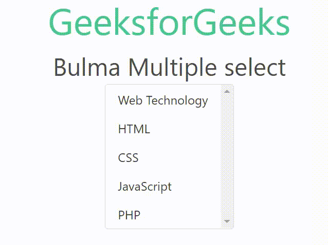
Output:
Reference: https://bulma.io/documentation/form/select/#multiple-select
Like Article
Suggest improvement
Share your thoughts in the comments
Please Login to comment...