Borders in bootstrap with examples
Last Updated :
03 Aug, 2023
Borders: Borders are generally used to display an outline around a box or table cell or any other HTML element. In Bootstrap, there are different classes available to add or remove borders. The classes that are used to add borders are referred as Additive classes and those that are used to remove borders are referred as subtractive classes.
Additive Border Classes:
- .border: This class adds a border all around the element.
- .border-top: This class adds a border on the top edge of the element.
- .border-left: This class adds a border on the left edge of the element.
- .border-right: This class adds a border on the right of the element.
- .border-bottom: This class adds a border on the bottom of the element.
Subtractive Border Classes:
- .border-0: This class removes the border from all around the element if exists.
- .border-top-0: This class removes the border from the top edge of the element if exists.
- .border-left-0: This class removes the border from the left edge of the element if exists.
- .border-right-0: This class removes the border from the right of the element if exists.
- .border-bottom-0: This class removes the border from the bottom of the element if exists.
The below program uses all of the additive and subtractive classes to add and remove borders:
html
<!DOCTYPE html>
<html>
<head>
<title>Bootstrap Example</title>
<link rel="stylesheet"
href=
<script src=
</script>
<script src=
</script>
<script src=
</script>
<style>
/* CSS for Square boxes */
span {
display: inline-block;
width: 70px;
height: 70px;
margin: 6px;
background-color: #DCDCDC;
}
</style>
</head>
<body>
<div class="container">
<h2>Additive Border Classes</h2>
<span class="border border-dark"></span>
<span class="border-top border-dark"></span>
<span class="border-right border-dark"></span>
<span class="border-bottom border-dark"></span>
<span class="border-left border-dark"></span>
</div>
<div class="container">
<h2>Subtractive Border Classes</h2>
<span class="border border-dark"></span>
<span class="border border-0 border-dark"></span>
<span class="border border-top-0 border-dark"></span>
<span class="border border-right-0 border-dark"></span>
<span class="border border-bottom-0 border-dark"></span>
<span class="border border-left-0 border-dark"></span>
</div>
</body>
</html>
|
Output:

Color of Borders: Any color can be added to the border by using the following border-color classes that are available in Bootstrap. If you want any other customized color, then you can set it manually using the CSS attribute.
html
<!DOCTYPE html>
<html>
<head>
<title>Bootstrap Example</title>
<link rel="stylesheet"
href=
<script src=
</script>
<script src=
</script>
<script src=
</script>
<style>
/* CSS style for Boxes */
span {
display: inline-block;
width: 70px;
height: 70px;
margin: 6px;
background-color: #DCDCDC;
}
</style>
</head>
<body>
<div class="container">
<h2>Borders</h2>
<p>Color Border:</p>
<span class="border border-primary"></span>
<span class="border border-secondary"></span>
<span class="border border-success"></span>
<span class="border border-danger"></span>
<span class="border border-warning"></span>
<span class="border border-info"></span>
<span class="border border-light"></span>
<span class="border border-dark"></span>
</div>
</body>
</html>
|
Output:

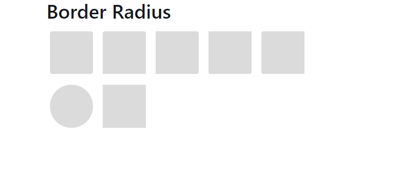
Radius of Borders: Border radius is used to make the corner of the border curved. The more the radius, the more curved and round it will be.
In Bootstrap, the following classes as used in the code are used to implement radius at particular corners.
html
<!DOCTYPE html>
<html>
<head>
<title>Bootstrap Example</title>
<link rel="stylesheet"
href=
<script src=
</script>
<script src=
</script>
<script src=
</script>
<style>
/* CSS Style for Boxes */
span {
display: inline-block;
width: 70px;
height: 70px;
margin: 6px;
background-color: #DCDCDC;
}
</style>
</head>
<body>
<div class="container">
<h2>Border Radius</h2>
<span class="rounded"></span>
<span class="rounded-top"></span>
<span class="rounded-right"></span>
<span class="rounded-bottom"></span>
<span class="rounded-left"></span>
<span class="rounded-circle"></span>
<span class="rounded-0"></span>
</div>
</body>
</html>
|
Output:
Supported Browser:
- Google Chrome
- Firefox
- Opera
- Safari
Like Article
Suggest improvement
Share your thoughts in the comments
Please Login to comment...