Bootstrap5 Layout Utilities
Last Updated :
15 Apr, 2024
Bootstrap 5 Layout Utilities facilitate mobile-friendly, responsive websites. They offer numerous utility classes for tasks like displaying, hiding, aligning, and spacing content, enabling versatile modifications tailored to different design requirements.
| Name | Description |
|---|
| Changing display | Bootstrap 5 provides display properties for responsive output mixing with grid, content, or components. |
| Flexbox options | Flexbox in Bootstrap 5 for responsive layout design of components with dynamic arrangement. |
| Margin and padding | Bootstrap 5’s margin and padding utility sets space with a six-level scale based on 1rem. |
| Toggle visibility | Bootstrap 5 toggles element visibility without changing the layout, providing control over the display. |
Example 1: In this example we demonstrates Bootstrap 5 Layout Utilities. It features two sections, one with inline display and another with block display, styled with padding, background color, and text color classes from Bootstrap.
HTML
<!DOCTYPE html>
<html>
    <head>
        <link
            rel="stylesheet"
            href=
"https://stackpath.bootstrapcdn.com/bootstrap/5.0.0-alpha1/css/bootstrap.min.css"
            crossorigin="anonymous"
        />
        <title>Bootstrap5 Layout Utilities</title>
    </head>

    <body>
        <h3>Bootstrap5 Layout Utilities</h3>
        <br />
        <section
            class="d-inline p-2
                   bg-primary
                   text-white"
        >
            GFG inline element
        </section>
        <br />
        <br />
        <section
            class="d-block p-2
                   bg-dark
                   text-white"
        >
            GFG block element
        </section>
    </body>
</html>
Output:

Bootstrap5 Layout Utilities Example Output
Example 2: let’s see an example of flexbox utility.
HTML
<!DOCTYPE html>
<html>
    <head>
        <link
            rel="stylesheet"
            href=
"https://stackpath.bootstrapcdn.com/bootstrap/5.0.0-alpha1/css/bootstrap.min.css"
            crossorigin="anonymous"
        />
        <title>Bootstrap5 Layout Utilities</title>
    </head>

    <body>
        <h3>Bootstrap5 Layout Utilities</h3>
        <br />
        <p>
            <b>normal form of rows</b>
        </p>
        <section>
            <div class="p-2 border">GFG 1</div>
            <div class="p-2 border">GFG 2</div>
            <div class="p-2 border">GFG 3</div>
        </section>
        <br />
        <p>
            <b
                >When we applied display property
                in rows</b
            >
        </p>
        <section class="d-flex">
            <div class="p-2 border">GFG 1</div>
            <div class="p-2 border">GFG 2</div>
            <div class="p-2 border">GFG 3</div>
        </section>
    </body>
</html>
Output:
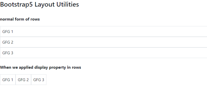
Bootstrap5 Layout Utilities Example Output
Like Article
Suggest improvement
Share your thoughts in the comments
Please Login to comment...