Bootstrap 5 Progress Multiple bars
Last Updated :
25 Nov, 2022
Bootstrap 5 Progress Multiple bars is used to put multiple bars in a single progress bar you can include multiple progress bars in a progress component giving them different colors and styling using bootstrap 5 classes.
Bootstrap 5 Progress Multiple bars Class: There is no class to create multiple progress bars, we just need to include multiple progress bars in the progress component.
Syntax: Here * can be any value.
<div class="progress">
    <div class="progress-bar ..."
         style="width: "
         aria-valuenow="*"
         aria-valuemin="*"
         aria-valuemax="*">
    </div>
    <div class="progress-bar ..."
         style="width: "
         aria-valuenow="*"
         aria-valuemin="*"
         aria-valuemax="*">
    </div>
</div>
Below example illustrate the Bootstrap 5 Progress Multiple bars:
Example1:In this example, we set the different width progress classes adding different colors and backgrounds.
HTML
<!DOCTYPE html>
<html lang="en">
<head>
<link href=
rel="stylesheet">
</head>
<body>
<div class="container">
<div>
<h1 class="text-success">GeeksforGeeks</h1>
<h3> Bootstrap 5 Progress Multiple bars</h3>
</div>
<div>
<div class="progress mb-3 mt-4">
<div class="progress-bar bg-warning"
style="width: 10%"
aria-valuenow="10"
aria-valuemin="0"
aria-valuemax="100">
</div>
<div class="progress-bar bg-primary"
style="width: 30%"
aria-valuenow="30"
aria-valuemin="0"
aria-valuemax="100">
</div>
<div class="progress-bar bg-secondary"
style="width: 20%"
aria-valuenow="20"
aria-valuemin="0"
aria-valuemax="100">
</div>
</div>
<div class="progress mb-3">
<div class="progress-bar bg-secondary"
style="width: 15%"
aria-valuenow="15"
aria-valuemin="0"
aria-valuemax="100">
</div>
<div class="progress-bar bg-success"
style="width: 30%"
aria-valuenow="30"
aria-valuemin="0"
aria-valuemax="100">
</div>
<div class="progress-bar bg-info"
style="width: 20%"
aria-valuenow="20"
aria-valuemin="0"
aria-valuemax="100">
</div>
</div>
<div class="progress mb-3">
<div class="progress-bar bg-warning"
style="width: 20%"
aria-valuenow="20"
aria-valuemin="0"
aria-valuemax="100">
</div>
<div class="progress-bar bg-danger"
style="width: 40%"
aria-valuenow="40"
aria-valuemin="0"
aria-valuemax="100">
</div>
<div class="progress-bar bg-primary"
style="width: 25%"
aria-valuenow="25"
aria-valuemin="0"
aria-valuemax="100">
</div>
</div>
</div>
</div>
</body>
</html>
|
Output:
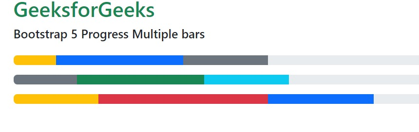
Bootstrap 5 progress multiple bars
Example 2: In this example, we set the height and width progress classes stripped with the background color.
HTML
<!DOCTYPE html>
<html lang="en">
<head>
<link href=
rel="stylesheet">
</head>
<body>
<div class="container">
<div>
<h3 class="text-success">GeeksforGeeks</h3>
<h5>Bootstrap 5 Progress Multiple bars</h5>
</div>
<div class="progress mb-3 mt-4" style="height: 20px;">
<div class="progress-bar bg-success"
style="width: 15%"
aria-valuenow="15"
aria-valuemin="0"
aria-valuemax="100">
</div>
<div class="progress-bar bg-info"
style="width: 20%"
aria-valuenow="20"
aria-valuemin="0"
aria-valuemax="100">
</div>
<div class="progress-bar bg-warning"
style="width: 30%"
aria-valuenow="30" aria-valuemin="0"
aria-valuemax="100">
</div>
</div>
<div class="progress mb-3" style="height: 35px;">
<div class="progress-bar bg-secondary"
style="width: 10%"
aria-valuenow="10"
aria-valuemin="0"
aria-valuemax="100">
</div>
<div class="progress-bar bg-success"
style="width: 15%"
aria-valuenow="15"
aria-valuemin="0"
aria-valuemax="100">
</div>
<div class="progress-bar bg-danger"
style="width: 20%"
aria-valuenow="20"
aria-valuemin="0"
aria-valuemax="100">
</div>
</div>
<div class="progress mb-3" style="height: 25px;">
<div class="progress-bar bg-warning"
style="width: 20%"
aria-valuenow="20"
aria-valuemin="0"
aria-valuemax="100">
</div>
<div class="progress-bar bg-primary"
style="width: 25%"
aria-valuenow="25"
aria-valuemin="0"
aria-valuemax="100">
</div>
<div class="progress-bar bg-info"
style="width: 30%"
aria-valuenow="30"
aria-valuemin="0"
aria-valuemax="100">
</div>
</div>
</div>
</body>
</html>
|
Output:

Progress multiple bars
Reference: https://getbootstrap.com/docs/5.0/components/progress/#multiple-bars
Like Article
Suggest improvement
Share your thoughts in the comments
Please Login to comment...