Bootstrap 5 Floating labels SASS
Last Updated :
26 Dec, 2022
Bootstrap 5 Floating labels can be used to change the default values provided for the floating label by customizing scss file of bootstrap5.
SASS variables of Floating Labels:
- $form-floating-height: This variable provides the height of the floating label. By default, it is 3.5rem.
- $form-floating-padding-x: This variable provides the left padding and right padding of the floating label in the input field. By default, it is 0.75rem.
- $form-floating-padding-y: This variable provides the top padding and bottom padding of the floating label in the input field. By default, it is 0.375rem.
- $form-floating-input-padding-t: This variable provides the top padding of the input text in the input field with floating label on clicking the input field to enter input data. By default, it is 1.625rem.
- $form-floating-input-padding-b: This variable provides the bottom padding of the input text in the input field with floating label on clicking the input field to enter input data. By default, it is 0.625rem.
- $form-floating-label-opacity: This variable provides the opacity of the floating label when the input field is clicked. By default, it is 0.65.
- $form-floating-transition: This variable provides the transitions to the floating label when user clicks on the input field to enter data. By default, the opacity of floating label is set with transition duration of 1 second and the transition timing function as ‘ease-in-out’. Also the transform property is set with transition duration of 1 second and the transition timing function as ‘ease-in-out’.
Steps to override scss of Bootstrap:
Step 1: Install bootstrap using following command:
npm i bootstrap
Step 2: Create your custom scss file and write the variable you want to override. Then include the bootstrap scss file using import.
$class_to_override: values;
@import "node_modules/bootstrap/scss/bootstrap"
Step 3: Convert the file to CSS using live server.
Step 4: Include the converted scss file to your HTML after the link tag of Bootstrap css.
Project Structure: Here the custom scss file name is “custom.scss” and custom.css is converted file
Syntax:
$class_to_override: values;
@import "node_modules/bootstrap/scss/bootstrap"
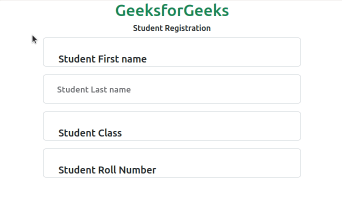
Example 1: In this example, making use of the $form-floating-padding-x, $form-floating-padding-y, $form-floating-height, $form-floating-label-opacity variables. Here in the scss file, the top and bottom padding of floating label is changed to 30px, the height of the floating label is changed to 100px, the left and right padding of floating label is changed to 30 px, the opacity of floating label on clicked is changed to 0.9.
custom.scss
SCSS
$form-floating-padding-y:30px;
$form-floating-height: 100px;
$form-floating-padding-x:30px;
$form-floating-label-opacity:0.9;
@import "./node_modules/bootstrap/scss/bootstrap"
|
CSS file created after conversion
custom.css
CSS
.form-floating > .form-select {
height: 100px;
line-height: 1.25;
}
.form-floating > .form-control-plaintext {
padding: 30px 30px;
}
.form-floating > .form-select ~ label {
opacity: 0.9;
}
|
index.html
HTML
<!DOCTYPE html>
<html lang="en">
<head>
<meta charset="UTF-8">
<meta name="viewport" content="width=device-width, initial-scale=1.0">
<link href=
rel="stylesheet">
<script src=
"node_modules/bootstrap/dist/js/bootstrap.js">
</script>
<style>
.form-floating > .form-select {
height: 100px;
line-height: 1.25;
}
.form-floating > .form-control-plaintext {
padding: 30px 30px;
}
.form-floating > .form-select ~ label {
opacity: 0.9;
}
</style>
</head>
<body class="text-center">
<h1 class="text-success">
GeeksforGeeks
</h1>
<div class="container">
<h6>
Student Registration
</h6>
<div class="form-floating pb-3">
<input class="form-control" id="name"
name="text" placeholder="name">
<label for="name">
<h5>
Student First name
</h5>
</label>
</div>
<div class="form-floating pb-3">
<input class="form-control" id="studentLastName"
name="text" placeholder="studentLastName">
<label for="studentLastName">
<h5>
Student Last name
</h5>
</label>
</div>
<div class="form-floating pb-3">
<input class="form-control" id="classNumber"
name="number" placeholder="classNumber">
<label for="classNumber">
<h5>
Student Class
</h5>
</label>
</div>
<div class="form-floating">
<input class="form-control" id="rollNumber"
name="text" placeholder="rollNumber">
<label for="rollNumber">
<h5>
Student Roll Number
</h5>
</label>
</div>
</div>
</body>
</html>
|
Output:

Example 2: In this example, making use of the $form-floating-padding-x, $form-floating-padding-y, $form-floating-height, $form-floating-input-padding-t, $form-floating-input-padding-b, $form-floating-transition variables. Here in the scss file, the top and bottom padding of the floating label is changed to 30px, the height of the floating label is changed to 100px, the left and right padding of the floating label is changed to 30 px, the opacity transition of the floating labels on clicked is changed to 0.1 with ease-in speed curve and the transformation of the floating label is changed to 4 seconds of transition duration with ease-in speed curve.
custom.scss
SCSS
$form-floating-padding-y:30px;
$form-floating-height: 100px;
$form-floating-padding-x:30px;
$form-floating-input-padding-t:4rem;
$form-floating-input-padding-b:4rem;
$form-floating-transition:opacity .1s ease-in, transform 4s ease-in;
@import "./node_modules/bootstrap/scss/bootstrap"
|
CSS file created after conversion
custom.css
CSS
.form-floating > label {
padding: 30px 30px;
transition: opacity 0.1s ease-in, transform 4s ease-in;
}
.form-floating > .form-select {
padding-top: 4rem;
padding-bottom: 4rem;
}
.form-floating > .form-select {
height: 100px;
line-height: 1.25;
}
.form-floating > .form-control-plaintext {
padding: 30px 30px;
}
.form-floating > .form-select ~ label {
opacity: 0.9;
transform: scale(0.85) translateY(-0.5rem) translateX(0.15rem);
}
|
index.html
HTML
<!DOCTYPE html>
<html lang="en">
<head>
<meta charset="UTF-8">
<meta name="viewport" content="width=device-width, initial-scale=1.0">
<link href=
rel="stylesheet">
<script src=
"node_modules/bootstrap/dist/js/bootstrap.js">
</script>
<style>
.form-floating > label {
padding: 30px 30px;
transition: opacity 0.1s ease-in, transform 4s ease-in;
}
.form-floating > .form-select {
padding-top: 4rem;
padding-bottom: 4rem;
}
.form-floating > .form-select {
height: 100px;
line-height: 1.25;
}
.form-floating > .form-control-plaintext {
padding: 30px 30px;
}
.form-floating > .form-select ~ label {
opacity: 0.9;
transform: scale(0.85) translateY(-0.5rem) translateX(0.15rem);
}
</style>
</head>
<body class="text-center">
<h1 class="text-success">
GeeksforGeeks
</h1>
<div class="container">
<h6>
Student Registration
</h6>
<div class="form-floating pb-3">
<input class="form-control" id="name"
name="text" placeholder="name">
<label for="name">
<h5>
Student First name
</h5>
</label>
</div>
<div class="form-floating pb-3">
<input class="form-control" id="studentLastName"
name="text">
<label for="studentLastName">
<h5>
Student Last name
</h5>
</label>
</div>
<div class="form-floating pb-3">
<input class="form-control" id="classNumber"
name="number" placeholder="classNumber">
<label for="classNumber">
<h5>
Student Class
</h5>
</label>
</div>
<div class="form-floating">
<input class="form-control" id="rollNumber"
name="text" placeholder="rollNumber">
<label for="rollNumber">
<h5>
Student Roll Number
</h5>
</label>
</div>
</div>
</body>
</html>
|
Output:
Reference: https://getbootstrap.com/docs/5.0/forms/floating-labels/#sass
Share your thoughts in the comments
Please Login to comment...