Bootstrap 5 Flex Direction
Last Updated :
10 Apr, 2024
Bootstrap 5 Flex Direction is set by using the direction utilities for flex items in a flex container.
The default browser setting is for the horizontal direction with the use of the flex-row class. For horizontal direction from the opposite side, the class used is flex-row-reverse. Use flex-column class for vertical direction and flex-column-reverse class for opposite side vertical direction.
Bootstrap 5 Flex Direction Classes:
| Class | Description |
|---|
| flex-row | Sets default browser horizontal direction. |
| flex-row-reverse | Sets horizontal direction from the opposite side. |
| flex-column | Sets vertical direction. |
| flex-column-reverse | Sets vertical direction from the opposite side. |
| flex-*-row | Sets default browser horizontal direction for responsiveness. |
| flex-*-row-reverse | Sets horizontal direction from the opposite side for responsiveness. |
| flex-*-column | Sets vertical direction for responsiveness. |
| flex-*-column-reverse | Sets vertical direction from the opposite side for responsiveness. |
Note: Responsive variants also exist for flex-direction classes, in the above classes, the ‘*’ can be replaced by device breakpoints i.e. sm, md, lg, xl, and xxl.
Syntax: In order to make a flexbox container and convert direct children into flex items, we have to use the d-flex class. This will make our container a flexbox container so we can manipulate the items according to our needs. The ‘*’ can be replaced by device breakpoints such as sm, md, lg, xl, and xxl.
<div class="d-flex Flex Direction Class">
     ...
</div>
Note: You can also create an inline flex container using the class d-inline-flex.
Example 1: If you want your items placed horizontally one after another, then you need to mention the flex-row class. If your items need to be reversely aligned, then you have to mention the flex-row-reverse class.
HTML
<!DOCTYPE html>
<html>
    <head>
        <link
            href=
"https://cdn.jsdelivr.net/npm/bootstrap@5.0.2/dist/css/bootstrap.min.css"
            rel="stylesheet"
            integrity=
"sha384-EVSTQN3/azprG1Anm3QDgpJLIm9Nao0Yz1ztcQTwFspd3yD65VohhpuuCOmLASjC"
            crossorigin="anonymous"
        />
    </head>

    <body class="m-2 text-center">
        <strong
            >Bootstrap 5 Flex Direction</strong
        >
        <br />
        <strong>Flex Direction: flex-row</strong>
        <div
            class="d-flex flex-row p-3
                   bg-success
                   text-success"
        >
            <div
                class="p-2 bg-light
                       border border-dark"
            >
                Flex item 1
            </div>
            <div
                class="p-2 bg-light
                       border border-dark"
            >
                Flex item 2
            </div>
            <div
                class="p-2 bg-light
                       border border-dark"
            >
                Flex item 3
            </div>
        </div>
        <br />
        <strong
            >Flex Direction:
            flex-row-reverse</strong
        >
        <div
            class="d-flex flex-row-reverse
                   p-3 bg-success
                   text-success"
        >
            <div
                class="p-2 bg-light border
                       border-dark"
            >
                Flex item 1
            </div>
            <div
                class="p-2 bg-light border
                       border-dark"
            >
                Flex item 2
            </div>
            <div
                class="p-2 bg-light
                       border
                       border-dark"
            >
                Flex item 3
            </div>
        </div>
    </body>
</html>
Output:

Bootstrap 5 Flex Direction Example output
Example 2: When you want your items to be placed in stacked order, you can use the flex-column class. If you want to stack in opposite/reverse order, use the flex-column-reverse class.
HTML
<!DOCTYPE html>
<html>
    <head>
        <link
            href=
"https://cdn.jsdelivr.net/npm/bootstrap@5.0.2/dist/css/bootstrap.min.css"
            rel="stylesheet"
            integrity=
"sha384-EVSTQN3/azprG1Anm3QDgpJLIm9Nao0Yz1ztcQTwFspd3yD65VohhpuuCOmLASjC"
            crossorigin="anonymous"
        />
        <title>GeeksForGeeks</title>
    </head>

    <body class="m-2 text-center">
        <strong
            >Bootstrap 5 Flex Direction</strong
        >
        <br />
        <strong>Flex Direction: flex-col</strong>
        <div
            class="d-flex flex-column
                   p-3 bg-success
                   text-success"
        >
            <div
                class="p-2 bg-light
                       border
                       border-dark"
            >
                Flex item 1
            </div>
            <div
                class="p-2 bg-light
                       border border-dark"
            >
                Flex item 2
            </div>
        </div>
        <br />
        <strong
            >Flex Direction:
            flex-col-reverse</strong
        >
        <div
            class="d-flex flex-column-reverse
                   p-3 bg-success text-success"
        >
            <div
                class="p-2 bg-light
                       border border-dark"
            >
                Flex item 1
            </div>
            <div
                class="p-2 bg-light
                       border border-dark"
            >
                Flex item 2
            </div>
        </div>
        <br />
    </body>
</html>
Output:
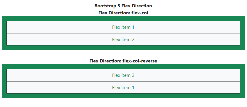
Bootstrap 5 Flex Direction Example Output
Like Article
Suggest improvement
Share your thoughts in the comments
Please Login to comment...