Bootstrap 5 Colors
Last Updated :
04 Apr, 2024
Bootstrap 5 Colors utility is used to set the text colors, into green as a success, and blue as a primary. There are lots of other informative colors that we need like danger, warning, and so on. In this article, we will know about all the text colors that can be used through Bootstrap 5.
Bootstrap 5 Colors Classes:
| Class | Description |
|---|
| text-primary | Denotes important text. |
| text-success | Indicates task success with green text. |
| text-info | Represents informative text. |
| text-warning | Denotes warning text in yellow. |
| text-danger | Represents danger with red text. |
| text-secondary | Represents secondary texts. |
| text-white | Changes text color to white. |
| text-dark | Black text color. |
| text-body | Default body color, usually black. |
| text-light | Light gray text color. |
| text-muted | Denotes muted text, usually light gray. |
Note: According to the docs, they have used only text-color classes, but we can use background classes in a similar way, for that we just need to replace the text with bg(text-primary to bg-primary.)
Syntax:
<p class="Colors Class">
   Text Content
 </p>
Examples of Bootstrap 5 Colors
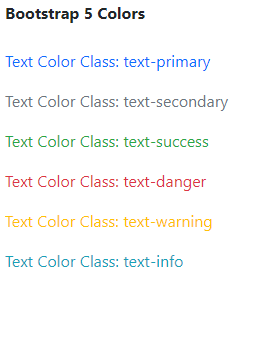
Example 1: In this example, we will use all the informative text color classes.
HTML
<!DOCTYPE html>
<html lang="en">
<head>
    <meta charset="UTF-8">
    <meta http-equiv="X-UA-Compatible"
          content="IE=edge">
    <meta name="viewport" content=
"width=device-width, initial-scale=1.0">
    <link rel="stylesheet" href=
"https://stackpath.bootstrapcdn.com/bootstrap/5.0.0-alpha1/css/bootstrap.min.css">
</head>

<body class="m-2">
    <div>
        <strong>Bootstrap 5 Colors</strong>
    </div>
    <br>
    <div>
        <!-- Bootstrap 5 Color Classes are used -->
        <p class="text-primary">
            Text Color Class: text-primary
        </p>
        <p class="text-secondary">
            Text Color Class: text-secondary</p>
        <p class="text-success">
            Text Color Class: text-success</p>
        <p class="text-danger">
            Text Color Class: text-danger</p>
        <p class="text-warning">
            Text Color Class: text-warning</p>
        <p class="text-info">
            Text Color Class: text-info</p>
    </div>
</body>
</html>
Output:
Bootstrap 5 ColorsExample
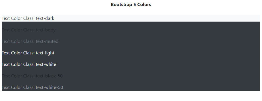
Example 2: In this example, we will use normal text color classes like white, and black and different classes on different opacity/brightness.
HTML
<!DOCTYPE html>
<html lang="en">
    <head>
        <meta charset="UTF-8" />
        <meta
            http-equiv="X-UA-Compatible"
            content="IE=edge"
        />
        <meta
            name="viewport"
            content="width=device-width,
                     initial-scale=1.0"
        />
        <link
            rel="stylesheet"
            href=
"https://stackpath.bootstrapcdn.com/bootstrap/5.0.0-alpha1/css/bootstrap.min.css"
        />
    </head>

    <body class="m-2">
        <div class="text-center">
            <strong>Bootstrap 5 Colors</strong>
        </div>
        <br />
        <div class="bg-dark">
            <!-- Bootstrap 5 Color Classes are used -->
            <p class="text-dark bg-light">
                Text Color Class: text-dark
            </p>
            <p class="text-body">
                Text Color Class: text-body
            </p>
            <p class="text-muted">
                Text Color Class: text-muted
            </p>
            <p class="text-light">
                Text Color Class: text-light
            </p>
            <p class="text-white">
                Text Color Class: text-white
            </p>
            <p class="text-black-50">
                Text Color Class: text-black-50
            </p>
            <p class="text-white-50">
                Text Color Class: text-white-50
            </p>
        </div>
    </body>
</html>
Output:
Bootstrap 5 Colors Example Output
Like Article
Suggest improvement
Share your thoughts in the comments
Please Login to comment...