Bootstrap 5 Cards Navigation
Last Updated :
05 Feb, 2023
Bootstrap 5 Cards navigation refers to a user interface design pattern where related information is organized into individual cards that can be interacted with and rearranged for easy viewing and access. This approach is commonly used in mobile app design and website design for a visually appealing and organized way of presenting the information.
Bootstrap 5 Cards Navigation used classes:
- nav-item: This class is used to style navigation items card’s header.
<div class="card">
    <div class="card-header">
        <ul class="nav nav-tabs card-header-tabs">
            <li class="nav-item">
                <a class="nav-link" href="...">
                    ...
                </a>
            </li>
        </ul>
    </div>
</div>
Example 1: In this example, we set the elements on the top of the card’s header using .nav-item classes.
HTML
<!DOCTYPE html>
<html lang="en">
<head>
<meta charset="UTF-8">
<meta http-equiv="X-UA-Compatible"
content="IE=edge">
<meta name="viewport"
content="width=device-width, initial-scale=1.0">
<title>Bootstrap 5-GeeksforGeeks </title>
<link href=
rel="stylesheet">
</head>
<body>
<div class="container text-center ">
<h1 class="text-success">
GeeksforGeeks
</h1>
<h5>Bootstrap 5 Cards Navigation</h5>
</div>
<div class="card text-center text-bg-light">
<div class="card-header">
<ul class="nav nav-tabs card-header-tabs">
<li class="nav-item">
<a class="nav-link"
GeeksforGeeks
</a>
</li>
<li class="nav-item">
<a class="nav-link"
Practice
</a>
</li>
<li class="nav-item">
<a class="nav-link"
My post
</a>
</li>
<li class="nav-item">
<a class="nav-link"
Problems
</a>
</li>
</ul>
</div>
<div class="card-body">
<div class="input-group mb-2">
<input type="text" class="form-control"
placeholder="Username or ID">
</div>
<div class="input-group mb-3">
<input type="text" class="form-control"
placeholder="password">
</div>
<button type="button"
class="btn btn-success">
Sign In
</button>
</div>
</div>
</body>
</html>
|
Output:
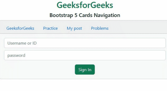
Bootstrap 5 Cards Navigation
Example 2: In this example, we set the elements at the top of the card’s header and also activate an element using .nav-item classes.
HTML
<!DOCTYPE html>
<html lang="en">
<head>
<meta charset="UTF-8">
<meta http-equiv="X-UA-Compatible"
content="IE=edge">
<meta name="viewport"
content="width=device-width, initial-scale=1.0">
<title>Bootstrap 5-GeeksforGeeks </title>
<link href=
rel="stylesheet">
<script src=
</script>
<script src=
</script>
</head>
<body>
<div class="container text-center ">
<h1 class="text-success">
GeeksforGeeks
</h1>
<h5>Bootstrap 5 Cards Navigation</h5>
</div>
<div class="card text-center bg-light">
<div class="card-header">
<ul class="nav nav-tabs card-header-tabs">
<li class="nav-item">
<a class="nav-link active"
href=
Courses
</a>
</li>
<li class="nav-item">
<a class="nav-link"
href=
Write
</a>
</li>
<li class="nav-item">
<a class="nav-link"
href=
My post
</a>
</li>
</ul>
</div>
<div class="card-body text-bg-success">
<div class="input-group p-5">
<button class="btn btn-primary
dropdown-toggle"
type="button"
data-bs-toggle="dropdown">
Select the course
</button>
<ul class="dropdown-menu">
<li>
<a class="dropdown-item" href="#">
Btech
</a>
</li>
<li>
<a class="dropdown-item" href="#">
Mtech
</a>
</li>
<li>
<a class="dropdown-item" href="#">
MBA
</a>
</li>
<li>
<a class="dropdown-item" href="#">
BSC Agriculture
</a>
</li>
</ul>
<input type="text" class="form-control">
</div>
</div>
</div>
</body>
</html>
|
Output:

Bootstrap 5 Cards Navigation
Reference: https://getbootstrap.com/docs/5.0/components/card/#navigation
Like Article
Suggest improvement
Share your thoughts in the comments
Please Login to comment...