For ones new to the term, Bootstrap 4 is a free front-end framework for faster and easier web development. Bootstrap includes HTML and CSS based design templates for typography, forms, buttons, tables, navigation, modals, image carousels, and many others, as well as optional JavaScript plugins. Bootstrap also gives you the ability to easily create responsive designs. Utilities for layout: For faster mobile-friendly and responsive development, Bootstrap 4 includes dozens of utility classes for showing, hiding, aligning, and spacing content. All of them are categorized and listed with examples below:
- Colors:
- They are used to convey meaning through colors with a handful of color utility classes. Bootstrap 4 includes support for styling links with hover states (state when you move the cursor over the item) too.
Example 1:
HTML
<!DOCTYPE html>
<html lang="en">
<head>
<link rel="stylesheet" href=
</head>
<body>
<div class="container">
<p class="text-primary">.text-primary</p>
<p class="text-secondary">.text-secondary</p>
<p class="text-success">.text-success</p>
<p class="text-danger">.text-danger</p>
<p class="text-warning">.text-warning</p>
<p class="text-info">.text-info</p>
<p class="text-light bg-dark">.text-light</p>
<p class="text-dark">.text-dark</p>
<p class="text-muted">.text-muted</p>
<p class="text-white bg-dark">.text-white</p>
</div>
</body>
</html>
|
Output:

- Contextual text classes can also be used on links, which will add a darker hover color.
Example 2:
HTML
<!DOCTYPE html>
<html lang="en">
<head>
<link rel="stylesheet" href=
</head>
<body>
<div class="container">
<h2>Contextual Link Colors</h2>
<p>Hover over the links.</p>
<a href="#" class="text-muted">
Muted link.
</a>
<a href="#" class="text-primary">
Primary link.
</a>
<a href="#" class="text-success">
Success link.
</a>
<a href="#" class="text-info">
Info link.
</a>
<a href="#" class="text-warning">
Warning link.
</a>
<a href="#" class="text-danger">
Danger link.
</a>
<a href="#" class="text-secondary">
Secondary link.
</a>
<a href="#" class="text-dark">
Dark grey link.
</a>
<a href="#" class="text-body">
Body/black link.
</a>
<a href="#" class="text-light">
Light grey link.
</a>
</div>
</body>
</html>
|
Output:

Here, when we hover above the text (links) in the code above, a darker color appears. We can also add 50% opacity for black or white text with the .text-black-50 or .text-white-50 classes, as shown below:
Example 3:
HTML
<!DOCTYPE html>
<html lang="en">
<head>
<link rel="stylesheet" href=
</head>
<body>
<div class="container">
<p class="text-black-50">
Black text with 50% opacity on white background
</p>
<p class="text-white-50 bg-dark">
White text with 50% opacity on black background
</p>
</div>
</body>
</html>
|
Output:

- Background colours : Similar to the contextual text color classes, we can easily set the background of an element to any contextual class. The classes for background colors are: .bg-primary, .bg-success, .bg-info, .bg-warning, .bg-danger, .bg-secondary, .bg-dark and .bg-light.
Note: background colors do not set the text color, so in some cases you’ll want to use them together with a .text-* class.
Example:
HTML
<!DOCTYPE html>
<html lang="en">
<head>
<link rel="stylesheet" href=
</head>
<body>
<div class="container">
<p class="bg-primary text-white">
This text is important.
</p>
<p class="bg-success text-white">
This text indicates success.
</p>
<p class="bg-info text-white">
This text represents some information.
</p>
<p class="bg-warning text-white">
This text represents a warning.
</p>
<p class="bg-danger text-white">
This text represents danger.
</p>
<p class="bg-secondary text-white">
Secondary background color.
</p>
<p class="bg-dark text-white">
Dark grey background color.
</p>
<p class="bg-light text-dark">
Light grey background color.
</p>
</div>
</body>
</html>
|
Output:

- Border utilities: They are used to add or remove an element’s borders. Use border utilities to quickly style the border and border radius of an element. Works well for images, buttons, or any other element(s). Use class ‘Border’ here.
Additive Borders: Use to ‘add’ borders.
Example:
HTML
<!DOCTYPE html>
<html lang="en">
<head>
<link rel="stylesheet" href=
<style>
.border {
display: inline-block;
width: 70px;
height: 70px;
margin: 6px;
}
</style>
</head>
<body>
<div class="container">
<span class="border"></span>
<span class="border border"></span>
<span class="border border-top"></span>
<span class="border border-right"></span>
<span class="border border-bottom"></span>
<span class="border border-left"></span>
</div>
</body>
</html>
|
Output:

As one can see, all 4 borders are added to the first square, then the top, right, bottom and left borders have been added to the subsequent squares, as per the code above. (the border is light, observe closely)
Subtractive Borders: Use to ‘remove’ borders:
Example:
HTML
<!DOCTYPE html>
<html lang="en">
<head>
<link rel="stylesheet" href=
<style>
.border {
display: inline-block;
width: 70px;
height: 70px;
margin: 6px;
}
</style>
</head>
<body>
<div class="container">
<span class="border"></span>
<span class="border border-0"></span>
<span class="border border-top-0"></span>
<span class="border border-right-0"></span>
<span class="border border-bottom-0"></span>
<span class="border border-left-0"></span>
</div>
</body>
</html>
|
Output:

Again clear from the pictures provided above that all 4 borders are removed from the first square, then the top, right, bottom, and left borders have been removed from the subsequent squares (from an initial 4-sides bordered square), as per the code above. (the border is light, observe closely) Note that we simply add a ‘-0’ to our code (after the ‘border’) to make it subtractive.
Border color: Use to give a particular color to the border.
Example:
HTML
<!DOCTYPE html>
<html lang="en">
<head>
<link rel="stylesheet" href=
<style>
.border {
display: inline-block;
width: 70px;
height: 70px;
margin: 6px;
}
</style>
</head>
<body>
<div class="container">
<span class="border border-primary">
</span>
<span class="border border-secondary">
</span>
<span class="border border-success">
</span>
<span class="border border-danger">
</span>
<span class="border border-warning">
</span>
<span class="border border-info">
</span>
<span class="border border-light">
</span>
<span class="border border-dark">
</span>
<span class="border border-white">
</span>
</div>
</body>
</html>
|
Output:

The above example is simple enough, having border colors with their usual indications such as danger for red, warning for yellow (as in caution street signs), success for green, and so forth.
Border radius: Use to give a particular radius type: (like being circular edged).
Example:
HTML
<!DOCTYPE html>
<html lang="en">
<head>
<link rel="stylesheet" href=
<style>
span {
display: inline-block;
width: 70px;
height: 70px;
margin: 6px;
background-color: #555;
}
</style>
</head>
<body>
<div class="container">
<span class="rounded-sm">
</span>
<span class="rounded">
</span>
<span class="rounded-lg">
</span>
<span class="rounded-top">
</span>
<span class="rounded-right">
</span>
<span class="rounded-bottom">
</span>
<span class="rounded-left">
</span>
<span class="rounded-circle">
</span>
<span class="rounded-0">
</span>
</div>
</body>
</html>
|
Output:

In the above example, we added rounded corners to all 4-sides on the first three squares (with the corners being small, normal, and large respectively), then to only the top, right, bottom, and left sides of the subsequent squares as evident from the code above. Then a completely circular border (not a square, a circle) and a non-circular border (a square, no circular edges) are implemented.
- Text: Bootstrap 4 includes documentation and examples for common text utilities to control alignment, wrapping, weight, and more.
Text Alignment: For the left, right, and center alignment, responsive classes are available that use the same viewport width breakpoints as the grid system.
Example:
HTML
<!DOCTYPE html>
<html>
<head>
<link rel="stylesheet" href=
</head>
<body>
<div class="container">
<p class="text-left">
Left aligned text on all viewport sizes.
</p>
<p class="text-center">
Center aligned text on all viewport sizes.
</p>
<p class="text-right">
Right aligned text on all viewport sizes.
</p>
<p class="text-sm-left">
Left aligned text on viewports sized SM
(small) or wider.
</p>
<p class="text-md-left">
Left aligned text on viewports sized MD
(medium) or wider.
</p>
<p class="text-lg-left">
Left aligned text on viewports sized LG
(large) or wider.
</p>
<p class="text-xl-left">
Left aligned text on viewports sized XL
(extra-large) or wider.
</p>
</div>
</body>
</html>
|
Output: 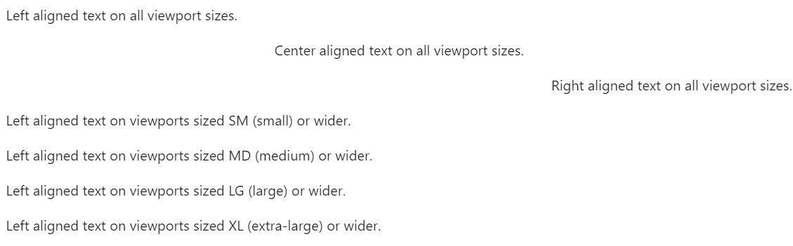
Text Transform: We can transform text into components with text capitalization classes.
Example:
HTML
<!DOCTYPE html>
<html>
<head>
<link rel="stylesheet" href=
</head>
<body>
<div class="container">
<p class="text-lowercase">Lowercased text.</p>
<p class="text-uppercase">Uppercased text.</p>
<p class="text-capitalize">Capitalized text.</p>
</div>
</body>
</html>
|
Output:

Font Weight/Italics: We can change the weight/boldness of text or italicize text.
Example:
HTML
<!DOCTYPE html>
<html lang="en">
<head>
<link rel="stylesheet" href=
</head>
<body>
<div class="container">
<h1>Font weight and italics</h1>
<p class="font-weight-bold">
Bold text.
</p>
<p class="font-weight-normal">
Normal weight text.
</p>
<p class="font-weight-light">
Light weight text.
</p>
<p class="font-italic">
Italic text.
</p>
</div>
</body>
</html>
|
Output:

- Floats and Clearfix Utility: We can float an element to the right with the .float-right class or to the left similarly with .float-left class.
Example:
HTML
<!DOCTYPE html>
<html lang="en">
<head>
<link rel="stylesheet" href=
</head>
<body>
<div class="container">
<div class="clearfix">
<span class="float-left">
Float left
</span>
<span class="float-right">
Float right
</span>
</div>
</div>
</body>
</html>
|
Output:  We can clear floats with the .clearfix class.
Responsive Floats: We can float an element to the left or to the right depending on screen width, with the responsive float classes (.float-*-left|right – where * is sm (>=576px), md (>=768px), lg (>=992px) or xl (>=1200px)). The sizes for these different categories (small, medium, large, extra large) are fixed.
Example:
HTML
<!DOCTYPE html>
<html lang="en">
<head>
<link rel="stylesheet" href=
</head>
<body>
<div class="container">
<div class="clearfix">
<div class="float-sm-right">
Float right on small screens or wider
</div>
<br>
<div class="float-md-right">
Float right on medium screens or wider
</div>
<br>
<div class="float-lg-right">
Float right on large screens or wider
</div>
<br>
<div class="float-xl-right">
Float right on extra large screens or wider
</div>
<br>
<div class="float-none">
Float none
</div>
</div>
</div>
</body>
</html>
|
Output: 
Position: There are shorthand utilities for quickly configuring the position of an element. Some quick positioning classes are “position-static“, “position-relative“, “position-absolute“, “position-fixed” and “position-sticky“. For example, we can use the .fixed-top class to make any element fixed/stay at the top of the page. Similarly, .fixed-bottom class positions an element at the bottom of the viewport, from edge to edge. Sticky-top would position an element at the top of the viewport, from edge to edge, but only after you scroll past it. The .sticky-top utility uses CSS’s position: sticky, which isn’t fully supported in all browsers. likewise, the sticky bottom would do the same for the bottom face.
Sizing: Bootstrap 4 enables us to easily make an element as wide or as tall (relative to its parent) with its width and height utilities.
Width: Set the width of an element with the w-* classes (.w-25, .w-50, .w-75, .w-100, .mw-100).
Example:
HTML
<!DOCTYPE html>
<html lang="en">
<head>
<link rel="stylesheet" href=
</head>
<body>
<div class="container">
<div class="w-25 bg-success">
Width 25%
</div>
<div class="w-50 bg-success">
Width 50%
</div>
<div class="w-75 bg-success">
Width 75%
</div>
<div class="w-100 bg-success">
Width 100%
</div>
<div class="mw-100 bg-success">
Max Width 100%
</div>
</div>
</body>
</html>
|
Output: 
Height: Set the height of an element with the h-* classes (.h-25, .h-50, .h-75, .h-100, .mh-100).
Example:
HTML
<!DOCTYPE html>
<html lang="en">
<head>
<link rel="stylesheet" href=
</head>
<body>
<div class="container">
<div style="height:200px;background-color:#ddd">
<div class="h-25 d-inline-block p-2 bg-success">
Height 25%
</div>
<div class="h-50 d-inline-block p-2 bg-success">
Height 50%
</div>
<div class="h-75 d-inline-block p-2 bg-success">
Height 75%
</div>
<div class="h-100 d-inline-block p-2 bg-success">
Height 100%
</div>
<div class="mh-100 d-inline-block p-2 bg-success"
style="height:500px">
Max Height 100%
</div>
</div>
</div>
</body>
</html>
|
Output:

Spacing: Bootstrap 4 has a wide range of responsive margin and padding utility classes. They work for all breakpoints (have no breakpoint abbreviation in them): xs (=576px), md (>=768px), lg (>=992px) or xl (>=1200px)): The classes are used in the format: {property}{sides}-{size} for xs (extra small) and {property}{sides}-{breakpoint}-{size} for sm, md, lg, and xl. Where property is one of: m – sets margin p – sets padding Where sides is one of: t – sets margin-top or padding-top b – sets margin-bottom or padding-bottom l – sets margin-left or padding-left r – sets margin-right or padding-right x – sets both padding-left and padding-right or margin-left and margin-right y – sets both padding-top and padding-bottom or margin-top and margin-bottom blank – sets a margin or padding on all 4 sides of the element Where size is one of: 0 – sets margin or padding to 0 1 – sets margin or padding to .25rem (4px if font-size is 16px) 2 – sets margin or padding to .5rem (8px if font-size is 16px) 3 – sets margin or padding to 1rem (16px if font-size is 16px) 4 – sets margin or padding to 1.5rem (24px if font-size is 16px) 5 – sets margin or padding to 3rem (48px if font-size is 16px) auto – sets margin to auto.
Note: margins can also be negative, by adding an “n” in front of size. n1 – sets margin to -.25rem (-4px if font-size is 16px) n2 – sets margin to -.5rem (-8px if font-size is 16px) n3 – sets margin to -1rem (-16px if font-size is 16px) n4 – sets margin to -1.5rem (-24px if font-size is 16px) n5 – sets margin to -3rem (-48px if font-size is 16px).
Example:
HTML
<!DOCTYPE html>
<html lang="en">
<head>
<link rel="stylesheet" href=
</head>
<body>
<div class="container">
<div class="pt-4 bg-info">
I only have a top padding (1.5rem = 24px)
</div>
<div class="p-5 bg-success">
I have a padding on all sides (3rem = 48px)
</div>
<div class="m-5 pb-5 bg-info">
I have a margin on all sides (3rem = 48px)
and a bottom padding (3rem = 48px)
</div>
</div>
</body>
</html>
|
Output:

More examples on spacing:
| .m-# / m-*-# |
margin on all sides |
| .mt-# / mt-*-# |
margin top |
| .mb-# / mb-*-# |
margin bottom |
| .ml-# / ml-*-# |
margin left |
| .mr-# / mr-*-# |
margin right |
| .mx-# / mx-*-# |
margin left and right |
| .my-# / my-*-# |
margin top and bottom |
| .p-# / p-*-# |
padding on all sides |
| .pt-# / pt-*-# |
padding top |
| .pb-# / pb-*-# |
padding bottom |
| .pl-# / pl-*-# |
padding left |
| .pr-# / pr-*-# |
padding right |
| .py-# / py-*-# |
padding top and bottom |
| .px-# / px-*-# |
.px-# / px-*-# |
Vertical Align: Bootstrap 4 uses the align- classes to change the alignment of elements (only works on inline, inline-block, inline-table and table cell elements). We can choose from .align-baseline, .align-top, .align-middle, .align-bottom, .align-text-bottom, and .align-text-top as needed.
For example:
Vertical Align with inline-elements:
HTML
<!DOCTYPE html>
<html lang="en">
<head>
<link rel="stylesheet" href=
</head>
<body>
<div class="container">
<span class="align-baseline">
baseline
</span>
<span class="align-top">
top
</span>
<span class="align-middle">
middle
</span>
<span class="align-bottom">
bottom
</span>
<span class="align-text-top">
text-top
</span>
<span class="align-text-bottom">
text-bottom
</span>
</div>
</body>
</html>
|
Output:

Vertical Align with table-cells:
HTML
<!DOCTYPE html>
<html lang="en">
<head>
<link rel="stylesheet" href=
</head>
<body>
<div class="container">
<table style="height: 100px;">
<tbody>
<tr>
<td class="align-baseline">
baseline
</td>
<td class="align-top">
top
</td>
<td class="align-middle">
middle
</td>
<td class="align-bottom">
bottom
</td>
<td class="align-text-top">
text-top
</td>
<td class="align-text-bottom">
text-bottom
</td>
</tr>
</tbody>
</table>
</div>
</body>
</html>
|
Output:

Embeds: Bootstrap 4 enables us to create responsive video or slideshow embeds based on the width of the parent by creating an intrinsic ratio that scales on any device. We simply need to add the .embed-responsive-item to any embed elements in a parent element with .embed-responsive and an aspect ratio of our choice.
Example:
HTML
<!DOCTYPE html>
<html lang="en">
<head>
<link rel="stylesheet" href=
</head>
<body>
<div class="container mt-3">
<p>Create a responsive video
and scale it nicely to the parent element.</p>
<h2>Aspect ratio 1:1</h2>
<div class="embed-responsive embed-responsive-1by1">
<iframe class="embed-responsive-item"
</iframe>
</div>
<br>
<h2>Aspect ratio 4:3</h2>
<div class="embed-responsive embed-responsive-4by3">
<iframe class="embed-responsive-item"
</iframe>
</div>
<br>
<h2>Aspect ratio 16:9</h2>
<div class="embed-responsive embed-responsive-16by9">
<iframe class="embed-responsive-item"
</iframe>
</div>
<br>
<h2>Aspect ratio 21:9</h2>
<div class="embed-responsive embed-responsive-21by9">
<iframe class="embed-responsive-item"
</iframe>
</div>
</div>
</body>
</html>
|
Output:  In the code above, replace the tag ‘tgbNymZ7vqY’ with your desired youtube video or video URL of your choice, in case you want a different video. (or change complete URL for other video hosting/sharing website)
Visibility: We can control the visibility, without modifying the display, of elements with visibility utilities. Simply use the .visible or .invisible classes to control the visibility of elements.
Example:
HTML
<!DOCTYPE html>
<html lang="en">
<head>
<link rel="stylesheet" href=
</head>
<body>
<div class="container">
<div class="visible bg-success">
I am visible
</div>
<div class="invisible bg-warning">
I am invisible
</div>
</div>
</body>
</html>
|
Output:

Close Icon: We can use the .close class to style a close icon. This is often used for dismissing alerts and modals.
Note: We use the × symbol to create the actual icon (a better-looking “x”). Also, note that it floats right by default.
Example: (It appears blank/white for being closed)
HTML
<!DOCTYPE html>
<html lang="en">
<head>
<link rel="stylesheet" href=
</head>
<body>
<div class="container">
<div class="clearfix">
<button type="button" class="close">
×
</button>
</div>
</div>
</body>
</html>
|
Output:

Screenreaders: We can use the screenreader utility (.sr-only) to hide elements on all devices except screen readers.
Example:
HTML
<!DOCTYPE html>
<html lang="en">
<head>
<link rel="stylesheet" href=
</head>
<body>
<div class="container mt-3">
<p>Use the .sr-only class to hide an element on
all devices, except screen readers:</p>
<span class="sr-only">
I will be hidden on all screens
except for screen readers.</span>
</div>
</body>
</html>
|
Output:
Blocks: To make an element into a block element, add the .d-block class. We can use any of the d-*-block classes to control when the element should be a block element on specific screen width.
Example:
HTML
<!DOCTYPE html>
<html lang="en">
<head>
<link rel="stylesheet" href=
</head>
<body>
<div class="container mt-3">
<span class="d-block bg-success">
d-block
</span>
<span class="d-sm-block bg-success">
d-sm-block
</span>
<span class="d-md-block bg-success">
d-md-block
</span>
<span class="d-lg-block bg-success">
d-lg-block
</span>
<span class="d-xl-block bg-success">
d-xl-block
</span>
</div>
</body>
</html>
|
Output:

Flex: Bootstrap 4 helps us to quickly manage the layout, alignment, and sizing of grid columns, navigation, components, and more with a full suite of responsive flexbox utilities. For more complex implementations, custom CSS may be necessary. We can use .flex-* classes to control the layout with flexbox.
Flex Behaviours: We can apply display utilities to create a flexbox container and transform direct children elements into flex items. Flex containers and items are able to be modified further with additional flex properties.
Examples:
HTML
<!DOCTYPE html>
<html lang="en">
<head>
<link rel="stylesheet" href=
</head>
<body>
<div class="container mt-3">
<div class="d-flex p-2">
I'm a flexbox container!
</div>
<div class="d-inline-flex p-2">
I'm an inline flexbox container!
</div>
</div>
</body>
</html>
|
Output:


Likewise, we can use .flex-column to set a vertical direction, or .flex-column-reverse to start the vertical direction from the opposite side.
Example:
HTML
<!DOCTYPE html>
<html lang="en">
<head>
<link rel="stylesheet" href=
</head>
<body>
<div class="container mt-3">
<div class="d-flex flex-column">
<div class="p-2">
Flex item 1
</div>
<div class="p-2">
Flex item 2
</div>
<div class="p-2">
Flex item 3
</div>
</div>
<div class="d-flex flex-column-reverse">
<div class="p-2">
Flex item 1
</div>
<div class="p-2">
Flex item 2
</div>
<div class="p-2">
Flex item 3
</div>
</div>
</div>
</body>
</html>
|
Output:

Justify: We can use justify-content utilities on flexbox containers to change the alignment of flex items on the main axis (the x-axis to start, y-axis if flex-direction: column). Choose from the start (browser default), end, center, between, or around.
Examples:
HTML
<!DOCTYPE html>
<html lang="en">
<head>
<link rel="stylesheet" href=
</head>
<body>
<div class="container mt-3">
<div class="d-flex justify-content-start bg-secondary mb-3">
<div class="p-2 bg-success">
Flex item 1
</div>
<div class="p-2 bg-success">
Flex item 2
</div>
<div class="p-2 bg-success">
Flex item 3
</div>
</div>
<div class="d-flex justify-content-end bg-secondary mb-3">
<div class="p-2 bg-success">
Flex item 1
</div>
<div class="p-2 bg-success">
Flex item 2
</div>
<div class="p-2 bg-success">
Flex item 3
</div>
</div>
<div class="d-flex justify-content-center bg-secondary mb-3">
<div class="p-2 bg-success">
Flex item 1
</div>
<div class="p-2 bg-success">
Flex item 2
</div>
<div class="p-2 bg-success">
Flex item 3
</div>
</div>
<div class="d-flex justify-content-between bg-secondary mb-3">
<div class="p-2 bg-success">
Flex item 1
</div>
<div class="p-2 bg-success">
Flex item 2
</div>
<div class="p-2 bg-success">
Flex item 3
</div>
</div>
<div class="d-flex justify-content-around bg-secondary mb-3">
<div class="p-2 bg-success">
Flex item 1
</div>
<div class="p-2 bg-success">
Flex item 2
</div>
<div class="p-2 bg-success">
Flex item 3
</div>
</div>
</div>
</body>
</html>
|
Output: 
Display: Lastly, we can change the value of the display property with our responsive display utility classes. Bootstrap 4 purposely supports only a subset of all possible values for display. Classes can be combined for various effects as we need. As such, the classes are named using the format: .d-{value} for xs .d-{breakpoint}-{value} for sm, md, lg, and xl.
Where value is one of:
- none
- inline
- inline-block
- block
- table
- table-cell
- table-row
- flex
- inline-flex
Like Article
Suggest improvement
Share your thoughts in the comments
Please Login to comment...