Bar chart using Plotly in Python
Last Updated :
08 Jul, 2021
Plotly is a Python library which is used to design graphs, especially interactive graphs. It can plot various graphs and charts like histogram, barplot, boxplot, spreadplot, and many more. It is mainly used in data analysis as well as financial analysis. Plotly is an interactive visualization library.
Bar Chart
In a bar chart the data categories are displayed on the vertical axis and the data values are displayed on the horizontal axis. Labels are easier to display and with a big data set they impel to work better in a narrow layout such as mobile view.
Syntax: plotly.express.bar(data_frame=None, x=None, y=None, color=None, facet_row=None, facet_col=None, facet_col_wrap=0, hover_name=None, hover_data=None, custom_data=None, text=None, error_x=None, error_x_minus=None, error_y=None, error_y_minus=None, animation_frame=None, animation_group=None, category_orders={}, labels={}, color_discrete_sequence=None, color_discrete_map={}, color_continuous_scale=None, range_color=None, color_continuous_midpoint=None, opacity=None, orientation=None, barmode=’relative’, log_x=False, log_y=False, range_x=None, range_y=None, title=None, template=None, width=None, height=None)
Parameters:
| Name |
Description |
| data_frame |
This argument needs to be passed for column names (and not keyword names) to be used. Array-like and dict are transformed internally to a pandas DataFrame. Optional: if missing, a DataFrame gets constructed under the hood using the other arguments. |
| x |
Either a name of a column in data_frame, or a pandas Series or array_like object. Values from this column or array_like are used to position marks along the x axis in cartesian coordinates. Either x or y can optionally be a list of column references or array_likes, in which case the data will be treated as if it were ‘wide’ rather than ‘long’. |
| y |
Either a name of a column in data_frame, or a pandas Series or array_like object. Values from this column or array_like are used to position marks along the y axis in cartesian coordinates. Either x or y can optionally be a list of column references or array_likes, in which case the data will be treated as if it were ‘wide’ rather than ‘long’. |
| color |
Either a name of a column in data_frame, or a pandas Series or array_like object. Values from this column or array_like are used to assign color to marks. |
Bar chart with Plotly Express
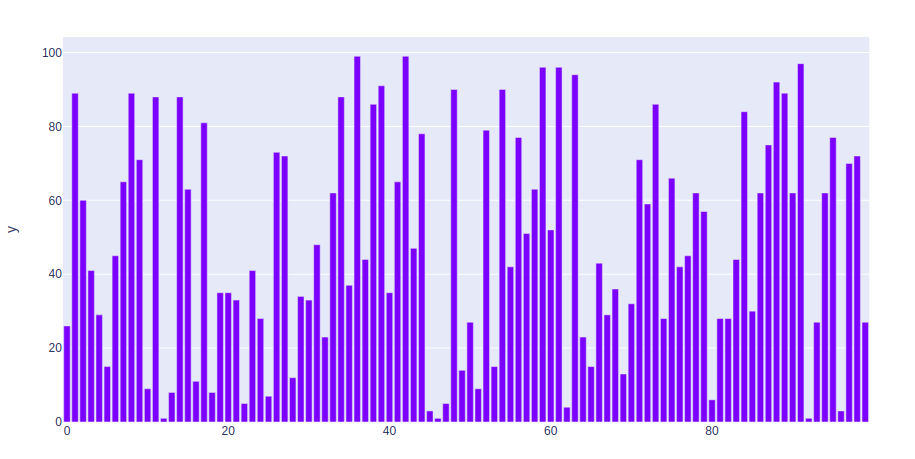
In this example, we are going to use Plotly express to plot a bar chart.
Python3
import plotly.express as px
import numpy
np.random.seed(42)
random_x= np.random.randint(1, 101, 100)
random_y= np.random.randint(1, 101, 100)
fig = px.bar(random_x, y = random_y)
fig.show()
|
Output:
Bar chart with Long and wide Format Data
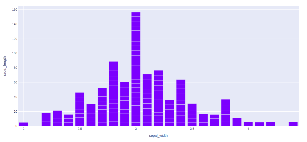
Example 1: In this example, we will use the iris data set and convert it into the dataframe to plot bar chart.
Python3
import plotly.express as px
df = px.data.iris()
fig = px.bar(df, x = "sepal_width", y = "sepal_length")
fig.show()
|
Output:
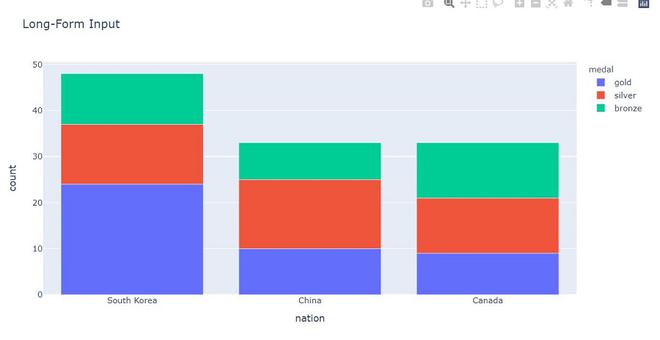
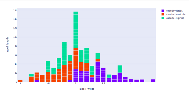
Example 2: In this example, we will see long-form data. long-form data has one row per observation, and one column per variable. This is suitable for storing and displaying multivariate data i.e. with dimensions greater than 2. This format is sometimes called “tidy”.
Python3
import plotly.express as px
long_df = px.data.medals_long()
fig = px.bar(long_df, x = "nation", y = "count",
color = "medal", title = "Long-Form Input")
fig.show()
|
Output:
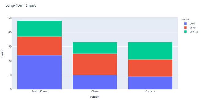
Example 3: In this example, we will see wide-from data. wide-form data has one row per value of one of the first variable, and one column per value of the second variable. This is suitable for storing and displaying 2-dimensional data.
Python3
import plotly.express as px
df = px.data.medals_wide()
fig = px.bar(df, x="nation",
y=["gold", "silver", "bronze"],
title="Wide Form Data")
fig.show()
|
Output:
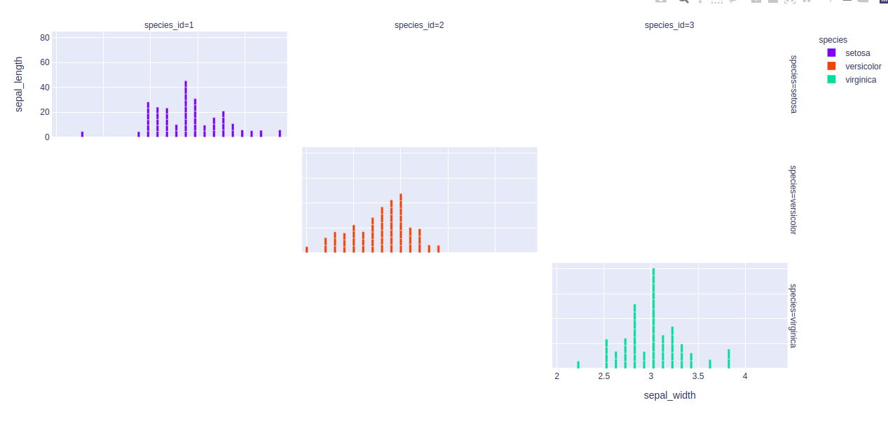
Showing Facetted subplots
In plotly, to create the facetted subplots facet_row argument is used, where different values correspond to different rows of the dataframe columns.
Example:
Python3
import plotly.express as px
df = px.data.iris()
fig = px.bar(df, x="sepal_width", y="sepal_length",
color="species", barmode="group",
facet_row="species", facet_col="species_id")
fig.show()
|
Output:
Customizing bar charts
By using keyword arguments the bar mode can be customized. Let’s see the examples given below:
Example 1: In this example, the bar is customizing according to the color attributes.
Python3
import plotly.express as px
df = px.data.iris()
fig = px.bar(df, x="sepal_width", y="sepal_length", color="species")
fig.show()
|
Output:
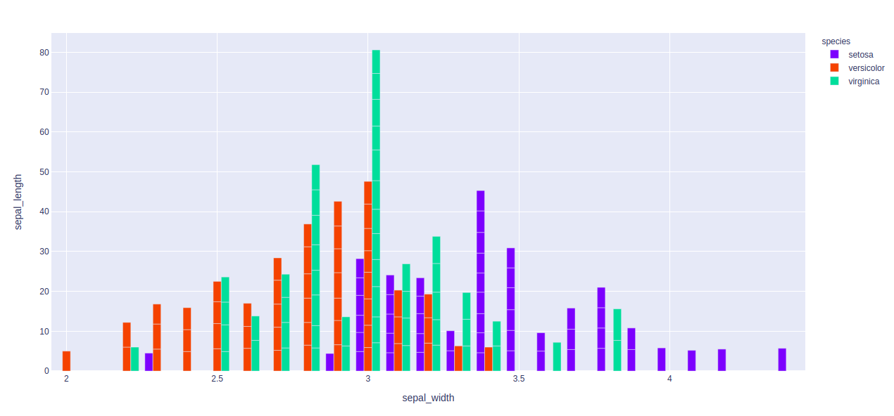
Example 2: In this example, we will use barmode = “group”. With “group”, the bars are grouped with one another
Python3
import plotly.express as px
df = px.data.iris()
fig = px.bar(df, x="sepal_width", y="sepal_length",
color="species", barmode = 'group')
fig.show()
|
Output:
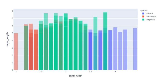
Example 3: Here, we will use “overlay” With “overlay”, the bars are overlaid with another. Here we see easily “opacity” to see multiple bars.
Python3
import plotly.express as px
df = px.data.iris()
fig = px.bar(df, x="sepal_width", y="sepal_length",
color="species", barmode='overlay')
fig.show()
|
Output:
Like Article
Suggest improvement
Share your thoughts in the comments
Please Login to comment...