One important aspect of Machine Learning is model evaluation. You need to have some mechanism to evaluate your model. This is where these performance metrics come into the picture they give us a sense of how good a model is. If you are familiar with some of the basics of Machine Learning then you must have come across some of these metrics, like accuracy, precision, recall, auc-roc, etc., which are generally used for classification tasks. In this article, we will explore in depth one such metric, which is the AUC-ROC curve.
What is the AUC-ROC curve?
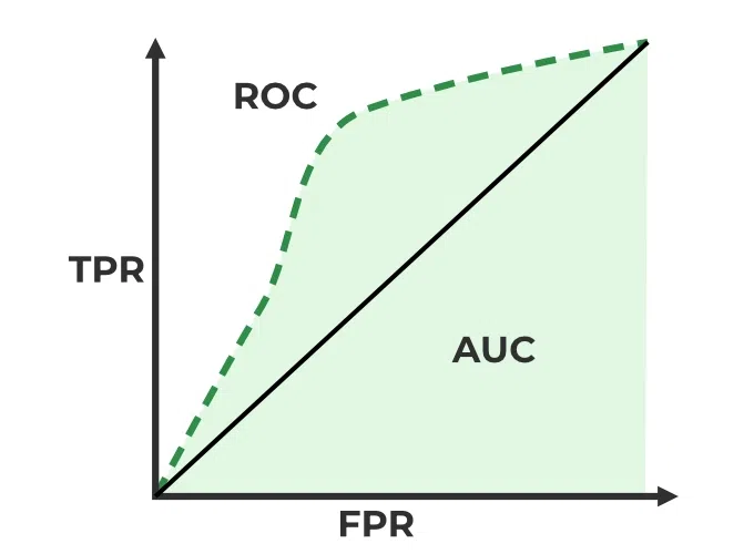
The AUC-ROC curve, or Area Under the Receiver Operating Characteristic curve, is a graphical representation of the performance of a binary classification model at various classification thresholds. It is commonly used in machine learning to assess the ability of a model to distinguish between two classes, typically the positive class (e.g., presence of a disease) and the negative class (e.g., absence of a disease).
Let’s first understand the meaning of the two terms ROC and AUC.
- ROC: Receiver Operating Characteristics
- AUC: Area Under Curve
Receiver Operating Characteristics (ROC) Curve
ROC stands for Receiver Operating Characteristics, and the ROC curve is the graphical representation of the effectiveness of the binary classification model. It plots the true positive rate (TPR) vs the false positive rate (FPR) at different classification thresholds.
Area Under Curve (AUC) Curve:
AUC stands for the Area Under the Curve, and the AUC curve represents the area under the ROC curve. It measures the overall performance of the binary classification model. As both TPR and FPR range between 0 to 1, So, the area will always lie between 0 and 1, and A greater value of AUC denotes better model performance. Our main goal is to maximize this area in order to have the highest TPR and lowest FPR at the given threshold. The AUC measures the probability that the model will assign a randomly chosen positive instance a higher predicted probability compared to a randomly chosen negative instance.
It represents the probability with which our model can distinguish between the two classes present in our target.
ROC-AUC Classification Evaluation Metric
Key terms used in AUC and ROC Curve
1. TPR and FPR
This is the most common definition that you would have encountered when you would Google AUC-ROC. Basically, the ROC curve is a graph that shows the performance of a classification model at all possible thresholds( threshold is a particular value beyond which you say a point belongs to a particular class). The curve is plotted between two parameters
- TPR – True Positive Rate
- FPR – False Positive Rate
Before understanding, TPR and FPR let us quickly look at the confusion matrix.
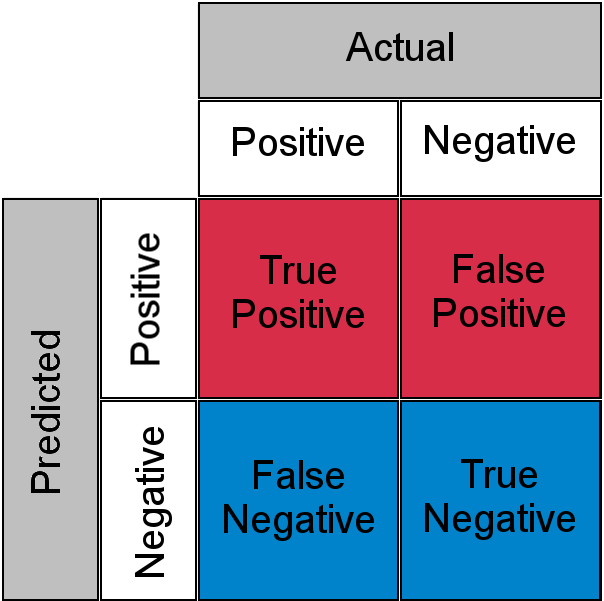
Confusion Matrix for a Classification Task
- True Positive: Actual Positive and Predicted as Positive
- True Negative: Actual Negative and Predicted as Negative
- False Positive(Type I Error): Actual Negative but predicted as Positive
- False Negative(Type II Error): Actual Positive but predicted as Negative
In simple terms, you can call False Positive a false alarm and False Negative a miss. Now let us look at what TPR and FPR are.
2. Sensitivity / True Positive Rate / Recall
Basically, TPR/Recall/Sensitivity is the ratio of positive examples that are correctly identified. It represents the ability of the model to correctly identify positive instances and is calculated as follows:

Sensitivity/Recall/TPR measures the proportion of actual positive instances that are correctly identified by the model as positive.
3. False Positive Rate
FPR is the ratio of negative examples that are incorrectly classified.

4. Specificity
Specificity measures the proportion of actual negative instances that are correctly identified by the model as negative. It represents the ability of the model to correctly identify negative instances

And as said earlier ROC is nothing but the plot between TPR and FPR across all possible thresholds and AUC is the entire area beneath this ROC curve.
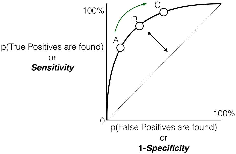
Sensitivity versus False Positive Rate plot
Relationship between Sensitivity, Specificity, FPR, and Threshold.
Sensitivity and Specificity:
- Inverse Relationship: sensitivity and specificity have an inverse relationship. When one increases, the other tends to decrease. This reflects the inherent trade-off between true positive and true negative rates.
- Tuning via Threshold: By adjusting the threshold value, we can control the balance between sensitivity and specificity. Lower thresholds lead to higher sensitivity (more true positives) at the expense of specificity (more false positives). Conversely, raising the threshold boosts specificity (fewer false positives) but sacrifices sensitivity (more false negatives).
Threshold and False Positive Rate (FPR):
- FPR and Specificity Connection: False Positive Rate (FPR) is simply the complement of specificity (FPR = 1 – specificity). This signifies the direct relationship between them: higher specificity translates to lower FPR, and vice versa.
- FPR Changes with TPR: Similarly, as you observed, the True Positive Rate (TPR) and FPR are also linked. An increase in TPR (more true positives) generally leads to a rise in FPR (more false positives). Conversely, a drop in TPR (fewer true positives) results in a decline in FPR (fewer false positives)
How does AUC-ROC work?
We looked at the geometric interpretation, but I guess it is still not enough in developing the intuition behind what 0.75 AUC actually means, now let us look at AUC-ROC from a probabilistic point of view. Let us first talk about what AUC does and later we will build our understanding on top of this
AUC measures how well a model is able to distinguish between classes.
An AUC of 0.75 would actually mean that let’s say we take two data points belonging to separate classes then there is a 75% chance the model would be able to segregate them or rank order them correctly i.e positive point has a higher prediction probability than the negative class. (assuming a higher prediction probability means the point would ideally belong to the positive class). Here is a small example to make things more clear.
|
1
| 0.95
|
1
| 0.90
|
0
| 0.85
|
0
| 0.81
|
1
| 0.78
|
0
| 0.70
|
Here we have 6 points where P1, P2, and P5 belong to class 1 and P3, P4, and P6 belong to class 0 and we’re corresponding predicted probabilities in the Probability column, as we said if we take two points belonging to separate classes then what is the probability that model rank orders them correctly.
We will take all possible pairs such that one point belongs to class 1 and the other belongs to class 0, we will have a total of 9 such pairs below are all of these 9 possible pairs.
|
Yes
|
Yes
|
Yes
|
Yes
|
Yes
|
Yes
|
No
|
No
|
Yes
|
Here column is Correct tells if the mentioned pair is correctly rank-ordered based on the predicted probability i.e class 1 point has a higher probability than class 0 point, in 7 out of these 9 possible pairs class 1 is ranked higher than class 0, or we can say that there is a 77% chance that if you pick a pair of points belonging to separate classes the model would be able to distinguish them correctly. Now, I think you might have a bit of intuition behind this AUC number, just to clear up any further doubts let’s validate it using Scikit learns AUC-ROC implementation.
Python3
import numpy as np
from sklearn .metrics import roc_auc_score
y_true = [1, 1, 0, 0, 1, 0]
y_pred = [0.95, 0.90, 0.85, 0.81, 0.78, 0.70]
auc = np.round(roc_auc_score(y_true, y_pred), 3)
print("Auc for our sample data is {}".format(auc))
|
Output:
AUC for our sample data is 0.778
When should we use the AUC-ROC evaluation metric?
There are some areas where using ROC-AUC might not be ideal. In cases where the dataset is highly imbalanced, the ROC curve can give an overly optimistic assessment of the model’s performance. This optimism bias arises because the ROC curve’s false positive rate (FPR) can become very small when the number of actual negatives is large.
Looking at the FPR formula,

we observe ,
- The Negative class is in the majority, the denominator of FPR is dominated by True Negatives, because of which FPR becomes less sensitive to changes in predictions related to the minority class (positive class).
- ROC curves may be appropriate when the cost of False Positives and False Negatives is balanced and the dataset is not heavily imbalanced.
In those case, Precision-Recall Curves can be used which provide an alternative evaluation metric that is more suitable for imbalanced datasets, focusing on the performance of the classifier with respect to the positive (minority) class.
- A high AUC (close to 1) indicates excellent discriminative power. This means the model is effective in distinguishing between the two classes, and its predictions are reliable.
- A low AUC (close to 0) suggests poor performance. In this case, the model struggles to differentiate between the positive and negative classes, and its predictions may not be trustworthy.
- AUC around 0.5 implies that the model is essentially making random guesses. It shows no ability to separate the classes, indicating that the model is not learning any meaningful patterns from the data.
Understanding the AUC-ROC Curve
In an ROC curve, the x-axis typically represents the False Positive Rate (FPR), and the y-axis represents the True Positive Rate (TPR), also known as Sensitivity or Recall. So, a higher x-axis value (towards the right) on the ROC curve does indicate a higher False Positive Rate, and a higher y-axis value (towards the top) indicates a higher True Positive Rate.The ROC curve is a graphical representation of the trade-off between true positive rate and false positive rate at various thresholds. It shows the performance of a classification model at different classification thresholds. The AUC (Area Under the Curve) is a summary measure of the ROC curve performance.The choice of the threshold depends on the specific requirements of the problem you’re trying to solve and the trade-off between false positives and false negatives that is acceptable in your context.
- If you want to prioritize reducing false positives (minimizing the chances of labeling something as positive when it’s not), you might choose a threshold that results in a lower false positive rate.
- If you want to prioritize increasing true positives (capturing as many actual positives as possible), you might choose a threshold that results in a higher true positive rate.
Let’s consider an example to illustrate how ROC curves are generated for different thresholds and how a particular threshold corresponds to a confusion matrix. Suppose we have a binary classification problem with a model predicting whether an email is spam (positive) or not spam (negative).
Let us consider the hypothetical data,
True Labels: [1, 0, 1, 0, 1, 1, 0, 0, 1, 0]
Predicted Probabilities: [0.8, 0.3, 0.6, 0.2, 0.7, 0.9, 0.4, 0.1, 0.75, 0.55]
Case 1: Threshold = 0.5
|
|
1
|
0.8
|
1
|
|
0
|
0.3
|
0
|
|
1
|
0.6
|
1
|
|
0
|
0.2
|
0
|
|
1
|
0.7
|
1
|
|
1
|
0.9
|
1
|
|
0
|
0.4
|
0
|
|
0
|
0.1
|
0
|
|
1
|
0.75
|
1
|
|
0
|
0.55
|
1
|
Confusion matrix based on above predictions
Accordingly,
- True Positive Rate (TPR):
Proportion of actual positives correctly identified by the classifier is

- False Positive Rate (FPR):
Proportion of actual negatives incorrectly classified as positives

So, at the threshold of 0.5:
- True Positive Rate (Sensitivity): 0.8
- False Positive Rate: 0
The interpretation is that the model, at this threshold, correctly identifies 80% of actual positives (TPR) but incorrectly classifies 0% of actual negatives as positives (FPR).
Accordingly for different thresholds we will get ,
Case 2: Threshold = 0.7
|
|
1
|
0.8
|
1
|
|
0
|
0.3
|
0
|
|
1
|
0.6
|
0
|
|
0
|
0.2
|
0
|
|
1
|
0.7
|
0
|
|
1
|
0.9
|
1
|
|
0
|
0.4
|
0
|
|
0
|
0.1
|
0
|
|
1
|
0.75
|
1
|
|
0
|
0.55
|
0
|
Confusion matrix based on above predictions
Accordingly,
- True Positive Rate (TPR):
Proportion of actual positives correctly identified by the classifier is

- False Positive Rate (FPR):
Proportion of actual negatives incorrectly classified as positives

Case 3: Threshold = 0.4
|
|
1
|
0.8
|
1
|
|
0
|
0.3
|
0
|
|
1
|
0.6
|
1
|
|
0
|
0.2
|
0
|
|
1
|
0.7
|
1
|
|
1
|
0.9
|
1
|
|
0
|
0.4
|
0
|
|
0
|
0.1
|
0
|
|
1
|
0.75
|
1
|
|
0
|
0.55
|
1
|
Confusion matrix based on above predictions
Accordingly,
- True Positive Rate (TPR):
Proportion of actual positives correctly identified by the classifier is
- False Positive Rate (FPR):
Proportion of actual negatives incorrectly classified as positives
Case 4: Threshold = 0.2
|
|
1
|
0.8
|
1
|
|
0
|
0.3
|
1
|
|
1
|
0.6
|
1
|
|
0
|
0.2
|
0
|
|
1
|
0.7
|
1
|
|
1
|
0.9
|
1
|
|
0
|
0.4
|
1
|
|
0
|
0.1
|
0
|
|
1
|
0.75
|
1
|
|
0
|
0.55
|
1
|
Confusion matrix based on above predictions
Accordingly,
- True Positive Rate (TPR):
Proportion of actual positives correctly identified by the classifier is

- False Positive Rate (FPR):
Proportion of actual negatives incorrectly classified as positives
Case 5: Threshold = 0.85
|
|
1
|
0.8
|
0
|
|
0
|
0.3
|
0
|
|
1
|
0.6
|
0
|
|
0
|
0.2
|
0
|
|
1
|
0.7
|
0
|
|
1
|
0.9
|
1
|
|
0
|
0.4
|
0
|
|
0
|
0.1
|
0
|
|
1
|
0.75
|
0
|
|
0
|
0.55
|
0
|
Confusion matrix based on above predictions
Accordingly,
- True Positive Rate (TPR):
Proportion of actual positives correctly identified by the classifier is
- False Positive Rate (FPR):
Proportion of actual negatives incorrectly classified as positives

Based on the above result, we will plot the ROC curve
Python3
true_positive_rate = [0.4, 0.8, 0.8, 1.0, 1]
false_positive_rate = [0, 0, 0, 0.2, 0.8]
plt.plot(false_positive_rate, true_positive_rate, 'o-', label='ROC')
plt.plot([0, 1], [0, 1], '--', color='grey', label='Worst case')
plt.xlabel('False Positive Rate')
plt.ylabel('True Positive Rate')
plt.title('ROC Curve')
plt.legend()
plt.show()
|
Output:

From the graph it is implied that:
- The gray dashed line represents the “Worst case” scenario, where the model’s predictions i.e TPR are FPR are same. This diagonal line is considered the worst-case scenario, indicating an equal likelihood of false positives and false negatives.
- As points deviate from the random guess line towards the upper-left corner, the model’s performance improves.
- The Area Under the Curve (AUC) is a quantitative measure of the model’s discriminative ability. A higher AUC value, closer to 1.0, indicates superior performance. The best possible AUC value is 1.0, corresponding to a model that achieves 100% sensitivity and 100% specificity.
In all, the Receiver Operating Characteristic (ROC) curve serves as a graphical representation of the trade-off between a binary classification model’s True Positive Rate (sensitivity) and False Positive Rate at various decision thresholds. As the curve gracefully ascends towards the upper-left corner, it signifies the model’s commendable ability to discriminate between positive and negative instances across a range of confidence thresholds. This upward trajectory indicates an improved performance, with higher sensitivity achieved while minimizing false positives. The annotated thresholds, denoted as A, B, C, D, and E, offer valuable insights into the model’s dynamic behavior at different confidence levels.
Implementation using two different models
Installing Libraries
Python3
import numpy as np
import pandas as pd
import matplotlib.pyplot as plt
from sklearn.datasets import make_classification
from sklearn.model_selection import train_test_split
from sklearn.linear_model import LogisticRegression
from sklearn.ensemble import RandomForestClassifier
from sklearn.metrics import roc_curve, auc
|
In order to train the Random Forest and Logistic Regression models and to present their ROC curves with AUC scores, the algorithm creates artificial binary classification data.
Generating data and splitting data
Python3
X, y = make_classification(
n_samples=1000, n_features=20, n_classes=2, random_state=42)
X_train, X_test, y_train, y_test = train_test_split(
X, y, test_size=0.2, random_state=42)
|
Using an 80-20 split ratio, the algorithm creates artificial binary classification data with 20 features, divides it into training and testing sets, and assigns a random seed to ensure reproducibility.
Training the different models
Python3
logistic_model = LogisticRegression(random_state=42)
logistic_model.fit(X_train, y_train)
random_forest_model = RandomForestClassifier(n_estimators=100, random_state=42)
random_forest_model.fit(X_train, y_train)
|
Using a fixed random seed to ensure repeatability, the method initializes and trains a logistic regression model on the training set. In a similar manner, it uses the training data and the same random seed to initialize and train a Random Forest model with 100 trees.
Predictions
Python3
y_pred_logistic = logistic_model.predict_proba(X_test)[:, 1]
y_pred_rf = random_forest_model.predict_proba(X_test)[:, 1]
|
Using the test data and a trained Logistic Regression model, the code predicts the positive class’s probability. In a similar manner, using the test data, it uses the trained Random Forest model to produce projected probabilities for the positive class.
Creating a dataframe
Python3
test_df = pd.DataFrame(
{'True': y_test, 'Logistic': y_pred_logistic, 'RandomForest': y_pred_rf})
|
Using the test data, the code creates a DataFrame called test_df with columns labeled “True,” “Logistic,” and “RandomForest,” adding true labels and predicted probabilities from the Random Forest and Logistic Regression models.
Plot the ROC Curve for the models
Python3
plt.figure(figsize=(7, 5))
for model in ['Logistic', 'RandomForest']:
fpr, tpr, _ = roc_curve(test_df['True'], test_df[model])
roc_auc = auc(fpr, tpr)
plt.plot(fpr, tpr, label=f'{model} (AUC = {roc_auc:.2f})')
plt.plot([0, 1], [0, 1], 'r--', label='Random Guess')
plt.xlabel('False Positive Rate')
plt.ylabel('True Positive Rate')
plt.title('ROC Curves for Two Models')
plt.legend()
plt.show()
|
Output:

The code generates a plot with 8 by 6 inch figures. It computes the AUC and ROC curve for each model (Random Forest and Logistic Regression), then plots the ROC curve. The ROC curve for random guessing is also represented by a red dashed line, and labels, a title, and a legend are set for visualization.
How to use ROC-AUC for a multi-class model?
For a multi-class setting, we can simply use one vs all methodology and you will have one ROC curve for each class. Let’s say you have four classes A, B, C, and D then there would be ROC curves and corresponding AUC values for all the four classes, i.e. once A would be one class and B, C, and D combined would be the others class, similarly, B is one class and A, C, and D combined as others class, etc.
The general steps for using AUC-ROC in the context of a multiclass classification model are:
One-vs-All Methodology:
- For each class in your multiclass problem, treat it as the positive class while combining all other classes into the negative class.
- Train the binary classifier for each class against the rest of the classes.
Calculate AUC-ROC for Each Class:
- Here we plot the ROC curve for the given class against the rest.
- Plot the ROC curves for each class on the same graph. Each curve represents the discrimination performance of the model for a specific class.
- Examine the AUC scores for each class. A higher AUC score indicates better discrimination for that particular class.
Implementation of AUC-ROC in Multiclass Classification
Importing Libraries
Python3
import numpy as np
import matplotlib.pyplot as plt
from sklearn.datasets import make_classification
from sklearn.model_selection import train_test_split
from sklearn.preprocessing import label_binarize
from sklearn.multiclass import OneVsRestClassifier
from sklearn.linear_model import LogisticRegression
from sklearn.ensemble import RandomForestClassifier
from sklearn.metrics import roc_curve, auc
from itertools import cycle
|
The program creates artificial multiclass data, divides it into training and testing sets, and then uses the One-vs-Restclassifier technique to train classifiers for both Random Forest and Logistic Regression. Lastly, it plots the two models’ multiclass ROC curves to demonstrate how well they discriminate between various classes.
Generating Data and splitting
Python3
X, y = make_classification(
n_samples=1000, n_features=20, n_classes=3, n_informative=10, random_state=42)
y_bin = label_binarize(y, classes=np.unique(y))
X_train, X_test, y_train, y_test = train_test_split(
X, y_bin, test_size=0.2, random_state=42)
|
Three classes and twenty features make up the synthetic multiclass data produced by the code. After label binarization, the data is divided into training and testing sets in an 80-20 ratio.
Training Models
Python3
logistic_model = OneVsRestClassifier(LogisticRegression(random_state=42))
logistic_model.fit(X_train, y_train)
rf_model = OneVsRestClassifier(
RandomForestClassifier(n_estimators=100, random_state=42))
rf_model.fit(X_train, y_train)
|
The program trains two multiclass models: a Random Forest model with 100 estimators and a Logistic Regression model with the One-vs-Rest approach. With the training set of data, both models are fitted.
Plotting the AUC-ROC Curve
Python3
fpr = dict()
tpr = dict()
roc_auc = dict()
models = [logistic_model, rf_model]
plt.figure(figsize=(6, 5))
colors = cycle(['aqua', 'darkorange'])
for model, color in zip(models, colors):
for i in range(model.classes_.shape[0]):
fpr[i], tpr[i], _ = roc_curve(
y_test[:, i], model.predict_proba(X_test)[:, i])
roc_auc[i] = auc(fpr[i], tpr[i])
plt.plot(fpr[i], tpr[i], color=color, lw=2,
label=f'{model.__class__.__name__} - Class {i} (AUC = {roc_auc[i]:.2f})')
plt.plot([0, 1], [0, 1], 'k--', lw=2, label='Random Guess')
plt.xlabel('False Positive Rate')
plt.ylabel('True Positive Rate')
plt.title('Multiclass ROC Curve with Logistic Regression and Random Forest')
plt.legend(loc="lower right")
plt.show()
|
Output:

The Random Forest and Logistic Regression models’ ROC curves and AUC scores are calculated by the code for each class. The multiclass ROC curves are then plotted, showing the discrimination performance of each class and featuring a line that represents random guessing. The resulting plot offers a graphic evaluation of the models’ classification performance.
Conclusion
In machine learning, the performance of binary classification models is assessed using a crucial metric called the Area Under the Receiver Operating Characteristic (AUC-ROC). Across various decision thresholds, it shows how sensitivity and specificity are traded off. Greater discrimination between positive and negative instances is typically exhibited by a model with a higher AUC score. Whereas 0.5 denotes chance, 1 represents flawless performance. Model optimization and selection are aided by the useful information that the AUC-ROC curve offers about a model’s capacity to discriminate between classes. When working with unbalanced datasets or applications where false positives and false negatives have different costs, it is particularly useful as a comprehensive measure.
FAQs for AUC ROC Curve in Machine Learning
1. What is the AUC-ROC curve?
For various classification thresholds, the trade-off between true positive rate (sensitivity) and false positive rate (specificity) is graphically represented by the AUC-ROC curve.
2. What does a perfect AUC-ROC curve look like?
An area of 1 on an ideal AUC-ROC curve would mean that the model achieves optimal sensitivity and specificity at all thresholds.
3. What does an AUC value of 0.5 signify?
AUC of 0.5 indicates that the model’s performance is comparable to that of random chance. It suggests a lack of discriminating ability.
4. Can AUC-ROC be used for multiclass classification?
AUC-ROC is frequently applied to issues involving binary classification. Variations such as the macro-average or micro-average AUC can be taken into consideration for multiclass classification.
5. How is the AUC-ROC curve useful in model evaluation?
The ability of a model to discriminate between classes is comprehensively summarized by the AUC-ROC curve. When working with unbalanced datasets, it is especially helpful.
Like Article
Suggest improvement
Share your thoughts in the comments
Please Login to comment...