Animated choropleth map with discrete colors using Python plotly
Last Updated :
17 Jan, 2023
Animated Choropleth Maps can be implemented by Python Plotly. This map is can be composed of colored polygons. We can easily represent spatial variations of any quantity with the help of choropleth maps. To make choropleth maps some basic inputs are required
- Geometrical/regional Information: This type of information can be supplied by the GeoJSON file in which each feature has a primary key that uniquely identifies that feature. It can be an id or an identifying value in properties. Also, this value can be given by build-in geometries within python Plotly.
- A list of values indexed with feature identifiers.
Animated Choropleth India map using Plotly
Python Plotly doesn’t have any in-build dataset that can be used to implement the India maps. So, for plotting India we will use GeoJSON files for Indian municipal boundaries and world region boundaries for Indian cities. We will use some Python libraries like pandas, Plotly, requests, etc. to plot the map.
Python3
import requests
import plotly.express as px
import pandas as pd
|
We can directly use GeoJSON files through the Python request module. First, we use the India district boundary, and then from the boundary of the whole world, we will select only the India portion from that file and extract its cities.
Python3
indiaMucp= requests.get(
"https://github.com/geohacker/india/raw/master\
/district/india_district.geojson"
)
indiaCity = (
pd.json_normalize(
requests.get(
"https://opendata.arcgis.com/datasets/6996f0\
3a1b364dbab4008d99380370ed_0.geojson"
).json()["features"]
)
.loc[
lambda d: d["properties.CNTRY_NAME"].eq("India"),
["properties.CITY_NAME", "geometry.coordinates"],
]
.assign(
lon=lambda d: d["geometry.coordinates"
].apply(lambda v: v[0]),
lat=lambda d: d["geometry.coordinates"
].apply(lambda v: v[1]),
)
)
|
Finally, we have all the required datasets and they will be plotted using Plotly.
Python3
px.scatter_mapbox(indiaCity, lat="lat", lon="lon",
hover_name="properties.CITY_NAME"
).update_layout(
mapbox={
"style": "carto-positron",
"zoom": 4.0,
"layers": [
{
"source": indiaMucp.json(),
"type": "line",
"color": "green",
"line": {"width": 1},
}
],
}
)
|
Output:
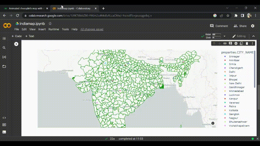
India map
Animated choropleth World map
Firstly we will import Plotly and select the gapmider() dataset which gives a world map continental-wise.
Python3
import plotly.express as px
worldMap = px.data.gapminder()
|
Next, we will plot it to the map which shows the whole world map continental-wise with discrete color style.
Python3
px.choropleth(worldMap,
locations="iso_alpha",
color="continent",
hover_name="country",
color_continuous_scale='Plasma',
height=700
)
|
Output:
From the output, we can see that it shows result in discrete color format and when the cursor is placed on any district it shows the description.
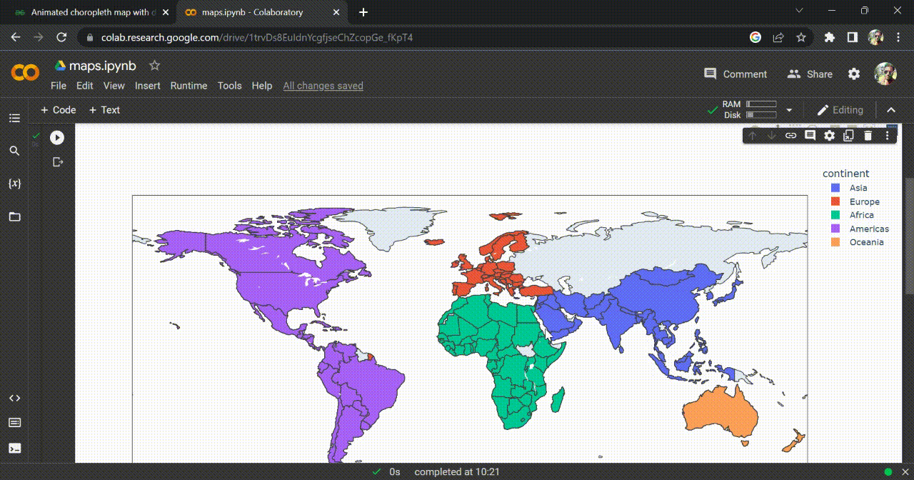
Choropleth map for whole-world
Like Article
Suggest improvement
Share your thoughts in the comments
Please Login to comment...