Angular PrimeNG StyleClass Enter/Leave Animation
Last Updated :
25 Aug, 2022
Angular PrimeNG is an open-source framework for Angular applications. It has a rich set of native UI components that can be used to make attractive and scalable web interfaces. In this article, we will discuss Angular PrimeNG StyleClass Enter/Leave Animation.
The StyleClass is used to manage CSS classes during entering and leaving animations of a component or to toggle a class on an element. The Enter/Leave animation properties are used to add or remove specific classes at various stages of the enter/leave animation.
Angular PrimeNG StyleClass Enter/Leave Animation Properties:
- pStyleClass: This property states the selector for the target element. It accepts a string value which can be a valid CSS query or a target keyword.
- enterClass: This property defines the class to add when the target element begins to appear on the screen.
- enterActiveClass: This property defines the class to add during the enter animation.
- enterToClass: This property defines the class to add when the enter animation has been completed.
- leaveClass: This property defines the class to add when the target element begins to get hidden from the screen.
- leaveActiveClass: This property defines the class to add during leave animation.
- leaveToClass: This property defines the class to add when the leave animation has been completed.
- hideOnOutsideClick: This property states whether to trigger the leave animation when outside of the element is clicked.
- toggleClass: This property is used to toggle a class for an element when no enter or leave animation is required.
Target Keywords for pStyleClass property:
- @next: This keyword is used to target the next element of the current element.
- @prev: This keyword is used to target the next element of the current element.
- @parent: This keyword is used to target the parent element.
- @grandparent: This keyword is used to target the grandparent (parent of the parent) element.
Syntax:
<button
      pButton
      label="..."
      pStyleClass="@next"
      leaveActiveClass="..."
      leaveToClass="...">
</button>
<div class="..."> ... </div>
Creating Angular application & Module installation:
Step 1: Create an Angular application using the following command.
ng new appname
Step 2: After creating your project folder i.e. appname, move to it using the following command.
cd appname
Step 3: Install PrimeNG in your given directory.
npm install primeng --save
npm install primeicons --save
Project Structure: It will look like the following:
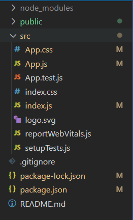
Project Structure
Let’s see some examples to understand the use of Angular PrimeNG StyleClass Enter/Leave Animation Properties.
Example 1: This is a basic example that shows the use of the Enter/Leave animation Properties of the StyleClass.
app.component.html
<h2 style="color: green">GeeksforGeeks</h2>
<h4>Angular PrimeNG StyleClass Enter/Leave Animation</h4>
<button
pButton
label="Show the Content"
class="mr-3"
pStyleClass=".content"
enterClass="hidden"
enterActiveClass="inAnimation">
</button>
<button
pButton
label="Hide the Content"
pStyleClass="@next"
leaveActiveClass="outAnimation"
leaveToClass="hidden">
</button>
<div class="content hidden">
GeeksforGeeks is a computer science
portal for geeks. It offers articles
on various computer science subjects
like Data Structures, Algorithms,
Compiler Design, Computer Networks, etc.
</div>
|
app.component.css
.content{
background-color: rgb(112, 255, 119);
width: 300px;
margin-top: 25px;
padding: 10px;
border-radius: 5px;
text-align: center;
font-size: 20px;
}
@keyframes inAnim {
0% {
opacity: 0;
}
100% {
opacity: 1;
}
}
@keyframes outAnim {
0% {
opacity: 1;
}
100% {
opacity: 0;
}
}
.inAnimation {
animation: inAnim .5s linear;
}
.outAnimation {
animation: outAnim .5s linear;
}
|
app.component.ts
import { Component } from "@angular/core";
@Component({
selector: "app-root",
templateUrl: "./app.component.html",
styleUrls: ["./app.component.css"]
})
export class AppComponent { }
|
<
app.module.ts
import { NgModule } from "@angular/core";
import { BrowserModule }
from "@angular/platform-browser";
import { BrowserAnimationsModule }
from "@angular/platform-browser/animations";
import { AppComponent } from "./app.component";
import { ButtonModule } from "primeng/button";
import { StyleClassModule } from 'primeng/styleclass';
@NgModule({
imports: [
BrowserModule,
BrowserAnimationsModule,
ButtonModule,
StyleClassModule,
],
declarations: [AppComponent],
bootstrap: [AppComponent],
})
export class AppModule { }
|
Steps to run the app:
Run the below command from the root directory of your project.
ng serve --open
Output:
Example 2: This example shows the use of the toggleClass property to toggle a specific class for an element.
app.compnent.html
<h2 style="color: green">GeeksforGeeks</h2>
<h4>Angular PrimeNG StyleClass Enter/Leave Animation</h4>
<button pButton
label="ToggleClass .hidden"
pStyleClass="@next"
toggleClass="hidden">
</button>
<div
style="
background-color: rgb(112, 255, 119);
width: 300px;
margin-top: 25px;
padding: 10px;
border-radius: 5px;
text-align: center;
font-size: 20px;
"
>
GeeksforGeeks is a computer science
portal for geeks. It offers articles
on various computer science subjects
like Data Structures, Algorithms,
Compiler Design, Computer Networks, etc.
</div>
|
app.component.ts
import { Component } from "@angular/core";
@Component({
selector: "app-root",
templateUrl: "./app.component.html",
styleUrls: ["./app.component.css"]
})
export class AppComponent { }
|
app.module.ts
import { NgModule } from "@angular/core";
import { BrowserModule }
from "@angular/platform-browser";
import { BrowserAnimationsModule }
from "@angular/platform-browser/animations";
import { AppComponent } from "./app.component";
import { ButtonModule } from "primeng/button";
import { StyleClassModule } from 'primeng/styleclass';
@NgModule({
imports: [
BrowserModule,
BrowserAnimationsModule,
ButtonModule,
StyleClassModule,
],
declarations: [AppComponent],
bootstrap: [AppComponent],
})
export class AppModule { }
|
Output:
Reference: http://primefaces.org/primeng/styleclass
Like Article
Suggest improvement
Share your thoughts in the comments
Please Login to comment...