Angular PrimeNG InputTextArea Component
Last Updated :
14 Feb, 2023
Angular PrimeNG is an open-source framework with a rich set of native Angular UI components that are used for great styling and this framework is used to make responsive websites with very much ease. In this article, we will know how to use the InputTextArea component in angular primeNG.
InputTextArea component: it is an element that is used to make a text field with multi-line input support.
Properties:
- autoResize: We can set if the textarea size should increase on increasing the text. Textarea will not display scrollbar as the size of textarea increases. For this reason, we may need to define the row & column property.
- disabled: We can set the textarea component to be disabled.
Events:
- onResize: When an element resizes, a callback is invoked.
Styling:
- p-inputtextarea: It is a directive & applied to the text input field.
Creating Angular Application & Module installation:
Project Structure: It will look like the following.

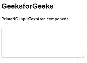
Example 1: This is the basic example that shows how to use InputTextArea component
app.component.html
<h2>GeeksforGeeks</h2>
<h5>PrimeNG inputTextArea component</h5>
<textarea rows="4" cols="35" pInputTextarea></textarea>
|
app.module.ts
import { NgModule } from "@angular/core";
import { BrowserModule } from "@angular/platform-browser";
import { FormsModule } from "@angular/forms";
import { AppComponent } from "./app.component";
import { InputTextareaModule } from "primeng/inputtextarea";
@NgModule({
imports: [BrowserModule, InputTextareaModule, FormsModule],
declarations: [AppComponent],
bootstrap: [AppComponent],
})
export class AppModule {}
|
Output:
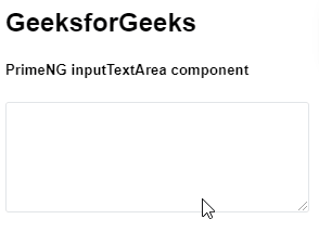
Example 2: In this example, we will know how to use disabled property in the InputTextArea component
app.component.html
<h2>GeeksforGeeks</h2>
<h5>PrimeNG inputTextArea component</h5>
<textarea rows="4" cols="35" pInputTextarea disabled></textarea>
|
app.module.ts
import { NgModule } from "@angular/core";
import { BrowserModule } from "@angular/platform-browser";
import { FormsModule } from "@angular/forms";
import { AppComponent } from "./app.component";
import { InputTextareaModule } from "primeng/inputtextarea";
@NgModule({
imports: [BrowserModule, InputTextareaModule, FormsModule],
declarations: [AppComponent],
bootstrap: [AppComponent],
})
export class AppModule {}
|
Output:
Reference: https://primeng.org/inputtextarea
Like Article
Suggest improvement
Share your thoughts in the comments
Please Login to comment...