Angular PrimeNG Galleria Component
Last Updated :
24 Sep, 2022
Angular PrimeNG is an open-source framework with a rich set of native Angular UI components that are used for great styling and this framework is used to make responsive websites with very much ease. In this article, we will be seeing Angular PrimeNG Galleria Component.
Angular PrimeNG Galleria is an advanced content gallery component. It is used for displaying images in an attractive manner. Let us learn about this using some examples.
Angular PrimeNG Galleria Component Properties:
- id: It is the unique id of the element. It is of type string and the default value is null.
- value: It is the array of objects to display. The default value is null
- activeIndex: It is the index of the first item to display. It is of type number and the default value is 0.
- fullScreen: It is a boolean property that tells whether to display the component on fullscreen. The default value is false.
- visible: It is a boolean property that specifies whether to display the mask when the component is fullscreen. The default value is false.
- numVisible: It tells the number of items visible per page. It is of type number and the default value is 3.
- responsiveOptions: It is the array of the portions for the galleria component to make it responsive.
- showItemNavigators: This boolean property tells whether to display the navigation buttons in the preview container. The default value is false.
- showThumbnailNavigators: This boolean property tells whether to display the navigation buttons in the thumbnail container. The default value is true.
- showItemNavigatorsOnHover: This boolean property tells whether to display navigation buttons when the preview container is in hovered state. The default value is false
- changeItemOnIndicatorHover: When this property is set to true, the preview item is changed when the user hovers the indicator element. The default value is false.
- circular: This property defines whether the scrolling in the galleria component will be infinite. The default value is false.
- autoPlay: If this property is set to true, the items of the galleria will be displayed in a slideshow. The default value is false.
- transitionInterval: It is time in milliseconds to scroll an item. It is of type number and the default value is 4000.
- showThumbnails: This property defines whether to show the thumbnail container of the galleria component. The default value is true.
- thumbnailsPosition: This property tells the place to show the thumbnail container. Accepted values are “bottom”, “top”, “left” and “right” and the default value is “bottom”.
- verticalThumbnailViewPortHeight: This tells the height of the viewport in a vertical thumbnail. It accepts string values and the default value is 300px.
- showIndicators: This boolean property defines whether to show the indicator container. The default value is false.
- showIndicatorsOnItem: When this property is set to true, the indicator container is displayed on the preview container. The default value is false.
- indicatorsPosition: THis property defines the position of the indicator container. The accepted values are “bottom”, “top”, “left” and “right”. The default value is “bottom”.
- baseZIndex: It is the base value of the zIndex property used in layering. It is of type number and the default value is 0.
- maskClass: It is the Style class of the mask on fullscreen mode. The default value is null.
- containerStyle: It is the inline style of the component on fullscreen mode. The default value is null.
- galleriaClass: It is the Style class of the component on fullscreen mode. The default value is null.
- showTransitionOptions: Transition options of the show animation. It is of type string and the default value is 150ms cubic-bezier(0, 0, 0.2, 1).
- hideTransitionOptions: Transition options of the hide animation. It is of type string and the default value is 150ms cubic-bezier(0, 0, 0.2, 1).
Syntax:
<p-galleria [numVisible]="..." [value]="...">
    <ng-template pTemplate="item" let-item>
        <img [src]="..." [alt]="..." [title]="..." style="width: 50%;" />
    </ng-template>

    <ng-template pTemplate="thumbnail" let-item width="50%">
        <div class="grid grid-nogutter justify-content-center">
            <img [src]="..." [alt]="..." [title]="..." width=80% />
        </div>
    </ng-template>
</p-galleria>
Creating Angular application & module installation:
Step-1: Install the Angular CLI
npm install - g @angular/cli
Step 2: Create an Angular application using the following command.
ng new appname
Step 3: After creating your project folder i.e. appname, move to it using the following command.
cd appname
Step 4: Install PrimeNG in your given directory.
npm install primeng --save
npm install primeicons --save
Project Structure: The project structure will look like the following image:
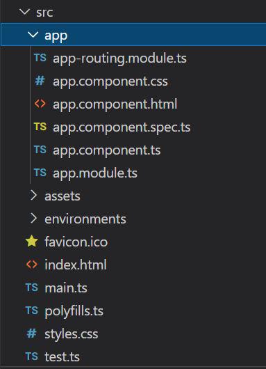
Project Structure
Example 1: In this example, we will learn about the Galleria component. We will fetch the images using URL and display them in the galleria component.
app.component.html
<h1 style="color:green">GeeksforGeeks</h1>
<h2>Angular PrimeNG Galleria Component</h2>
<div style="width:80%; background-color: black; ">
<p-galleria
[numVisible]="3"
[value]="images">
<ng-template pTemplate="item" let-item>
<img
[src]="item.previewImageSrc"
[alt]="item.alt"
[title]="item.title"
style="width: 50%;"
/>
</ng-template>
<ng-template pTemplate="thumbnail" let-item width="50%">
<div class="grid grid-nogutter justify-content-center">
<img
[src]="item.thumbnailImageSrc"
[alt]="item.alt"
[title]="item.title"
width=80%
/>
</div>
</ng-template>
</p-galleria>
</div>
|
app.component.ts
import { Component } from '@angular/core';
@Component({
selector: 'app-root',
templateUrl: './app.component.html',
styleUrls: ['./app.component.css']
})
export class AppComponent {
title = 'GFG';
images: any[] = [
{
previewImageSrc:
thumbnailImageSrc:
alt: 'Description for Image 1',
title: 'Title 1'
},
{
previewImageSrc:
thumbnailImageSrc:
alt: 'Description for Image 2',
title: 'Title 2'
},
{
previewImageSrc:
thumbnailImageSrc:
alt: 'Description for Image 3',
title: 'Title 3'
},
{
previewImageSrc:
thumbnailImageSrc:
alt: 'Description for Image 4',
title: 'Title 4'
},
];
}
|
app.module.ts
import { NgModule } from '@angular/core';
import { BrowserModule } from '@angular/platform-browser';
import { GalleriaModule } from 'primeng/galleria';
import { AppComponent } from './app.component';
@NgModule({
declarations: [
AppComponent,
],
imports: [
BrowserModule,
GalleriaModule
],
providers: [],
bootstrap: [AppComponent]
})
export class AppModule { }
|
Output:
Example 2: In this example, we will see how can we change the number of items visible in the Galleria component.
app.component.html
<h1 style="color:green">GeeksforGeeks</h1>
<h2>Angular PrimeNG Galleria Component</h2>
<div style="width:80%; background-color: black;">
<p-galleria [numVisible]="2" [value]="images">
<ng-template pTemplate="item" let-item>
<img
[src]="item.previewImageSrc"
[alt]="item.alt"
[title]="item.title"
style="width: 50%;"
/>
</ng-template>
<ng-template pTemplate="thumbnail" let-item width="50%">
<div class="grid grid-nogutter justify-content-center">
<img
[src]="item.thumbnailImageSrc"
[alt]="item.alt"
[title]="item.title"
width=80% />
</div>
</ng-template>
</p-galleria>
</div>
|
app.component.ts
import { Component } from '@angular/core';
@Component({
selector: 'app-root',
templateUrl: './app.component.html',
styleUrls: ['./app.component.css']
})
export class AppComponent {
title = 'GFG';
images: any[] = [
{
previewImageSrc:
thumbnailImageSrc:
alt: 'Description for Image 1',
title: 'Title 1'
},
{
previewImageSrc:
thumbnailImageSrc:
alt: 'Description for Image 2',
title: 'Title 2'
},
{
previewImageSrc:
thumbnailImageSrc:
alt: 'Description for Image 3',
title: 'Title 3'
},
{
previewImageSrc:
thumbnailImageSrc:
alt: 'Description for Image 4',
title: 'Title 4'
},
];
}
|
app.module.ts
import { NgModule } from '@angular/core';
import { BrowserModule } from '@angular/platform-browser';
import { GalleriaModule } from 'primeng/galleria';
import { AppComponent } from './app.component';
@NgModule({
declarations: [
AppComponent,
],
imports: [
BrowserModule,
GalleriaModule
],
providers: [],
bootstrap: [AppComponent]
})
export class AppModule { }
|
Output:
Reference: http://primefaces.org/primeng/galleria
Like Article
Suggest improvement
Share your thoughts in the comments
Please Login to comment...