Angular PrimeNG Form Slider Properties
Last Updated :
14 Oct, 2022
Angular PrimeNG is a collection of Interactive UI components for Angular applications. Developers can use these components to make beautiful and responsive web interfaces in no time as most of the components have all the necessary functions implemented. In this article, we will be discussing Angular PrimeNG Form Slider Properties.
The Slider component is an input component provided by PrimeNG. It can be used to take numerical input from the users. By using a slider to take input, we can make our web app more interactive.
Angular PrimeNG Form Slider Properties:
- animate: This is a boolean property and when enabled an animation is displayed when the user clicks the slider bar.
- disabled: When this property is present, it disables the slider component.
- min: It represents the minimum value of the slider input. The default value is 0.
- max: It represents the maximum value of the slider input. The default value is 100.
- orientation: IT specifies the orientation of the slider. It accepts string values. The accepted values are “horizontal” and “vertical”.
- step: The factor by which the slider’s value should increase. The default value is 1.
- range: This is a boolean property used to take numerical range input from the user.
- style: It is the inline style of the slider component.
- styleClass: It is the style class of the slider component.
- tabindex: It defines the index of the element in tabbing order
- ariaLabelledBy: It is used to establish relationships between the labels and components.
Syntax:
<p-slider
    [(ngModel)]="..."
    [range]="true | false"
    orientation="vertical | horizontal"
    [step]="1"
    [min]="..."
    [max]="...">
</p-slider>
Creating Angular Application and Installing the Module:
Step 1: Create an Angular application using the following command.
ng new appname
Step 2: After creating your project folder i.e. appname, move to it using the following command.
cd appname
Step 3: Finally, Install PrimeNG in your given directory.
npm install primeng --save
npm install primeicons --save
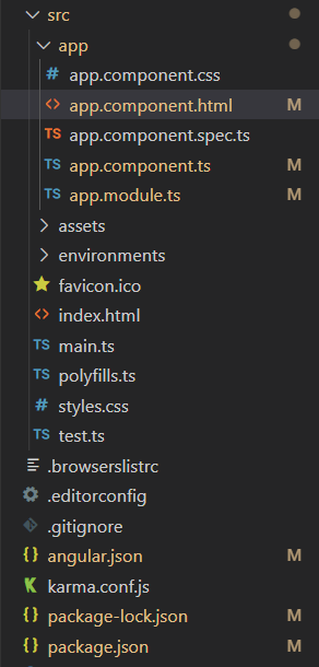
Project Structure: The project Structure will look like this after following the above steps:

Project Structure
Example 1: In this example, we used the min, max, and step properties of the slider component to make the user select only 4 values i.e 15, 30, 45, and 60.
HTML
<h2 style="color: green">GeeksforGeeks</h2>
<h3>
Angular PrimeNG Form
Slider Properties
</h3>
<p-slider
[(ngModel)]="sliderValue"
[step]="15"
[min]="15"
[max]="60">
</p-slider>
<h2>Current Value = {{sliderValue}}</h2>
|
Javascript
import { Component } from "@angular/core";
@Component({
selector: "app-root",
templateUrl: "./app.component.html",
styles: [
`:host ::ng-deep .p-slider{
width: 300px;
margin-top: 50px;
}
`
]
})
export class AppComponent {
sliderValue: number = 15;
}
|
Javascript
import { NgModule } from '@angular/core';
import { BrowserModule } from '@angular/platform-browser';
import { BrowserAnimationsModule }
from '@angular/platform-browser/animations';
import { AppComponent } from './app.component';
import { FormsModule } from '@angular/forms';
import { SliderModule } from 'primeng/slider';
@NgModule({
imports: [
BrowserModule,
BrowserAnimationsModule,
SliderModule,
FormsModule
],
declarations: [AppComponent],
bootstrap: [AppComponent],
})
export class AppModule { }
|
Output:
Example 2: In this example, we set the range property of the slider to “true” to take the range input from the user and set the orientation property to “vertical” to make the slider vertical.
HTML
<h2 style="color: green">GeeksforGeeks</h2>
<h3>
Angular PrimeNG Form
Slider Properties
</h3>
<p-slider
[(ngModel)]="sliderValues"
[range]="true"
orientation="vertical">
</p-slider>
<h2>
Current Value =
{{sliderValues[0]}} - {{sliderValues[1]}}
</h2>
|
Javascript
import { Component } from "@angular/core";
@Component({
selector: "app-root",
templateUrl: "./app.component.html",
})
export class AppComponent {
sliderValues: number[] = [10, 60];
}
|
Javascript
import { NgModule } from '@angular/core';
import { BrowserModule } from '@angular/platform-browser';
import { BrowserAnimationsModule }
from '@angular/platform-browser/animations';
import { AppComponent } from './app.component';
import { FormsModule } from '@angular/forms';
import { SliderModule } from 'primeng/slider';
@NgModule({
imports: [
BrowserModule,
BrowserAnimationsModule,
SliderModule,
FormsModule
],
declarations: [AppComponent],
bootstrap: [AppComponent],
})
export class AppModule { }
|
Output:
Reference: http://primefaces.org/primeng/slider
Like Article
Suggest improvement
Share your thoughts in the comments
Please Login to comment...