Angular PrimeNG Form MultiSelect Properties Component
Last Updated :
24 Nov, 2022
Angular PrimeNG is an open-source framework with a rich set of native Angular UI components that are used for great styling and this framework is used to make responsive websites with very much ease. In this article, we will know how to use the Dropdown component in Angular Angular PrimeNG Form MultiSelect Properties Component.
The Multiselect component is used to provide the user with a list of options where one or more than one options can be selected by the user. The properties of the MultiSelect Component are listed below.
Syntax:
<p-multiSelect
    [options]="..."
    [(ngModel)]="..."
    ...
    defaultLabel="..."
    optionLabel="..."
    [disabled]="..."
    display="...">
</p-multiSelect>
Angular PrimeNG Form MultiSelect Properties:
- appendTo: It is used to define the target element to attach the overlay.
- ariaFilterLabel: It is used to define the string that labels the filter input.
- label: It is used to define the label of the input for accessibility.
- ariaLabelledBy: It is used to define the relationships between the component and label(s) where its value should be one or more element IDs.
- autofocusFilter: It is used to define the focus of the filter element when the overlay is shown.
- autoZIndex: It is used to define the automatic managing layer.
- baseZIndex: It is used to define the base zIndex value to use in layering.
- defaultLabel: It is used to define the label to display when there are no selections.
- dataKey: It is used to define the property to uniquely identify a value in options.
- disabled: It is used to specify that the element should be disabled.
- displaySelectedLabel: It is used to show labels of selected item labels or use default labels.
- dropdownIcon: It is used to define the icon class of the dropdown icon.
- emptyFilterMessage: It is used to define the text to display when filtering does not return any results.
- filter: It is used to display an input field to filter the items on keyup.
- filterMatchMode: It is used to define how the items are filtered.
- filterValue: It is used to specify, filter displays with this value.
- filterLocale: It is used to define the locale to use in filtering.
- filterBy: It is used to define the field or fields (comma separated) to search against.
- filterPlaceHolder: It is used to define the placeholder of the filter input.
- hideTransitionOptions: It is used to define the transition options of the hide animation.
- inputId: It is used to define the identifier of the focus input to match a label defined for the component.
- maxSelectedLabels: It is used to define how many selected item labels to show at most.
- name: It is used to define the name of the input element.
- options: It is used to define the array of objects to display as the available options.
- optionLabel: It is used to define the name of the label field of an option.
- optionValue: It is used to define the name of the value field of an option.
- optionDisabled: It is used to define the name of the disabled field of an option.
- optionGroupLabel: It is used to define the name of the label field of an option group.
- optionGroupChildren: It is used to define the name of the options field of an option group.
- group: It is used to display options as grouped when nested options are provided.
- overlayVisible: It is used to define the Specify the visibility of the options panel.
- panelStyle: It is used to define the Inline style of the overlay panel.
- placeholder: It is used to define the label to display when there are no selections.
- readonly: It is used to define the specifications so that the component cannot be edited.
- emptyMessage: It is used to define the text to display when there is no data.
- emptyFilterMessage: It is used to define the text to display when filtering does not return any results.
- resetFilterOnHide: It is used to clear the filter value when hiding the dropdown.
- scrollHeight: It is used to define the height of the viewport in pixels, a scrollbar is defined if the height of the list exceeds this value.
- selectedItemsLabel: It is used to define the label to display after exceeding max selected labels
- selectionLimit: It is used to define the number of maximum options that can be selected.
- showHeader: It is used to define whether to show the header.
- showTransitionOptions: It is used to define the transition options of the show animation.
- showToggleAll: It is used to show the checkbox at the header to toggle all items at once.
- style: It is used to define the inline style of the element.
- styleClass: It is used to define the style class of the element.
- tabindex: It is used to define the index of the element in tabbing order.
- tooltip: It is used to define the advisory information to display in a tooltip on hover.
- tooltipStyleClass: It is used to define the style class of the tooltip.
- tooltipPosition: It is used to define the position of the tooltip, valid values are right, left, top, and bottom.
- tooltipPositionStyle: It is used to define the type of CSS position.
- showClear: It is used to define the clear icon that is displayed to clear the value.
- virtualScroll: It is used to define the virtual scroll.
- virtualScrollItemSize: It is used to define the height of an item in the list for VirtualScrolling.
- virtualScrollOptions: It is used to define the properties of the scroller component and can be used like an object in it.
- lazy: It is used to define if data is loaded and interacted with in a lazy manner.
Creating Angular application & module installation:
Step 1: Create an Angular application using the following command.
ng new appname
Step 2: After creating your project folder i.e. appname, move to it using the following command.
cd appname
Step 3: Install PrimeNG in your given directory.
npm install primeng --save
npm install primeicons --save
Project Structure: The project structure will look like the following:
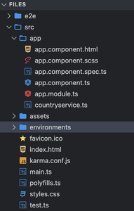
Project Structure
Example1: In the below code, we will be using the above properties to demonstrate the use of the Angular PrimeNG Form MultiSelect Properties Component.
HTML
<div style="text-align:center">
<h1 style="color:green;">GeeksforGeeks</h1>
<h3>A computer science portal for geeks</h3>
<h4>
Angular PrimeNG Form MultiSelect
Properties Component
</h4>
<h5>Chips</h5>
<p-multiSelect
[options]="cities"
[(ngModel)]="selectedCities"
defaultLabel="Select a City"
optionLabel="name"
display="chip">
</p-multiSelect>
</div>
|
Javascript
import { Component } from "@angular/core";
import { PrimeNGConfig } from "primeng/api";
@Component({
selector: "app-root",
templateUrl: "./app.component.html",
styleUrls: ["./app.component.css"],
})
export class AppComponent {
cities: any[];
selectedCities: string[] = [];
constructor(private primengConfig: PrimeNGConfig) {
this.cities = [
{ name: "Nallasopara", code: "Nallasopara" },
{ name: "Naigaon", code: "Naigaon" },
{ name: "Mira road", code: "MR" },
{ name: "Vasai", code: "VASAI" },
{ name: "Virar", code: "virar" }
];
}
ngOnInit() {
this.primengConfig.ripple = true;
}
}
|
Javascript
import { NgModule } from '@angular/core';
import { BrowserModule }
from '@angular/platform-browser';
import { FormsModule } from '@angular/forms';
import { HttpClientModule }
from '@angular/common/http';
import { BrowserAnimationsModule }
from '@angular/platform-browser/animations';
import { AppComponent } from './app.component';
import { MultiSelectModule }
from 'primeng/multiselect';
@NgModule({
imports: [
BrowserModule,
BrowserAnimationsModule,
MultiSelectModule,
FormsModule,
HttpClientModule
],
declarations: [AppComponent],
bootstrap: [AppComponent]
})
export class AppModule { }
|
Output:
Example 2: In this example, we used the disabled property of the Multiselect component to disable the component.
HTML
<div style="text-align:center">
<h1 style="color:green;">GeeksforGeeks</h1>
<h3>A computer science portal for geeks</h3>
<h4>
Angular PrimeNG Form
MultiSelect Properties Component
</h4>
<h5>Basic</h5>
<p-multiSelect
[options]="cities"
[(ngModel)]="selectedCities1"
defaultLabel="Select a City"
optionLabel="name"
[disabled]="true">
</p-multiSelect>
</div>
|
Javascript
import { Component } from "@angular/core";
import { PrimeNGConfig } from "primeng/api";
@Component({
selector: "app-root",
templateUrl: "./app.component.html",
styleUrls: ["./app.component.css"],
})
export class AppComponent {
cities: any[];
selectedCities1: any[] = [];
constructor(private primengConfig: PrimeNGConfig)
{
this.cities = [
{ name: "Nallasopara", code: "Nallasopara" },
{ name: "Naigaon", code: "Naigaon" },
{ name: "Mira road", code: "MR" },
{ name: "Vasai", code: "VASAI" },
{ name: "Virar", code: "virar" }
];
}
ngOnInit() {
this.primengConfig.ripple = true;
}
}
|
Javascript
import { NgModule } from '@angular/core';
import { BrowserModule }
from '@angular/platform-browser';
import { FormsModule } from '@angular/forms';
import { HttpClientModule }
from '@angular/common/http';
import { BrowserAnimationsModule }
from '@angular/platform-browser/animations';
import { AppComponent } from './app.component';
import { MultiSelectModule }
from 'primeng/multiselect';
@NgModule({
imports: [
BrowserModule,
BrowserAnimationsModule,
MultiSelectModule,
FormsModule,
HttpClientModule
],
declarations: [AppComponent],
bootstrap: [AppComponent]
})
export class AppModule { }
|
Output:
Reference: https://www.primefaces.org/primeng/multiselect
Like Article
Suggest improvement
Share your thoughts in the comments
Please Login to comment...