Angular PrimeNG Form MultiSelect Events Component
Last Updated :
29 Nov, 2022
Angular PrimeNG is a free and open-source framework with various components that Angular developers can use in their applications to enhance the user experience and speed up the development as they do not have to write everything from the ground up. In this article, we will be discussing the Angular PrimeNG Form MultiSelect Events Component.
The Form MultiSelect Component allows users to select multiple options from the set of provided options. The events of the Form Multiselect component are used to invoke a function when the user interacts with the component in some specific way. There are a total of 8 events of the Form MultiSelect component.
Angular PrimeNG Form MultiSelect Events:
- onClick: This event accepts a callback function which is called when the user clicks on the MultiSelect component.
- onChange: This event takes a callback function as its value. That callback is triggered when the value of the component changes.
- onFilter: The callback function passed to this event is triggered when the Multiselect data is filtered.
- onFocus: This event’s callback function is invoked when the MultiSelect component comes into focus.
- onBlur: This event’s callback function is invoked when the MultiSelect component goes out of focus.
- onPanelShow: The callback function passed to this event is triggered when the MultiSelect overlay panel becomes visible.
- onPanelHide: The callback function passed to this event is triggered when the MultiSelect overlay panel becomes hidden.
- onClear: The callback passed to this event is invoked when the Multiselect input is cleared using the clear icon.
- onLazyLoad: The callback passed to this event is invoked when new data is loaded when the lazy load is enabled.
Angular PrimeNG Form MultiSelect Events Properties:
- options: We can pass an array of objects to this property to display the MultiSelect options.
- defaultLabel: It is the label that is displayed when no items are selected.
- optionLabel: It is the name of the label field of an option of the MultiSelect component.
Syntax:
<p-multiSelect
    [options]="..."
    [(ngModel)]="..."
    defaultLabel="..."
    (event-name)="callbackFunc()"
    optionLabel="...">
</p-multiSelect>
Creating the Application and Installing the Required Modules:
Step 1: Create the Angular app using the following command.
ng new my_app
Step 2: After creating the app, move to the project folder using the command written below.
cd new_app
Step 3: Finally, Install the following modules in your project directory.
npm install primeng --save
npm install primeicons --save
Project Structure: Now, the project structure will as shown in the below picture.
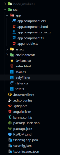
Project Structure
Example 1: The below example shows how to use the onClick, onChange, onPanelShow and onPanelHide events of the Multiselect Component to trigger custom functions.
HTML
<h2>GeeksforGeeks</h2>
<h5>
Angular PrimeNG Form
MultiSelect Events Component
</h5>
<p-multiSelect
[options]="courses"
[(ngModel)]="selected"
defaultLabel="Select Course(s)"
(onClick)="handleOnClick()"
(onChange)="handleOnChange()"
(onPanelShow)="handleOnPanelShow()"
(onPanelHide)="handleOnPanelHide()"
optionLabel="name">
</p-multiSelect>
<p-toast position="top-right"></p-toast>
|
Javascript
import { Component } from "@angular/core";
import { MessageService } from "primeng/api";
interface Course {
id: number;
name: string;
price: string;
}
@Component({
selector: "app-root",
templateUrl: "./app.component.html",
providers: [MessageService]
})
export class AppComponent {
constructor(private ms: MessageService) { }
courses: Course[] = [];
selected: Course[] = [];
ngOnInit() {
this.courses = [
{
id: 1,
name: "Self Paced DSA",
price: "3,899"
},
{
id: 2,
name: "CIP - Self Paced",
price: "6,999"
},
{
id: 3,
name: "System Design - Live",
price: "10,999"
},
{
id: 4,
name: "CP - Live",
price: "10,999"
},
{
id: 5,
name: "C++ Self Paced",
price: "1,699"
},
{
id: 6,
name: "GATE 2024",
price: "11,999"
}
];
}
handleOnClick() {
this.ms.add({
severity: "success",
summary: "Component Clicked",
detail: "GeeksforGeeks"
})
}
handleOnChange() {
this.ms.add({
severity: "success",
summary: "Component Value Changed",
detail: "GeeksforGeeks"
})
}
handleOnPanelShow() {
this.ms.add({
severity: "success",
summary: "Panel Visible",
detail: "GeeksforGeeks"
})
}
handleOnPanelHide() {
this.ms.add({
severity: "success",
summary: "Pannel Hidden",
detail: "GeeksforGeeks"
})
}
}
|
Javascript
import { NgModule } from "@angular/core";
import { BrowserModule }
from "@angular/platform-browser";
import { FormsModule } from "@angular/forms";
import { BrowserAnimationsModule }
from "@angular/platform-browser/animations";
import { AppComponent } from "./app.component";
import { ToastModule } from "primeng/toast";
import { MultiSelectModule }
from "primeng/multiselect";
@NgModule({
imports: [
BrowserModule,
BrowserAnimationsModule,
MultiSelectModule,
FormsModule,
ToastModule
],
declarations: [AppComponent],
bootstrap: [AppComponent],
})
export class AppModule { }
|
Output:
Example 2: In this example, we used the onFocus, onBlur, and onClear Events of the MultiSelect component and show the toast message whenever the event is fired.
HTML
<h2>GeeksforGeeks</h2>
<h5>
Angular PrimeNG Form
MultiSelect Events Component
</h5>
<p-multiSelect
[options]="courses"
[(ngModel)]="selected"
[showClear]="true"
[filter]="false"
defaultLabel="Select Course(s)"
(onClear)="handleOnClear()"
(onFocus)="handleOnFocus()"
(onBlur)="handleOnBlur()"
optionLabel="name">
</p-multiSelect>
<p-toast position="top-right"></p-toast>
|
Javascript
import { Component } from "@angular/core";
import { MessageService } from "primeng/api";
interface Course {
id: number;
name: string;
price: string;
}
@Component({
selector: "app-root",
templateUrl: "./app.component.html",
providers: [MessageService]
})
export class AppComponent {
constructor(private ms: MessageService) { }
courses: Course[] = [];
selected: Course[] = [];
ngOnInit() {
this.courses = [
{
id: 1,
name: "Self Paced DSA",
price: "3,899"
},
{
id: 2,
name: "CIP - Self Paced",
price: "6,999"
},
{
id: 3,
name: "System Design - Live",
price: "10,999"
},
{
id: 4,
name: "CP - Live",
price: "10,999"
},
{
id: 5,
name: "C++ Self Paced",
price: "1,699"
},
{
id: 6,
name: "GATE 2024",
price: "11,999"
}
];
}
handleOnFocus() {
this.ms.add({
severity: "success",
summary: "MultiSelect In Focus",
detail: "GeeksforGeeks"
})
}
handleOnBlur() {
this.ms.add({
severity: "success",
summary: "MultiSelect out of Focus",
detail: "GeeksforGeeks"
})
}
handleOnClear() {
this.ms.add({
severity: "success",
summary: "MultiSelect Cleared",
detail: "GeeksforGeeks"
})
}
}
|
Javascript
import { NgModule } from "@angular/core";
import { BrowserModule }
from "@angular/platform-browser";
import { FormsModule } from "@angular/forms";
import { BrowserAnimationsModule }
from "@angular/platform-browser/animations";
import { AppComponent } from "./app.component";
import { ToastModule } from "primeng/toast";
import { MultiSelectModule }
from "primeng/multiselect";
@NgModule({
imports: [
BrowserModule,
BrowserAnimationsModule,
MultiSelectModule,
FormsModule,
ToastModule
],
declarations: [AppComponent],
bootstrap: [AppComponent],
})
export class AppModule { }
|
Output:
Reference: https://www.primefaces.org/primeng/multiselect
Like Article
Suggest improvement
Share your thoughts in the comments
Please Login to comment...