Angular PrimeNG Form Chips Custom Content Component
Last Updated :
11 Oct, 2022
Angular PrimeNG is an open-source framework with a rich set of native Angular UI components that are used for great styling and this framework is used to make responsive websites with very much ease. This article will show us how to use the Angular PrimeNG Form Chips Custom Content Component.
The Chips Component is used to take input of multiple values in a single input element. It is commonly used to take input of filters on popular e-commerce websites. We can customize the chip by using an ng-template element where the value is passed as the implicit variable.
Angular PrimeNG Form Chips Custom Content Templates:
- item: The item template is used to set a custom template for the chips.
Syntax:
<p-chips [(ngModel)]="values">
   <ng-template let-item pTemplate="item">
       ...
   </ng-template>
</p-chips>
Creating Angular Application & Module Installation:
Step 1: Create an Angular application using the following command.
ng new appname
Step 2: After creating your project folder i.e. appname, move to it using the following command.
cd appname
Step 3: Install PrimeNG in your given directory.
npm install primeng --save
npm install primeicons --save
Project Structure:
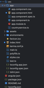
Project Structure
Example1: In the below code, we will make use of the above syntax to demonstrate the use of the Form Chips Custom Content Component.
HTML
<div style="text-align:center;">
<h1 style="color:green;">GeeksforGeeks</h1>
<h3>A computer science portal for geeks</h3>
<h4>Angular PrimeNG Form
Chips Custom Content Component</h4>
<div class="p-fluid">
<h5>ng-template</h5>
<p-chips [(ngModel)]="values3">
<ng-template let-item pTemplate="item">
{{ item }} - (active)
<i class="pi pi-user p-ml-2"></i>
</ng-template>
</p-chips>
</div>
</div>
|
Javascript
import { Component } from '@angular/core';
@Component({
selector: 'app-root',
templateUrl: './app.component.html'
})
export class AppComponent {
values3?: string[];
}
|
Javascript
import { NgModule } from '@angular/core';
import { BrowserModule } from '@angular/platform-browser';
import { FormsModule } from '@angular/forms';
import { BrowserAnimationsModule }
from '@angular/platform-browser/animations';
import { AppComponent } from './app.component';
import { ChipsModule } from 'primeng/chips';
import { ButtonModule } from 'primeng/button';
@NgModule({
imports: [
BrowserModule,
BrowserAnimationsModule,
ChipsModule,
ButtonModule,
FormsModule
],
declarations: [AppComponent],
bootstrap: [AppComponent]
})
export class AppModule { }
|
Output:
Example2: In the below code, we will make use of the above syntax to demonstrate the use of the Form Chips Custom Content Component
HTML
<div style="text-align:center;">
<h1 style="color:green;">GeeksforGeeks</h1>
<h3>A computer science portal for geeks</h3>
<h4>Angular PrimeNG Form
Chips Custom Content Component</h4>
<div class="p-fluid">
<h5>ng-template</h5>
<p-chips [(ngModel)]="values3">
<ng-template let-item pTemplate="item">
{{ item }} - (Offline)
<i class="pi pi-user p-ml-2"></i>
</ng-template>
</p-chips>
</div>
</div>
|
Javascript
import { Component } from '@angular/core';
@Component({
selector: 'app-root',
templateUrl: './app.component.html'
})
export class AppComponent {
values3?: string[];
}
|
Javascript
import { NgModule } from '@angular/core';
import { BrowserModule } from '@angular/platform-browser';
import { FormsModule } from '@angular/forms';
import { BrowserAnimationsModule }
from '@angular/platform-browser/animations';
import { AppComponent } from './app.component';
import { ChipsModule } from 'primeng/chips';
import { ButtonModule } from 'primeng/button';
@NgModule({
imports: [
BrowserModule,
BrowserAnimationsModule,
ChipsModule,
ButtonModule,
FormsModule
],
declarations: [AppComponent],
bootstrap: [AppComponent]
})
export class AppModule { }
|
Output:
Reference: https://www.primefaces.org/primeng/chips
Like Article
Suggest improvement
Share your thoughts in the comments
Please Login to comment...