Angular PrimeNG Form Calendar Animation Configuration Component
Last Updated :
11 Oct, 2022
Angular PrimeNG is an open-source framework with a rich set of native Angular UI components that are used for great styling and this framework is used to make responsive websites with very much ease. This article will show us how to use the Angular PrimeNG Form Calendar Animation Configuration Component.
The Calendar component is used to display a calendar that allows the user to select dates and move to the next or previous month. Animation Configuration Component is used to set the transition time of the animation and the transition of the show and hide animations can be customized using the showTransitionOptions and hideTransitionOptions properties.
Angular PrimeNG Form Calendar Animation Configuration Properties:
- showTransitionOptions: It specifies the transition options of the show transition. The default value is .12s cubic-bezier(0, 0, 0.2, 1)”.
- hideTransitionOptions: This property specifies the transition option of the hide transition. The default value is “.1s linear”
Syntax:
<p-calendar
    [(ngModel)]="dateValue"
    [showTransitionOptions]="..."
    [hideTransitionOptions]="...">
</p-calendar>
Creating Angular Application & Module Installation:
Step 1: Create an Angular application using the following command.
ng new appname
Step 2: After creating your project folder i.e. appname, move to it using the following command.
cd appname
Step 3: Install PrimeNG in your given directory.
npm install primeng --save
npm install primeicons --save
Project Structure:
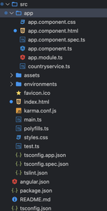
Project Structure
Example1: In the below code, we will make use of the above syntax to demonstrate the use of the Form Calendar Animation Configuration Component.
HTML
<div style="text-align:center;">
<h1 style="color:green;">GeeksforGeeks</h1>
<h3>A computer science portal for geeks</h3>
<h4>Angular PrimeNG Form Calendar
Animation Configuration Component
</h4>
<h5> [showTransitionOptions]="'1500ms'" </h5>
<div class="p-fluid p-grid p-formgrid">
<div class="p-field p-col-12 p-md-4">
<label for="basic"></label>
<p-calendar
[(ngModel)]="date1"
[showTransitionOptions]="'1500ms'"
[hideTransitionOptions]="'0ms'">
</p-calendar>
</div>
</div>
</div>
|
Javascript
import { Component } from '@angular/core';
@Component({
selector: 'app-root',
templateUrl: './app.component.html'
})
export class AppComponent {
date1?: Date;
}
|
Javascript
import { NgModule } from '@angular/core';
import { BrowserModule } from '@angular/platform-browser';
import { FormsModule } from '@angular/forms';
import { BrowserAnimationsModule }
from '@angular/platform-browser/animations';
import { AppComponent } from './app.component';
import { CalendarModule } from 'primeng/calendar';
@NgModule({
imports: [
BrowserModule,
BrowserAnimationsModule,
CalendarModule,
FormsModule
],
declarations: [AppComponent],
bootstrap: [AppComponent]
})
export class AppModule { }
|
Output:
Example2: This is another example where we use the above syntax to demonstrate the use of the Form Calendar Animation Configuration Component.
HTML
<div style="text-align:center;">
<h1 style="color:green;">GeeksforGeeks</h1>
<h3>A computer science portal for geeks</h3>
<h4>Angular PrimeNG Form Calendar
Animation Configuration Component
</h4>
<h5>[hideTransitionOptions]="'3000ms'"</h5>
<div class="p-fluid p-grid p-formgrid">
<div class="p-field p-col-12 p-md-4">
<label for="basic"></label>
<p-calendar
[(ngModel)]="date1"
[hideTransitionOptions]="'3000ms'">
</p-calendar>
</div>
</div>
</div>
|
Javascript
import { Component } from '@angular/core';
@Component({
selector: 'app-root',
templateUrl: './app.component.html'
})
export class AppComponent {
date1?: Date;
}
|
Javascript
import { NgModule } from '@angular/core';
import { BrowserModule } from '@angular/platform-browser';
import { FormsModule } from '@angular/forms';
import { BrowserAnimationsModule }
from '@angular/platform-browser/animations';
import { AppComponent } from './app.component';
import { CalendarModule } from 'primeng/calendar';
@NgModule({
imports: [
BrowserModule,
BrowserAnimationsModule,
CalendarModule,
FormsModule
],
declarations: [AppComponent],
bootstrap: [AppComponent]
})
export class AppModule { }
|
Output:
Reference: https://www.primefaces.org/primeng/calendar
Like Article
Suggest improvement
Share your thoughts in the comments
Please Login to comment...