Angular PrimeNG Button Icons Component
Last Updated :
08 Aug, 2022
Angular PrimeNG is an open-source front-end UI library that has many native Angular UI components which help developers to build a fast and scalable web solution. In this article, we will be see the Button Icons Component in Angular PrimeNG.
A Button Component is used for carrying out some action when clicked. The icon for a button can be specified using the icon property and its position can be altered using the iconPos property of the button. The button text may or may not be present for an icon button. The only icon in the button can also be displayed by specifying its value as undefined. The default value of the icon position is left.
Angular PrimeNG Button Icons Component Properties:
- icon: This property is used to specify an icon for the button.
- iconPos: This property is used to set the position of the icon in and button if the text is present. It accepts two values: “left” and “right“.
Syntax:
<button pButton
    type="button"
    icon="pi pi-check"
    label="Button with Icon">
</button>
Creating Angular Application and Installing the Module:
Step 1: Create an Angular application using the following command.
ng new appname
Step 2: After creating your project folder i.e. appname, move to it using the following command.
cd appname
Step 3: Finally, Install PrimeNG in your given directory.
npm install primeng --save
npm install primeicons --save
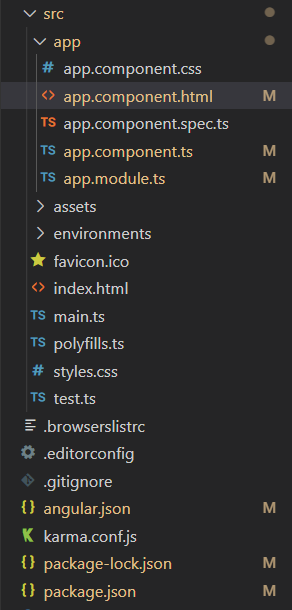
Project Structure: The project Structure will look like this after following the above steps:

Project Structure
Example 1: This example illustrates the use of the icon property of the button to set the icon. Here, we used the pi-check and pi-hashtag icons with the button.
app.component.html
<div class="header">
<h2>GeeksforGeeks</h2>
<h3>
Angular PrimeNG Button Icons Component
</h3>
</div>
<div class="buttons">
<button pButton type="button"
label="Button with No Icon">
</button>
<button pButton type="button"
icon="pi pi-check"
label="Button with Icon">
</button>
<button pButton type="button"
icon="pi pi-hashtag">
</button>
</div>
|
app.component.css
div {
display: flex;
align-items: center;
justify-content: center;
flex-direction: column;
}
.header h2 {
margin-bottom: 0;
color: green;
}
button {
margin-bottom: 10px;
}
|
app.component.ts
import { Component } from "@angular/core";
@Component({
selector: "my-app",
templateUrl: "./app.component.html",
styleUrls: ["./app.component.css"],
})
export class AppComponent {}
|
app.module.ts
import { NgModule } from "@angular/core";
import { BrowserModule } from "@angular/platform-browser";
import { BrowserAnimationsModule }
from "@angular/platform-browser/animations";
import { AppComponent } from "./app.component";
import { ButtonModule } from "primeng/button";
@NgModule({
imports: [BrowserModule,
BrowserAnimationsModule,
ButtonModule],
declarations: [AppComponent],
bootstrap: [AppComponent],
})
export class AppModule {}
|
ng serve --open
Output:
Example 2: In this example, we used the iconPos property along with the icon property to set the position of the icon.
app.component.html
<div class="header">
<h2>GeeksforGeeks</h2>
<h3>
Angular PrimeNG Button Icons Component
</h3>
</div>
<div class="buttons">
<button pButton type="button"
label="Button with No Icon">
</button>
<button pButton type="button"
icon="pi pi-check"
iconPos="left"
label="Button with Left Icon">
</button>
<button pButton type="button"
icon="pi pi-check"
iconPos="right"
label="Button with Right Icon">
</button>
</div>
|
app.component.css
div {
display: flex;
align-items: center;
justify-content: center;
flex-direction: column;
}
.header h2 {
margin-bottom: 0;
color: green;
}
button {
margin-bottom: 10px;
}
|
app.component.ts
import { Component } from "@angular/core";
@Component({
selector: "my-app",
templateUrl: "./app.component.html",
styleUrls: ["./app.component.css"],
})
export class AppComponent {}
|
app.module.ts
import { NgModule } from "@angular/core";
import { BrowserModule } from "@angular/platform-browser";
import { BrowserAnimationsModule }
from "@angular/platform-browser/animations";
import { AppComponent } from "./app.component";
import { ButtonModule } from "primeng/button";
@NgModule({
imports: [BrowserModule,
BrowserAnimationsModule,
ButtonModule],
declarations: [AppComponent],
bootstrap: [AppComponent],
})
export class AppModule {}
|
Output:
Reference: http://primefaces.org/primeng/button
Like Article
Suggest improvement
Share your thoughts in the comments
Please Login to comment...