Angular PrimeNG Accordion Custom Content at Headers
Last Updated :
06 Jan, 2023
Angular PrimeNG is a UI component library built by PrimeTek for helping out Angular developers for easing the process of developing consistent and scalable web interfaces in less time. In this article, we will talk about Accordion Custom Content at Headers in Angular PrimeNG.
The Accordion Component is used to display the content in a collection of tabs. By default, only one of the tabs of the Accordion can be opened but this can be overridden by setting the “multiple” property of the component to true. To place custom content in Accordion Header the header template of the p-accordionTab element can be used.
Angular PrimeNG Accordion Custom Content at Headers Properties:
- multiple: When this property is true, multiple accordion tabs can be opened at a time.
- activeIndex: It is the index of the active tab or an array of indexes to change the selected tab programmatically
- expandIcon: It is the icon of the expanded accordion tab.
- collapseIcon: It is the icon of the collapsed accordion tab.
Angular PrimeNG Accordion Custom Content at Headers Template:
- header: This template is used to show custom content as the header of the accordion tabs.
Syntax:
<p-accordion>
    <p-accordionTab>
        <ng-template pTemplate="header">
            Header Content
        </ng-template>
           ...
    </p-accordionTab>
    ...
</p-accordion>
Creating the Application and Installing the Required Modules:
Step 1: Create the Angular app using the following command.
ng new my_app
Step 2: After creating the app, move to the project folder using the command written below.
cd new_app
Step 3: Finally, Install the following modules in your project directory
npm install primeng --save
npm install primeicons --save
Project Structure: Now, the project structure will as shown in the below picture.
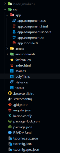
Project Structure
Example 1: In this example, we inserted H3 heading as the header of the accordion tab using the header template.
HTML
<div style="width: 400px;">
<h1 style="color:green;">GeeksforGeeks</h1>
<h3>A computer science portal for geeks</h3>
<h4>
Angular PrimeNG Accordion
Custom Content at Headers
</h4>
<p-accordion>
<p-accordionTab>
<ng-template pTemplate="header">
<h3>H3 as Header of Accordion Tab 1</h3>
</ng-template>
This is the content of the Accordion Tab 1.
</p-accordionTab>
<p-accordionTab header="AccordionTab 2 Header">
This is the content of the Accordion Tab 2.
</p-accordionTab>
<p-accordionTab header="AccordionTab 3 Header">
This is the content of the Accordion Tab 3.
</p-accordionTab>
</p-accordion>
</div>
|
Javascript
import { Component } from "@angular/core";
@Component({
selector: "app-root",
templateUrl: "./app.component.html",
styleUrls: ["./app.component.css"],
})
export class AppComponent { }
|
Javascript
import { NgModule } from "@angular/core";
import { BrowserModule }
from "@angular/platform-browser";
import { HttpClientModule }
from "@angular/common/http";
import { BrowserAnimationsModule }
from "@angular/platform-browser/animations";
import { AppComponent } from "./app.component";
import { ChipModule } from 'primeng/chip';
import { AccordionModule }
from "primeng/accordion";
import { InplaceModule }
from "primeng/inplace";
@NgModule({
imports: [
BrowserModule,
BrowserAnimationsModule,
InplaceModule,
AccordionModule,
ChipModule,
HttpClientModule,
],
declarations: [AppComponent],
bootstrap: [AppComponent],
})
export class AppModule { }
|
Output:
Example 2: In this example, we used the chip in the header of the Accordion tabs using the header template.
HTML
<div style="width: 400px;">
<h1 style="color:green;">GeeksforGeeks</h1>
<h3>A computer science portal for geeks</h3>
<h4>
Angular PrimeNG Accordion
Custom Content at Headers
</h4>
<p-accordion>
<p-accordionTab>
<ng-template pTemplate="header">
<p-chip
label="Header of Accordion Tab 1">
</p-chip>
</ng-template>
This is the content of the Accordion Tab 1.
</p-accordionTab>
<p-accordionTab>
<ng-template pTemplate="header">
<p-chip
label="Header of Accordion Tab 2">
</p-chip>
</ng-template>
This is the content of the Accordion Tab 2.
</p-accordionTab>
<p-accordionTab header="AccordionTab 3 Header">
This is the content of the Accordion Tab 3.
</p-accordionTab>
</p-accordion>
</div>
|
Javascript
import { Component } from "@angular/core";
@Component({
selector: "app-root",
templateUrl: "./app.component.html",
styleUrls: ["./app.component.css"],
})
export class AppComponent { }
|
Javascript
import { NgModule } from "@angular/core";
import { BrowserModule }
from "@angular/platform-browser";
import { HttpClientModule }
from "@angular/common/http";
import { BrowserAnimationsModule }
from "@angular/platform-browser/animations";
import { AppComponent } from "./app.component";
import { ChipModule } from 'primeng/chip';
import { AccordionModule }
from "primeng/accordion";
import { InplaceModule }
from "primeng/inplace";
@NgModule({
imports: [
BrowserModule,
BrowserAnimationsModule,
InplaceModule,
AccordionModule,
ChipModule,
HttpClientModule,
],
declarations: [AppComponent],
bootstrap: [AppComponent],
})
export class AppModule { }
|
Output:
Reference: https://www.primefaces.org/primeng/accordion
Like Article
Suggest improvement
Share your thoughts in the comments
Please Login to comment...