Angular Material Chips
Last Updated :
06 Feb, 2023
Angular Material is a UI component library that is developed by Google so that Angular developers can develop modern applications in a structured and responsive way. By making use of this library, we can greatly increase the user experience of an end-user thereby gaining popularity for our application. This library contains modern ready-to-use elements which can be directly used with minimum or no extra code.
The Chips in angular material are used to represent or show information, make selections, filter content, and enter data. For creating Chips we use the <mat-chip> directive. Angular Material provides different types of chips, which are described below:
- Static Chips: A static chip is used to display a set of items but these chips can not be selected, removed or edited, and are not part of any model. We can create chips using <mat-chip-set> element by nesting the <mat-chip> elements inside the <mat-chip-set>.
- Selection Chips: The Selection chips are used when we want to select one or many items from a list. The Selection chips are created by using <mat-chip-listbox> element and nesting <mat-chip-option> inside <mat-chip-listbox> for all the options available.
- Chips connected to an input field: Chips can be connected to the input field by using <mat-chip-grid> and <mat-chip-row>. The <input/> element is nested inside <mat-chip-row> which is nested inside <mat-chip-grid>.
- Icons: Icons can be added to chips to identify entities and additional functionality can be provided. To add an icon to the front slot of the chips, we can nest an element with matChipAvatar attribute inside of <mat-chip>.To add an icon to the back slot by the nesting of the chips, we can nest an element with either the matChipTrailingIcon or matChipRemove attribute.
- Orientation: The Default chip list is displayed in the horizontal direction. A Stack chip list is used to display chips in the vertical direction.To display chips vertically, the mat-mdc-chip-set-stacked class is used in <mat-chip-set>, <mat-chip-listbox> or <mat-chip-grid>.
- Specifying global configuration defaults: To define default options for the chips module, use the MAT_CHIPS_DEFAULT_OPTIONS token in the ngmodules provider’s array.
- Interaction Patterns: There are 3 interaction patterns associated with chips. They are
- Listbox: <mat-chip-listbox> and <mat-chip-option> are used to implement a listbox accessibility pattern which provides a set of user-selectable options.
- Text Entry: <mat-chip-grid> and <mat-chip-row> are used to implement a grid accessibility pattern which can be used as part of a free-form input that allows users to enter text to add chips.
- Static Content: <mat-chip-set> and <mat-chip> are used as an unordered list which provides a list of items that are not interactive. This interaction pattern mimics using ul and li elements.
Note: If we want to display the chips in disabled form or if we want to prevent user interaction with the chips disabled keyword can be used with <mat-chip>,<mat-chip-option>, and <mat-chip-row>.
We can change the theme of the chips by using the color property. In angular we have 3 themes, they are primary, accent, and warn.
Syntax:
<mat-chip-list >
    <mat-chip>Chip 1</mat-chip>
    <mat-chip>Chip 2</mat-chip>
    <mat-chip color="primary" selected>Primary</mat-chip>
    <mat-chip color="accent" selected>Accent</mat-chip>
</mat-chip-list>
Installation Syntax: The basic pre-requisite is that we must have Angular CLI installed on the system in order to add and configure the Angular material library. The following command is executed on the Angular CLI to install the angular material library:
ng add @angular/material
Make sure the path should be opened in the terminal before executing the above command.
Please refer to the Adding Angular Material Component to Angular Application article for the detailed installation procedure.
Adding Chips Component: To use the Chips Component, we need to import the below module into the app.module.ts file:
import { MatChipsModule } from "@angular/material/chips";
To use the Chips component in our code we have to import MatChipsModule into the imports array.
Project Structure: After successful installation, the project structure will look like the following image:
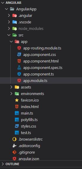
Project Structure
Example 1: This example describes the basic usage of the Angular Material Chips.
Javascript
import { NgModule } from '@angular/core';
import { BrowserModule }
from '@angular/platform-browser';
import { AppComponent } from './app.component';
import { BrowserAnimationsModule }
from '@angular/platform-browser/animations';
import { MatInputModule } from "@angular/material/input";
import { MatChipsModule } from "@angular/material/chips";
import { MatIconModule } from '@angular/material/icon';
@NgModule({
declarations: [
AppComponent
],
imports: [
BrowserModule,
MatChipsModule,
MatIconModule,
BrowserAnimationsModule,
MatInputModule,
],
providers: [],
bootstrap: [AppComponent]
})
export class AppModule { }
|
HTML
<div>
<h1 style="color: green">GeeksforGeeks</h1>
<h3>Angular Material Chips</h3>
<p>Default Chip List</p>
<mat-chip-listbox aria-span="Item selection">
<mat-chip-option *ngFor="let chip of frameworkChips"
selected [color]="chip.color">
{{chip.name}}
<mat-icon>code</mat-icon>
</mat-chip-option>
</mat-chip-listbox>
<br /><br />
<p>Stacked Chip List</p>
<mat-chip-listbox class="mat-mdc-chip-set-stacked"
aria-span="Item selection">
<mat-chip-option *ngFor="let chip of frameworkChips"
selected [color]="chip.color">
{{chip.name}}
</mat-chip-option>
</mat-chip-listbox>
</div>
|
Javascript
import { Component } from '@angular/core';
import { ThemePalette } from '@angular/material/core';
export interface ChipArray {
name: string;
color: ThemePalette;
}
@Component({
selector: 'chips-overview-example',
templateUrl: 'chips-overview-example.html',
})
export class ChipsOverviewExample {
frameworkChips: ChipArray[] = [
{ name: 'React', color: 'primary' },
{ name: 'Express', color: 'accent' },
{ name: 'Angular', color: 'warn' },
];
}
|
Output:

Angular Material Chip Gif
Example 2: This example illustrates the usage of the Angular Material Chips by implementing the Avatar Chips.
Javascript
import { NgModule } from '@angular/core';
import { BrowserModule }
from '@angular/platform-browser';
import { AppComponent } from './app.component';
import { BrowserAnimationsModule }
from '@angular/platform-browser/animations';
import { MatInputModule } from "@angular/material/input";
import { MatChipsModule } from "@angular/material/chips";
import { MatIconModule } from '@angular/material/icon';
@NgModule({
declarations: [
AppComponent
],
imports: [
BrowserModule,
MatChipsModule,
MatIconModule,
BrowserAnimationsModule,
MatInputModule,
],
providers: [],
bootstrap: [AppComponent]
})
export class AppModule { }
|
Javascript
import { Component } from '@angular/core';
@Component({
selector: 'my-app',
templateUrl: './app.component.html',
styleUrls: ['./app.component.css']
})
export class AppComponent {
title = 'AngularApp';
}
|
HTML
<div>
<h1 style="color: green;">
GeeksforGeeks
</h1>
<h3>Angular Material Avatar Chips</h3>
<mat-chip-listbox aria-label="selection">
<mat-chip>
<img matChipAvatar src=
alt="DSA" />
DSA
</mat-chip>
<mat-chip color="primary">
<img matChipAvatar src=
alt="Web Technology" />
Web Technology
</mat-chip>
<mat-chip color="accent">
<img matChipAvatar src=
alt="Progamming Language" />
Progamming Language
</mat-chip>
</mat-chip-listbox>
</div>
|
Output:
Reference: https://material.angular.io/components/chips/overview
Like Article
Suggest improvement
Share your thoughts in the comments
Please Login to comment...