Adding labels to a Bokeh plot
Last Updated :
19 Jul, 2022
Bokeh includes several layout options for arranging plots and widgets. They make it possible to arrange multiple components to create interactive dashboards or data applications. The layout functions let you build a grid of plots and widgets. You can nest as many rows, columns, or grids of plots together as you’d like. In addition, Bokeh layouts support a number of “sizing modes”. These sizing modes allow plots and widgets to resize based on the browser window.
Adding labels to a plot :
We can add label to x-axis, y-axis, legend label and title to a plot and much more. The label is just a text to describe the plot in a meaningful manner and it also describes the individual part in it.
Example 1:
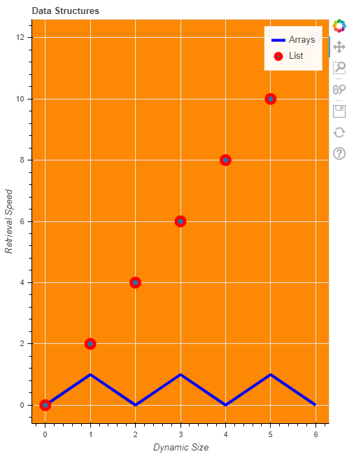
In this example, we will give title and x-axis label and y-axis label as well as labels for different plots. We will give y-axis as Retrieval size and x-axis as Dynamic size. We can give the x_axis_label and y_axis_label inside figure() method, and we will also give legend label as Arrays and List. Here our currentList contains elements from 0 to 6 and List2 will be every element of currentList divide by 2 and List3 will be every element of currentList multiply by 2. One plot will be currentList,List2 and one will be currentList,List3.
Below is a python program for adding a label to a plot-bokeh
Python3
from bokeh.io import output_file, show
from bokeh.layouts import column
from bokeh.plotting import figure
output_file("GFG.html")
currentList = list(range(7))
List2 = [i % 2 for i in currentList]
List3 = [i*2 for i in currentList]
f1 = figure(title="Data Structures",
x_axis_label="Dynamic Size",
y_axis_label="Retrieval Speed",
plot_width=500,
plot_height=650,
background_fill_color="#fc8803")
f1.line(currentList,
List2,
line_width=4,
line_color='blue',
legend_label='Arrays')
f1.circle(currentList,
List3, size=12,
line_width=5,
line_color='red',
legend_label='List')
show(f1)
|
Output :
Example 2 :
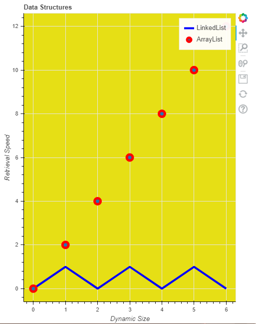
In this example, we will give the x-axis label and y-axis label outside the figure method, or you can say we will give them values as properties, not as method parameters. Here We also give legend label for the circle as ArrayList and for the line we named it as Linked List and changed the background color also. You can also look to customize it using your own thinking. Here our currentList contains elements from 0 to 6 and List2 will be every element of currentList divide by 2 and List3 will be every element of currentList multiply by 2. One plot will be currentList, List2 and one will be currentList,List3.
Below is the code for giving labels to bokeh plot.
Python3
from bokeh.io import output_file, show
from bokeh.layouts import column
from bokeh.plotting import figure
output_file("GFG.html")
currentList = list(range(7))
List2 = [i % 2 for i in currentList]
List3 = [i*2 for i in currentList]
f1 = figure(title="Data Structures",
plot_width=500,
plot_height=650,
background_fill_color="#e6df15")
f1.xaxis.axis_label = "Dynamic Size"
f1.yaxis.axis_label = "Retrieval Speed"
f1.line(currentList,
List2, line_width=4,
line_color='blue',
legend_label='LinkedList')
f1.circle(currentList,
List3,
size=12,
line_width=5,
line_color='red',
legend_label='ArrayList')
show(f1)
|
Output :
Like Article
Suggest improvement
Share your thoughts in the comments
Please Login to comment...