Adding a Secondary Axis to an Excel Chart
Last Updated :
01 Jun, 2021
We need a secondary axis in a chart when we deal with two or more chart types for any hierarchical data. For example, Sales vs Average Cost, Performance vs Conversion Rate, Sales vs Profit and many more.
In this article, we are going to see how to add a secondary axis in Excel using the example shown below.
Example: Consider a famous coaching institute that deals with both free content in their YouTube channel and also have their own paid online courses. There are broadly two categories of students in this institute :
(1) The students who enrolled but are learning from YouTube free video content.
(2) The students who enrolled in paid online video lectures.
So, the institute asked their Sales Department to make a statistical chart about how many paid courses from a pool of courses which the institute deals with sold from the year 2014 to last year 2020 and also show the percentage of students who have enrolled in the online paid courses only.
Table :
| Course Enrollment Stats |
| Year |
Number of Paid Courses sold |
Percentage of Students Enrolled |
| 2014 |
10 |
30% |
| 2015 |
15 |
25% |
| 2016 |
20 |
30% |
| 2017 |
20 |
50% |
| 2018 |
25 |
45% |
| 2019 |
15 |
20% |
| 2020 |
30 |
70% |
Implementation :
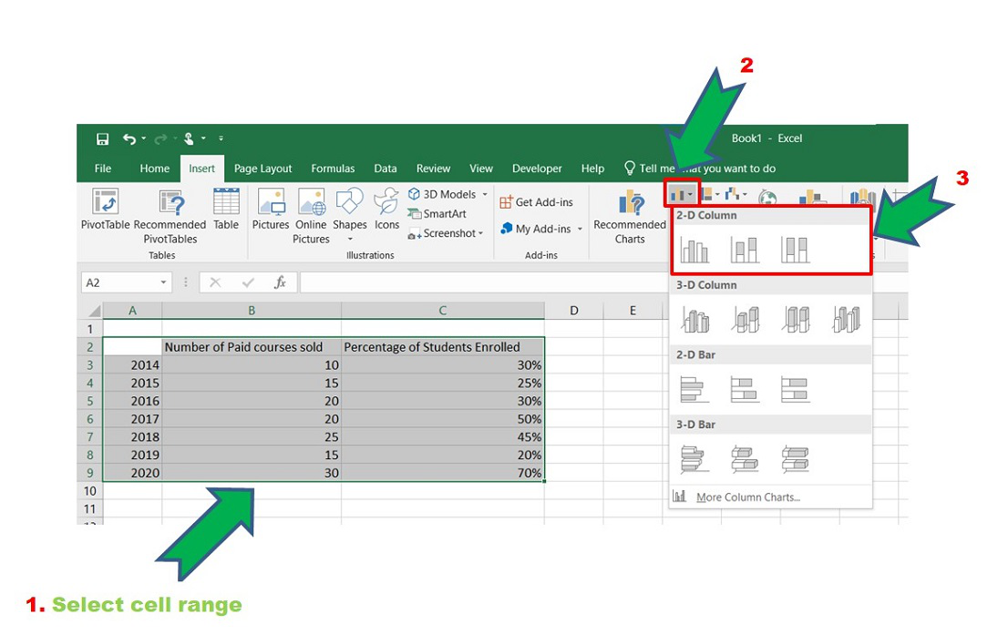
Step 1: Insert the data in the cells. After insertion, select the rows and columns by dragging the cursor.
Step 2: Now click on Insert Tab from the top of the Excel window and then select Insert Column or Bar Chart. From the pop-down menu select the first “2-D Column”.
Inserting Bar Chart
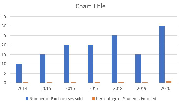
Bar Chart
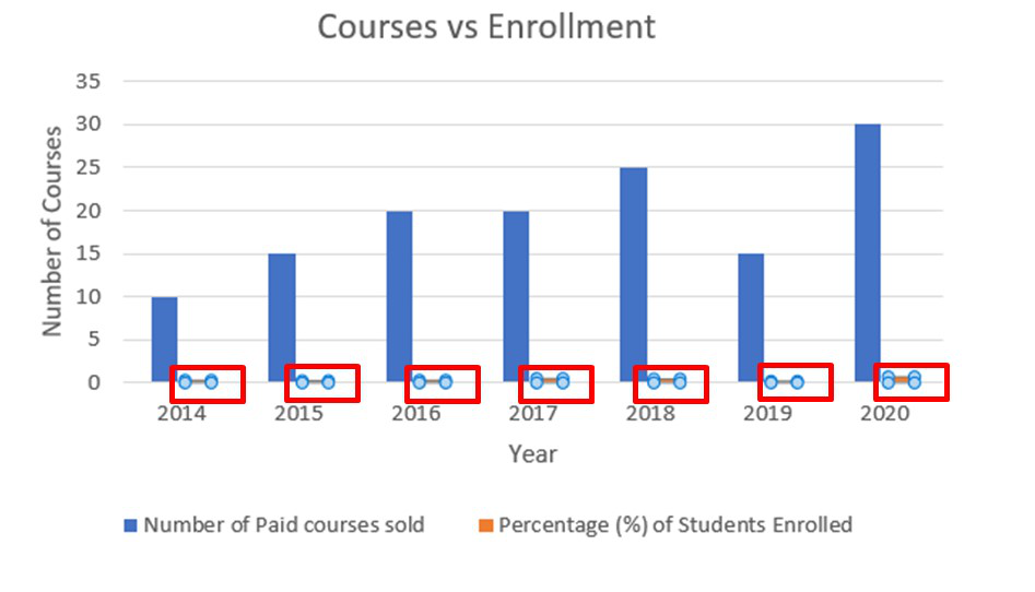
Step 3: Now we need a secondary axis for the “Percentage of Students Enrolled” in the courses. For that select the Percentage bar which is in the “light orange” color in the chart.
The chart may not be directly selected or sometimes may not be visible if the axis value increases. So, in that case, to select the chart of “Percentage of Students Enrolled” refer to the following steps :
- Select the entire chart.
- Click on Format Tab from the top of the Excel window.
- Select Plot Area pop down button.
- Then select Series “name of the column” which you want to select. In our case it is: Series “Percentage of Students Enrolled”.

Selected
Note that this step is optional. It has to be followed in case there is difficulty in seeing the second data chart or difficulty in selecting the second data chart. You can directly skip to Step 4.
Step 4: Since the second chart is selected now. To add a secondary axis follow :
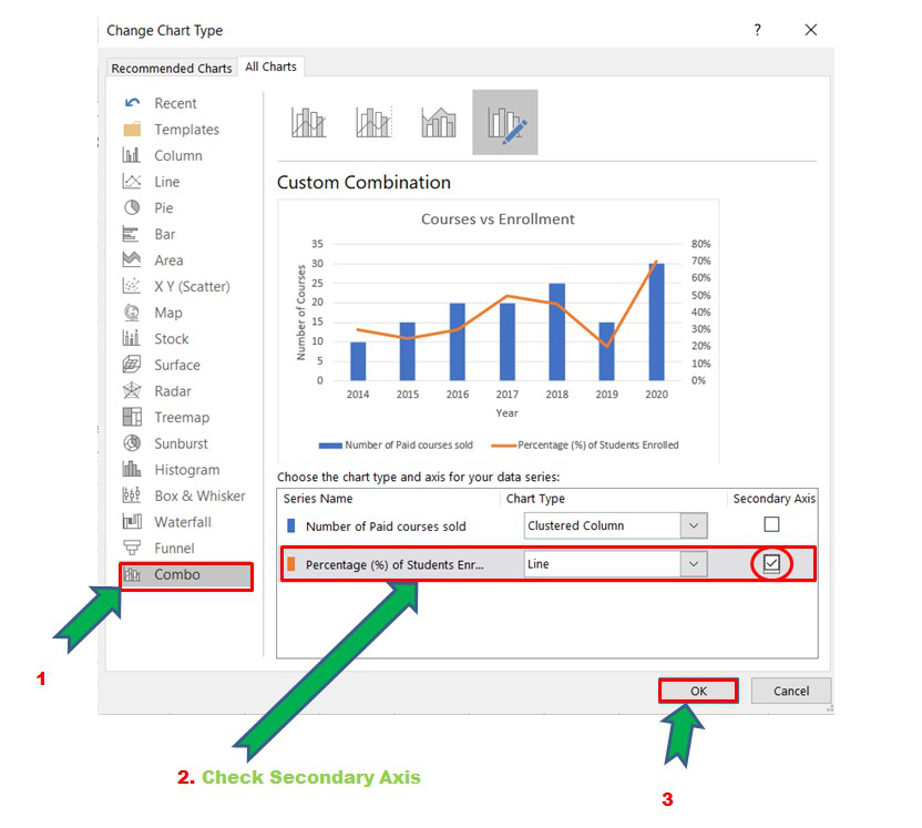
Select the chart -> Design -> Change Chart Type
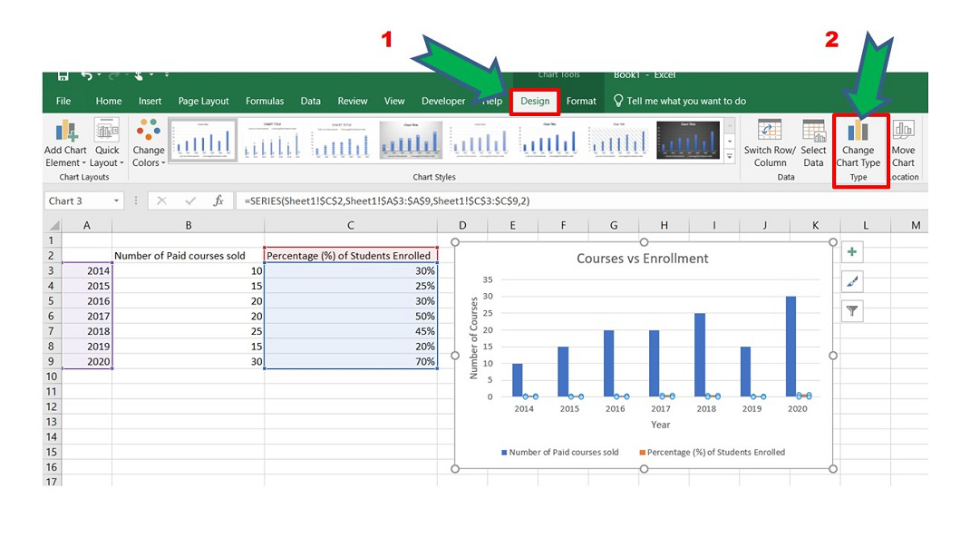
The shortcut to the above two steps is to right-click on the chart and select “Change Chart Type”.
Step 5: The Chart Type window opens. Now go to the “Combo” option and check the “Secondary Axis” box for the “Percentage of Students Enrolled” column. This will add the secondary axis to the original chart.
Adding Secondary Axis
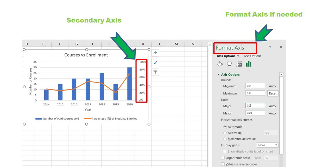
Secondary Axis added
The secondary axis is added. Now we can perform different modifications in the axes using the Format Axis window. The two charts formed together into a single chart are called “Combination charts”.
Like Article
Suggest improvement
Share your thoughts in the comments
Please Login to comment...